
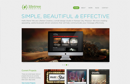
The heading on the home page of this site says it all. “Simple, Beautiful, & Effective.” The colors are fresh, the typography inviting, and the layout feels spot on. The flow of info and scanability of the site is great. The site is cleanly done and reflects that similar style of their client work.


Fitts’s Law: Why the Easy Button Wins
Large, close targets are faster to hit than small, distant ones, that’s Fitts’s Law. A look at the 1954 rule behind buttons, prime and magic pixels, thumb zones, and dark patterns.


0 Comments