
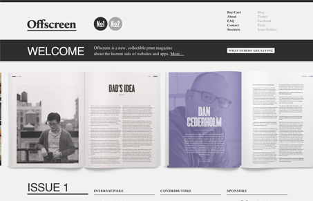
I love the slideshow of the inside of the magazine, well done and shows off what it’s all like. The black/white/gray color scheme fits well to help accentuate the photos and such too. Would love to get my hands on one of these for a review!


Fitts’s Law: Why the Easy Button Wins
Large, close targets are faster to hit than small, distant ones, that’s Fitts’s Law. A look at the 1954 rule behind buttons, prime and magic pixels, thumb zones, and dark patterns.


Thanks for featuring us guys! The screenshot is outdated though. 😉