Web Design Inspiration Curated
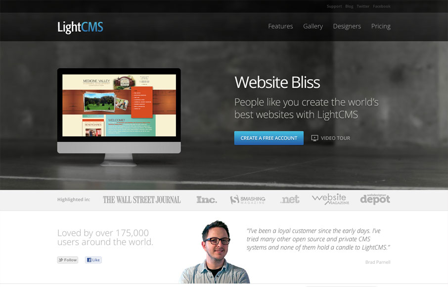
lightcms.com
I've followed LightCMS for a while and they always impress me with their product and they pack a nice punch with their product site too. The best part of this site is revealed as you scroll down, the offset images and asymmetrical look is just nice. They focus well on...
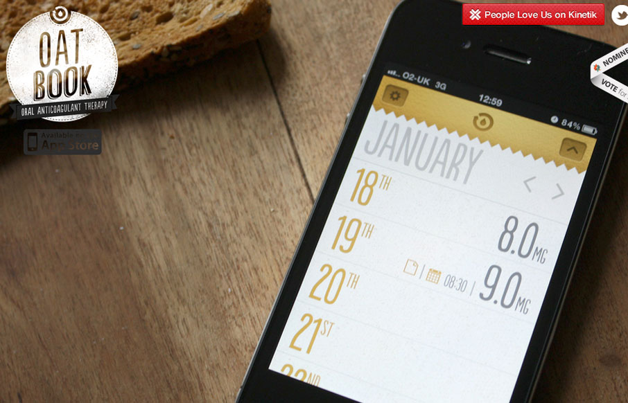
oatbook.co.uk
oatbook.co.uk is a beautiful gallery. The site takes a novel approach of creating interest for the OATBook product by presenting viewers with a massive, full screen gallery of images and nothing else. The photography is pretty good and the minimal design leaves a...
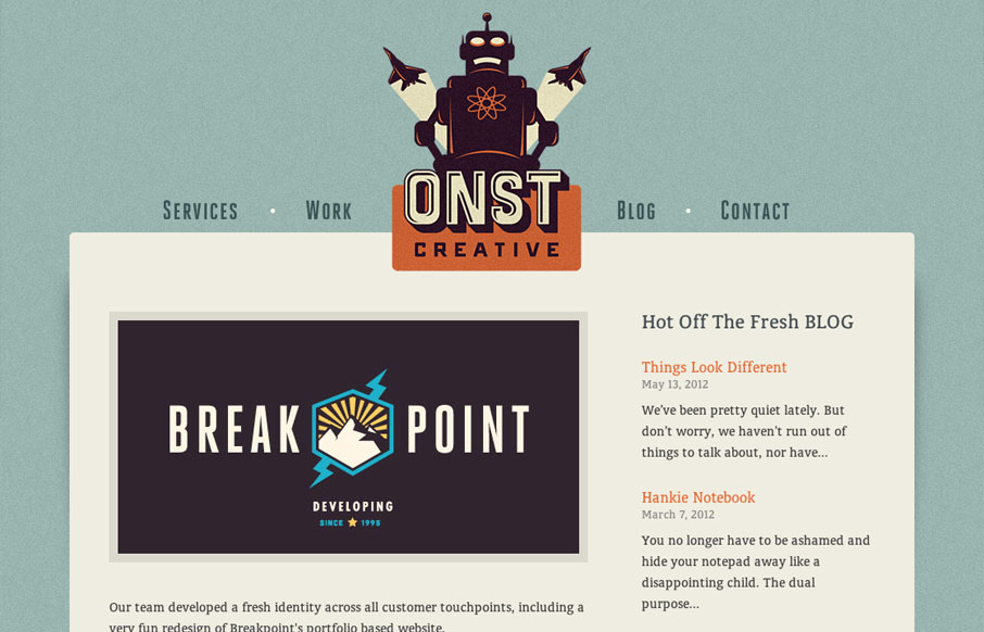
onstcreative.com
There are two things I love in the world (there are actually more, but I want to keep this review brief) and they are Retro-futuristic Design and Robots. These two loves come together beautifully in Onst Creative's website. First off, I'm a sucker for for sites with...
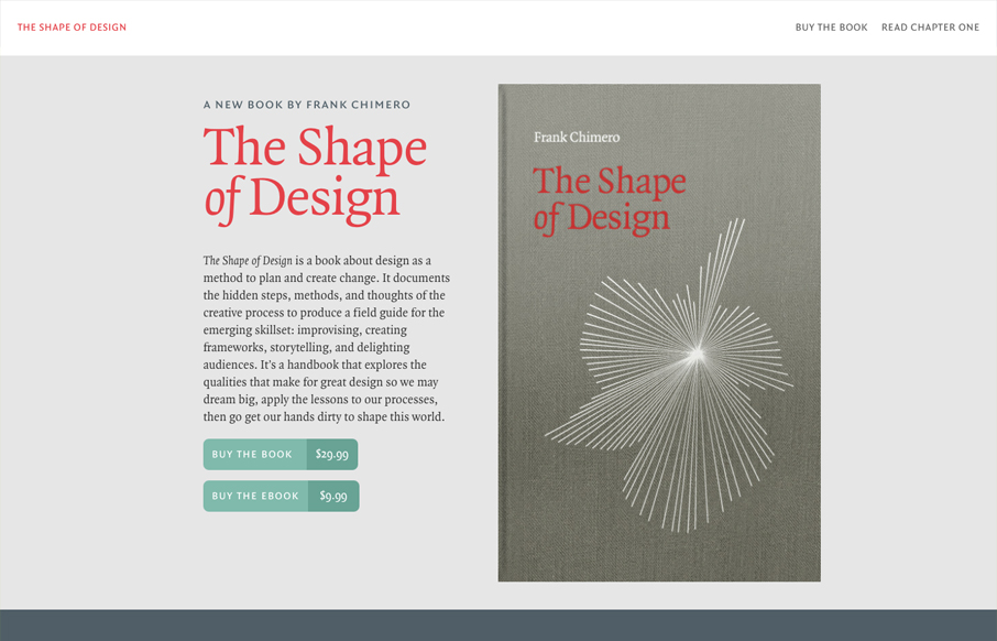
shapeofdesignbook.com
Beautifully designed website for the Shape of Design book by Frank Chimero. Well hell, it's just about perfect, I love it... Just buy the dang book okay.
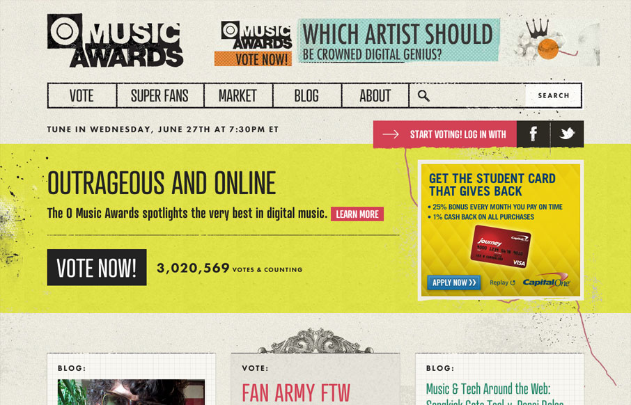
omusicawards.com
Goodness me, check out the @happycog-designed (and responsive!) omusicawards.com — Responsive Design (@RWD) May 29, 2012 Here is a sweet site with great texture and a simple open layout. I like the parallax effect in the background. It gives the site a 'fast' feel...
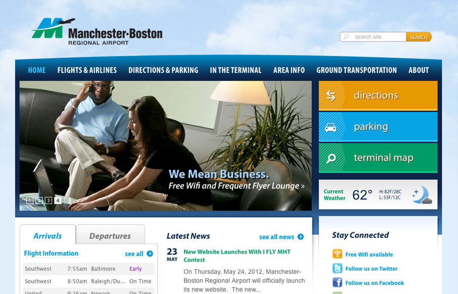
flymanchester.com
Well hey, check out the new responsive hotness over at flymanchester.com /via @webmeadow— Responsive Design (@RWD) May 18, 2012 Really well done responsive design, the "directions, parking and map" main buttons are all treated very well at all the major...
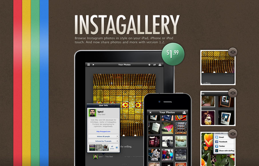
infinitapps.com/instagallery
This is another one of those microsites that all mobile apps seem to have. It's tight and simple, with minimal structure and lush textures. The vertical stripe is beautiful and gives the design a boldness it might otherwise lack. It also gives the design a slightly...
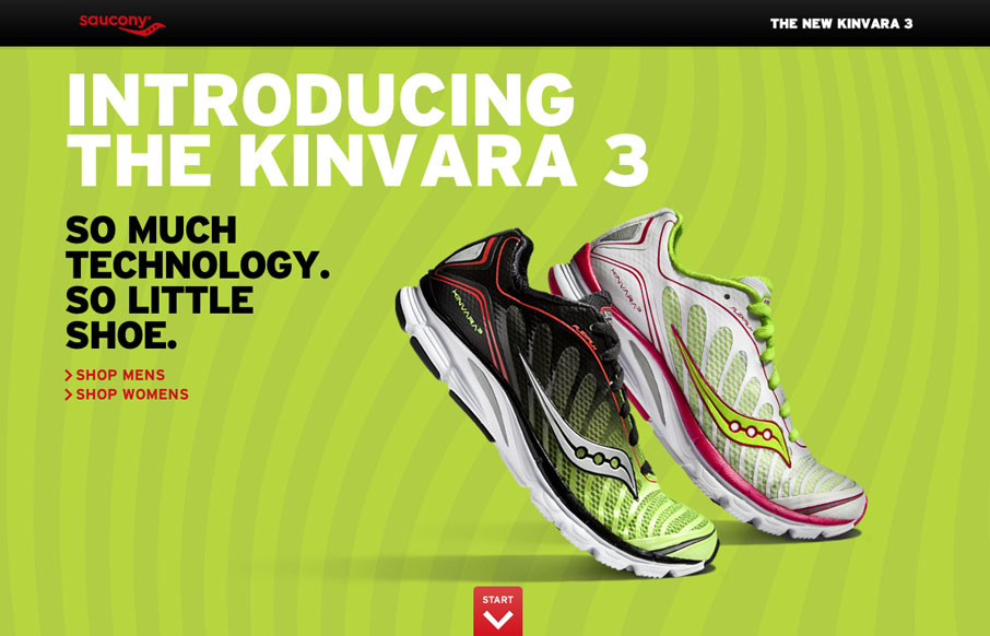
saucony.com/kinvara3
This website for the Saucony Kinvara 3 shoe is superb. The thing that gets it to work so well is the narrative of the shoe coming together. There are two really great visual/interactive moments on this site, when you get to the shoe flipping over then the next section...
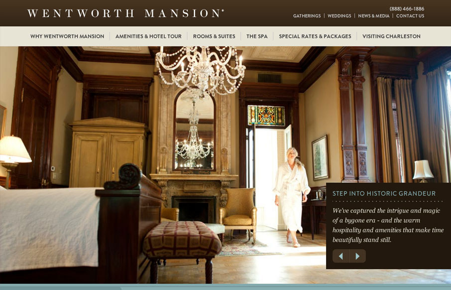
wentworthmansion.com
The Wentworth Mansion website by the fine folks at BlueIon here in SC is a very well crafted website. I love finding superb examples of responsive sites that aren't agency or person portfolio websites. Very nice navigational design decisions for the iPhone screen...
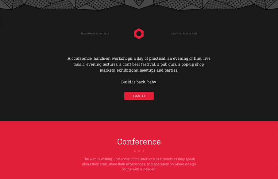
2012.buildconf.com
The 2012 Build Conference website is just beautiful. It makes me happy to scroll down and see the rounded headshots and then to discover the icons that have been designed to tell the tale of the workshops and finge events. The icon/illustration of Aaron Draplin is...
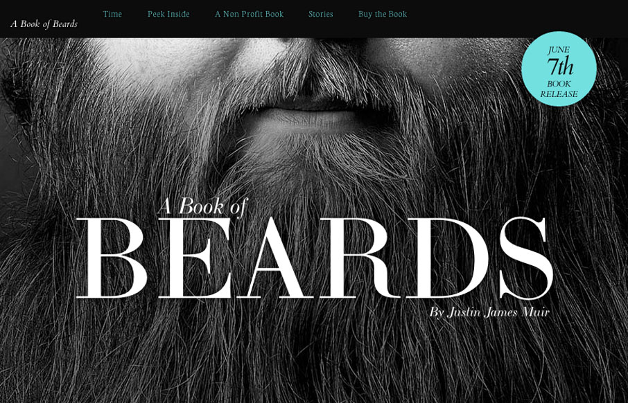
bookofbeards.com
Looking for one-page website inspiration and I found this. bookofbeards.com #inspiration— Jacklyn Burgan (@playfulpixel) May 24, 2012 Love love love this simple yet very bold design. It's a bout beards so let there be beards right? Lovely changes on the...
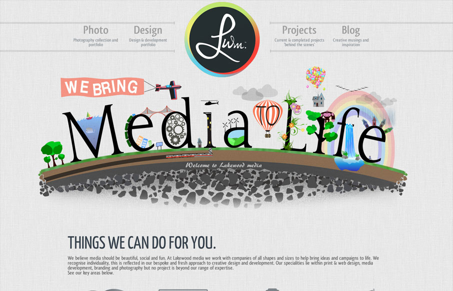
lakewoodmedia.co.uk
With this website we have aimed to achieve an impacting first response using unique designs and layout. Being a little different is what its all about, the Lakewood media website somehow stays conventional but steps over the perimeter of the norm. A flowing layout has...
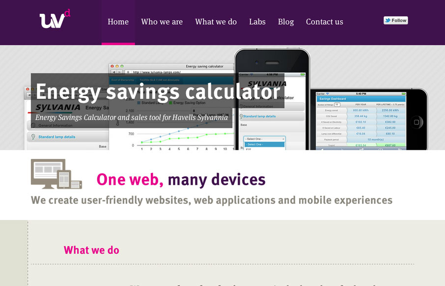
uvd.co.uk
Fantastic new website by the awesome guys at Ultraviolet Design, the awesome responsive approach is matched by astute attention to providing a great UX and great typography, awesome work. ASCII FTW!
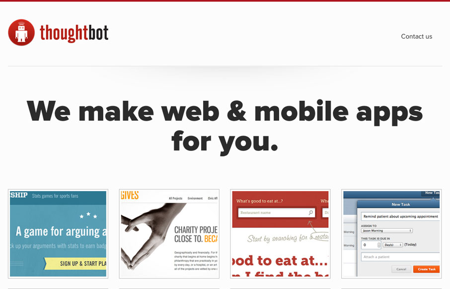
thoughtbot.com
I love the simplicity of the thoughtbot website design. The interactions on the home page portfolio images is really smartly done. The hierarchy is kept simple and gets more dense with content as you scroll down the page, with very minimal copy until after you see the...
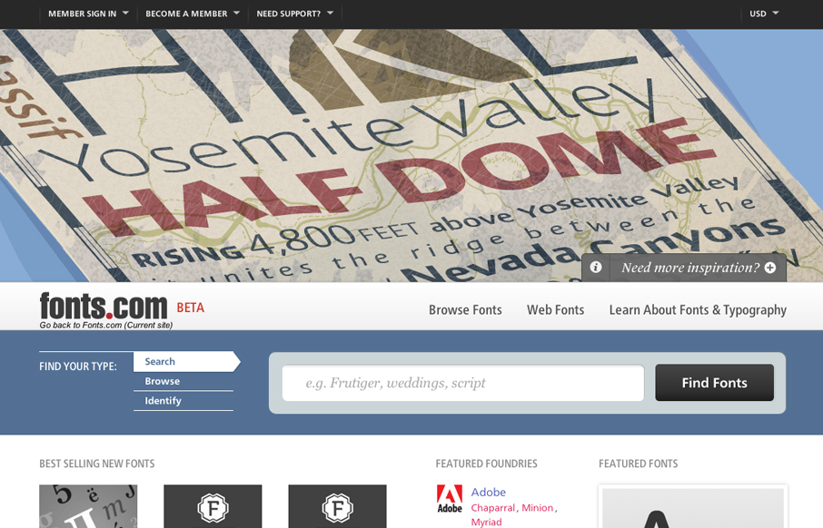
fonts.com
Looks as if Happy Cog just rolled out a new design for fonts.com. Here's a super detailed blog post about it. I like a lot of this new design. My particular favorite is the main image slideshow and how the main site colors change out as you experience it. Good...
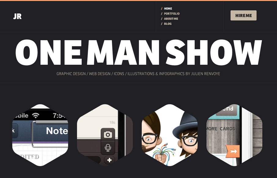
julienrenvoye.com
Really great interaction design on this portfolio website. I love the hexagons and how they grow a bit when you mouse over them. The way the headers load when you hit a new page is a nice little surprise too. Lovely bold yet minimal color palette. Really enjoyed...
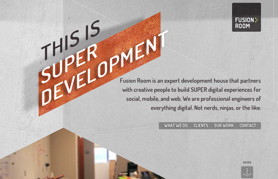
fusion-room.com
Really nice scrolling, single-page website design. I really like how the elements slide into view as you scroll down the page. The diagonal movement is very dynamic compared to most parallax technique sites like these. Lovely.
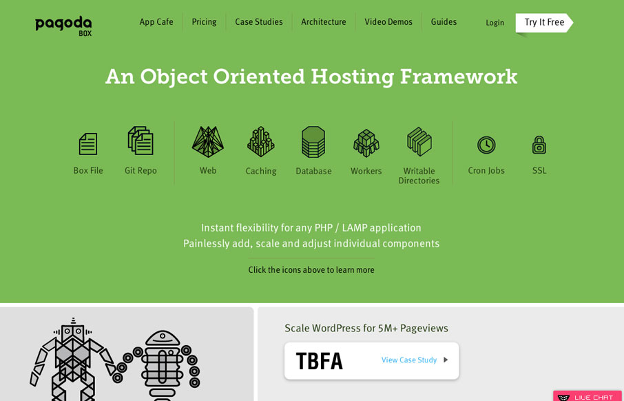
pagodabox.com
This site is definitely a strong rival to Heroku in terms of presenting complex information in a beautiful manner, not to mention showing off some pretty impressive features. A beautiful constructed and varied layout coupled with eye-catching infographics makes for an...
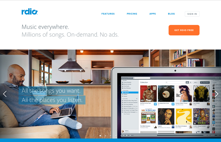
rdio.com v2+
The new(ish) rdio.com design is beautiful. I love the visual engagement that the design drives you into as you make your way down the hierarchy of the page. From light to dark, from sparse to dense it's very well put together. I think the colors get so much better and...
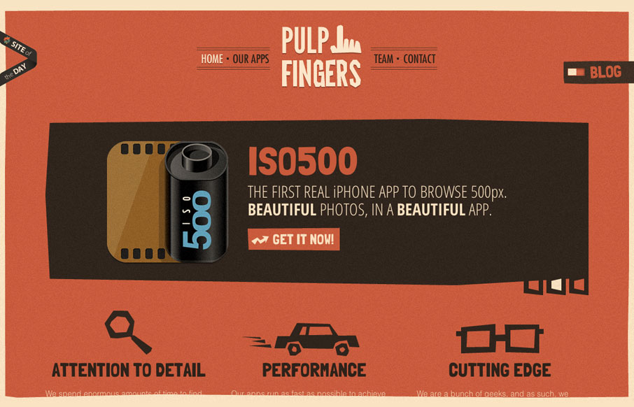
pulpfingers.com
The pulpfingers.com site is simple gorgeous. I love the orange/red and brown/black coloring, it's unique looking and along with the stark graphic illustrations gives it a nice sense of rememberability. There are some neat little visuals here and there on this site...
EMAIL NEWSLETTER
News & Articles
unmatchedstyle
http://jqueryvsmootools.com a nice comparison between two js libraries. (Via @snookca) #ums
unmatchedstyle
These are great! I'd like a Photoshop and a Flash pillow please. http://bit.ly/eOtR5 #ums
unmatchedstyle
http://www.chrisbuck.com - some really great and interesting photography. #ums

HARD WORK. CLEAN FUEL. NO EXCUSES
Use “WARRIOR2023″ for 10% off.