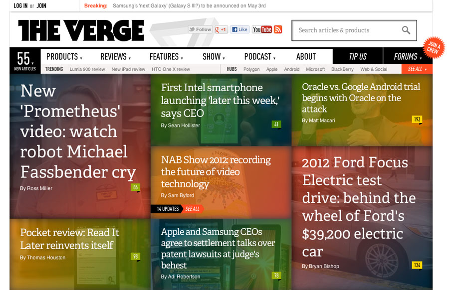
The Verge isn’t exactly new news in the design world. It’s been around a few months. I happen to feel like it’s a great experience in terms of taking in news/stories, both on the old laptop and on my iPad too. What are your gripes or loves for it?
Glassmorphism: The Transparent Design Trend That Refuses to Fade
Glassmorphism brings transparency, depth, and light back into modern UI. Learn how this “frosted glass” design trend enhances hierarchy, focus, and atmosphere, plus how to implement it in CSS responsibly.


I think this website does a fantastic job of piling an immense amount of content on one page. I think the key is breaking up all of the sections vertically and horizontally as you go down the page. So even though the page is very long, you never get the sense of these long unbroken columns of text. Lots of contrast and lots of imagery, plus really nice type helps.
I agree with Barry above (hi barry) … I visit a lot of news type sites and this one for me has the best thought through interface for bringing the best news to the top of the pile.
The one thing I don’t like is that the search box is a bit big and clunky, but that’s a really minor gripe.