Web Design Inspiration Curated
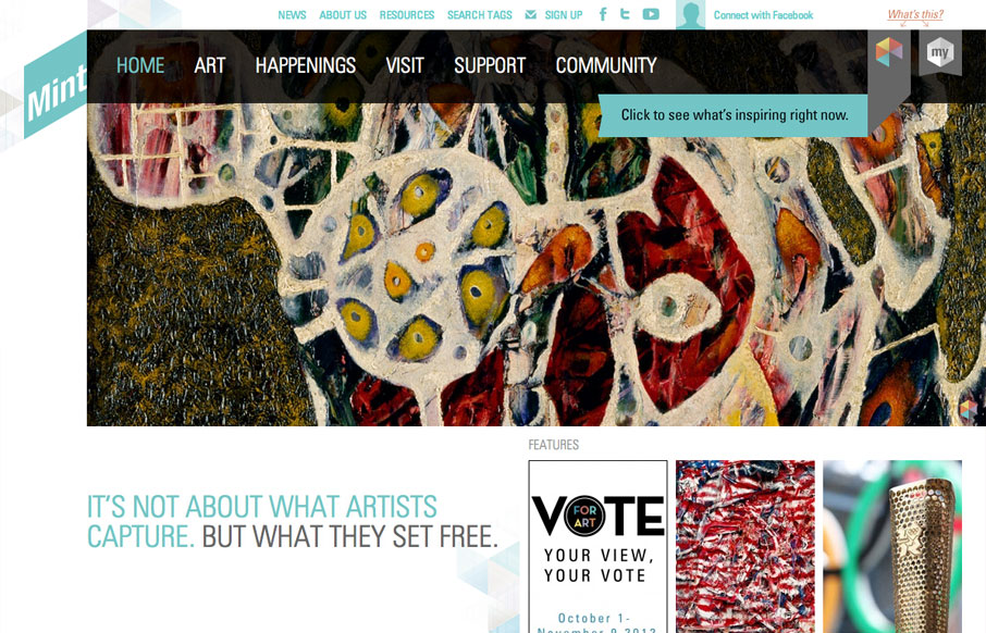
mintmuseum.org
The way they've used the logo in the mint museum website is pretty clever it's off the side and sort of slanted and it's not the central element but yet it's very noticeable. The large hero image slideshow is pretty standard but they've cropped and created different...
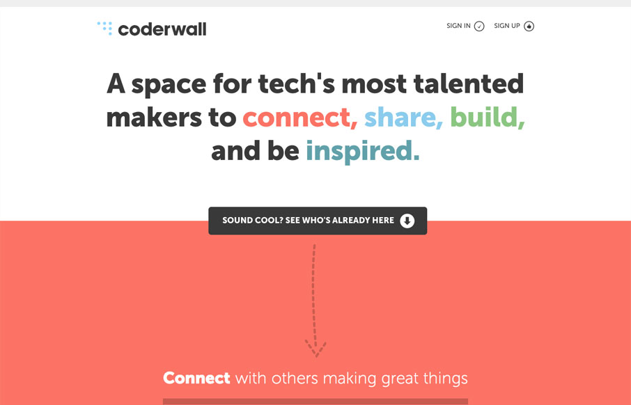
coderwall.com
The coderwall website is a pretty simple, single page website. I really dig it because of this simplicity. It does what it needs to do fast, it uses other people in the industry that you already know to show you who's using it as well as grouping with other brands, so...
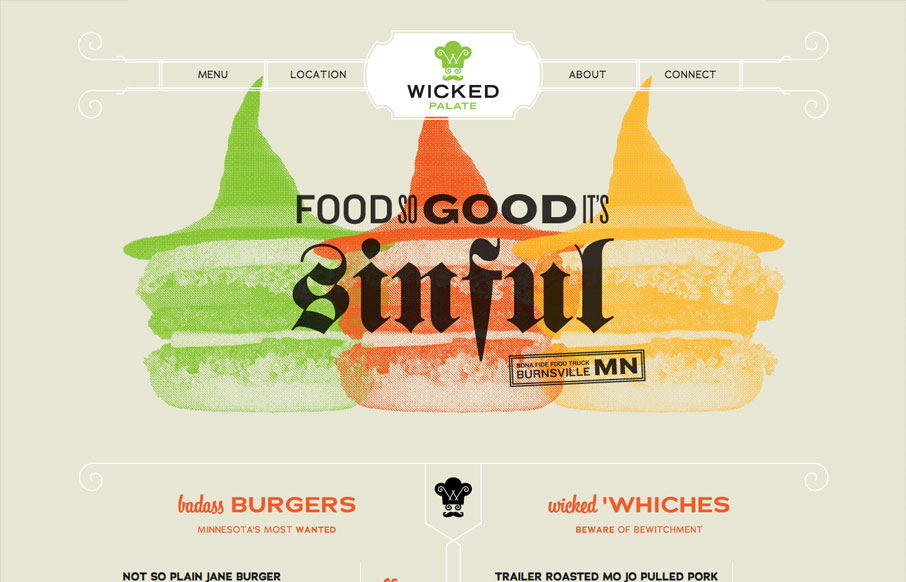
wickedpalate.com
Holy cow, this is how all restaurants should do their websites. It's a single page that uses anchors to scroll you down to the section you need. It's mainly a menu. Then it's responsive so you can see it on your iPhone, which I don't know about all of you, I've pretty...
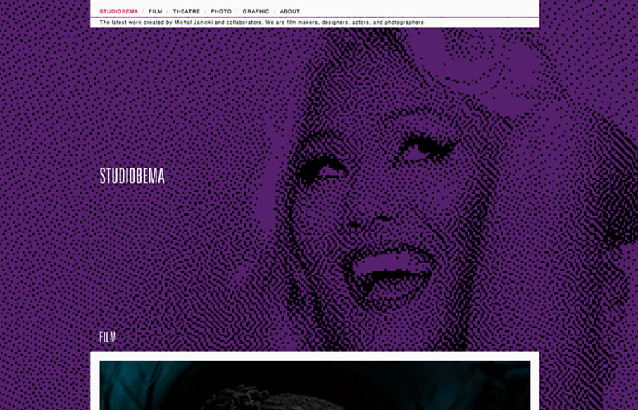
studiobema.com
Relatively simple website when you get down to it, the interactions aren't mindblowing but what's really nice is the simplicity mixed with the large illustrated background image/photos. For some reason they're just engaging to me and I love them.
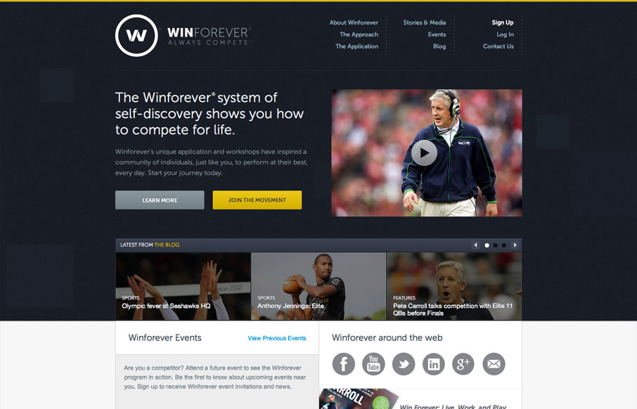
winforever.com
The Winforever website has that corporate/sport look, which is perfectly fitting. I really like the interactions over the three blog post blocks. Having them slide up and over the image is unexpected and adds just a nice extra little level of interaction to this clean...
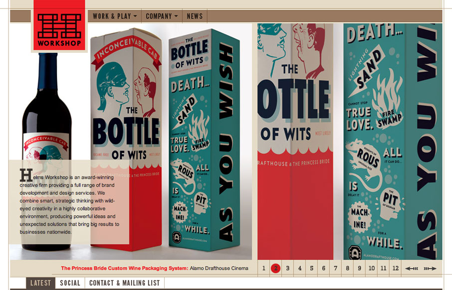
helmsworkshop.com
I think the Helms Workshop website has been around for a while and I'm just now seeing it. I still think it holds up really well and I love the tight typography and the minimal pallet with the browns and then the Red for highlight & focus is just nice.
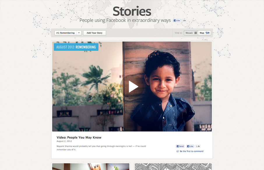
facebookstories.com
It's cool to see such great design things coming out of Facebook. Is this what they've hired all those designers for? Could be, but I really like it! This design is rather minimal which is perfect for this scenario, the grid is also nice how it goes from large to...
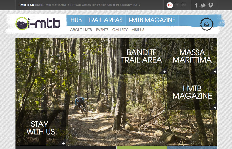
i-mtb.com
Submitted by: Andrew Couldwell @andrewcouldwell Role: Designer & Developer I-MTB is an MTB hub for enduro, downhill and cross country bike riders. It's an online MTB magazine and MTB trail areas operator in Tuscany, Italy. I really like the grid like modular view...
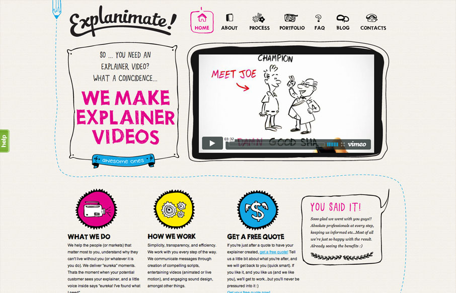
explanimate.com.au
The website is built visually around what these guys do as a service. They illustrate what your product or service does, so they use that same skill on their own stuff. Very fun and open feel. Simple colors and type all work in tandem together like it should. I'm not...
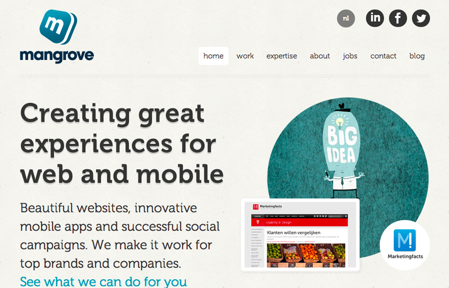
mangrove.com
I really like the simple typography and strong asymmetrical composition of mangrove.com. The site has a minimal, but judicious application of color that leaves plenty of room for their content. Coupled with simple, yet sophisticated interactions, mangrove.com is the...
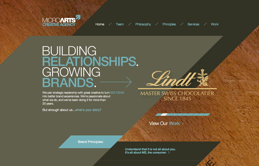
microarts.com
The diagonals really make this website dynamic visually. The flat shapes of color laid on top of the textured background image also adds to the visual interest to keep you looking. I find the colors a bit muted personally but it still works tone wise when you read the...
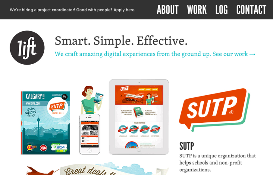
liftinteractive.com
Damn, this is a cool site. Mixture of multiple illustration styles is awesome, as is the overall experience. liftinteractive.com has everything. The typography is tight and varied (if maybe a little uninspired), and structured beautifully. The interactions are...
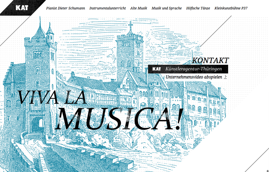
xn--knstleragentur-thringen-cpcq.de
I love the consistent use of art throughout this site. It couples with the monochromatic palette and helps to create the victorian feel that is clearly evident. It also compliments the typography to create a tight, consistent visual experience. At times, i get a...
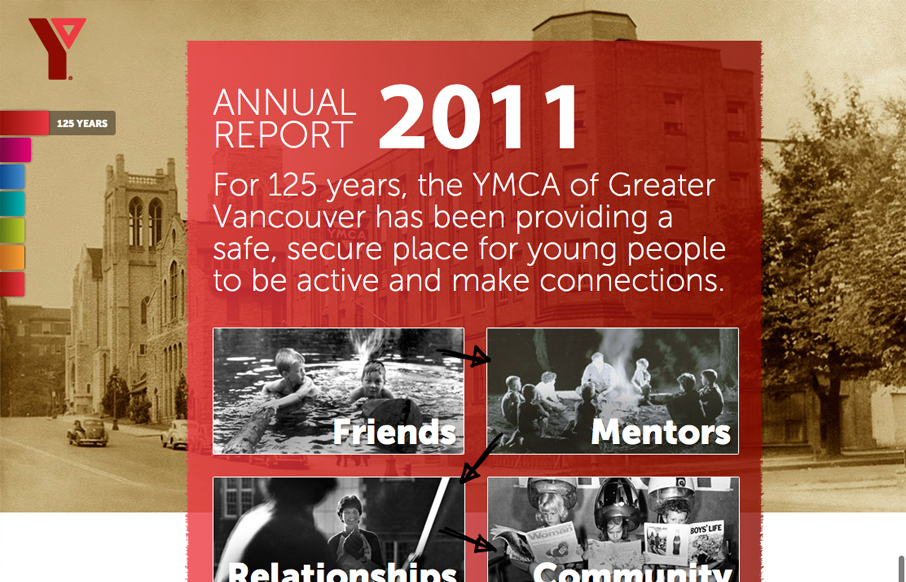
imagineourymca.ca
imagineourymca.ca is clearly designed to push the brand and to present a lot of information in a tight little package. I really like how the 'pages' have so much activity without getting in the way of the content. I especially enjoy the community sections user of...
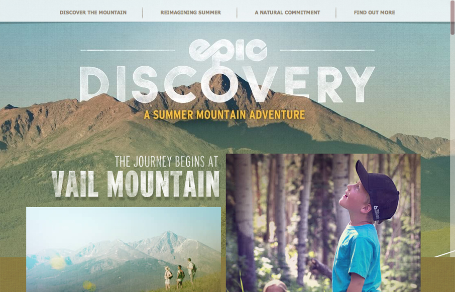
epicdiscovery.com
epicdeiscovery.com is a lovely little site with a whole lot of personality. It's clearly designed to get a user to want to be out in nature and I think it succeeds beautifully. While structurally complex, the content is fairly minimal as are interactions. Each content...
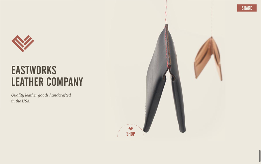
eastworksleather.com
Are you mesmerized by the spinning wallet? You should be, its a nice stop animation effect that is slightly hypnotic. I love the look of this site. The layout is open and presents the small assortment of items beautifully. Gotta love the logo and nav treatment as you...
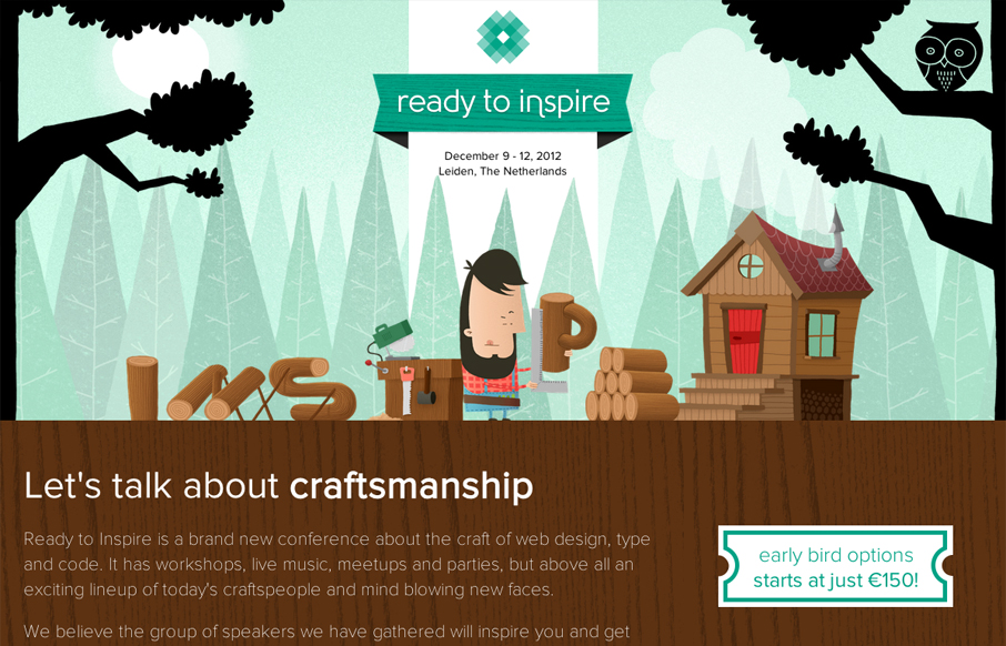
2012.inspireconf.com
The 2012 Inspire Conference website is wonderfully illustrated. I like the little lumberjack dude and how it's all tied into the theme. Nice responsive design too. Lovely site and it looks like a kick-ass conference too!
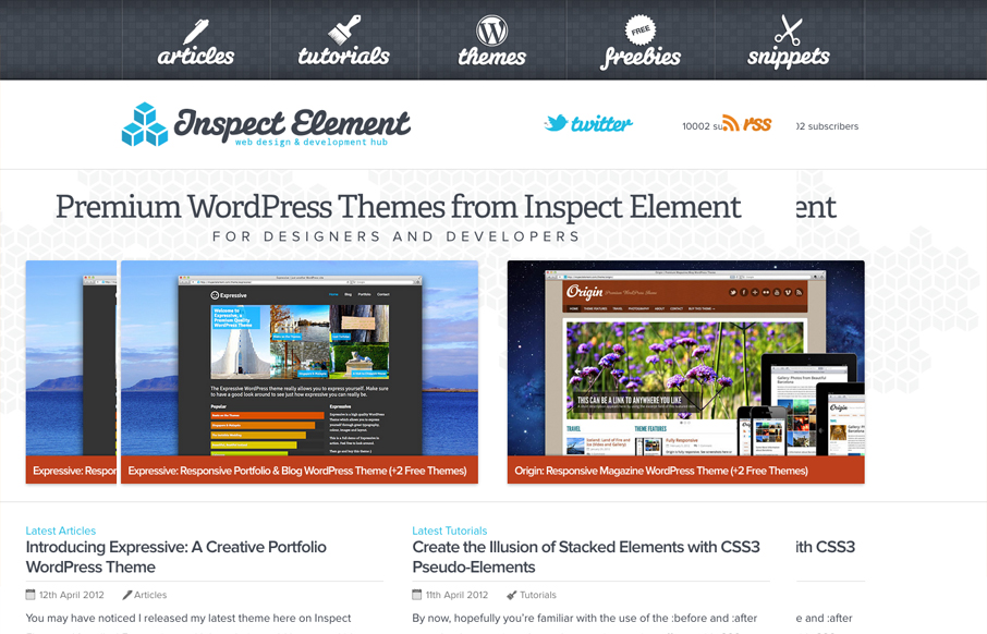
inspectelement.com
Really nice simple yet deep looking layout for the Inspect Element website. I really like how the main nav sort of hides under the page as you scroll down, that's a small detail but it makes you really notice it. Then the simple feeling 2 column layout with other...
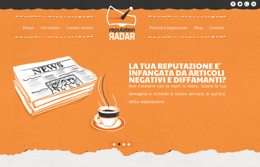
reputationradar.it
The animated slideshow is very cool. It's the thing that makes you pay attention to this site. Then the action on the fixed navigation as you scroll down has added impact. The home page is jammed with content and graphics and there is a ton of content across the...
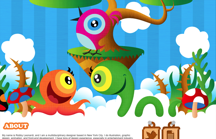
rleonardi.com
Submitted by: Robby Leonardi @rleonardi Role: Designer & Developer Great illustrations mixed with some interaction like this is a win. I love the sideways parallax and the way the other items animate into view as you scroll down. Fun and lite the design here is...
EMAIL NEWSLETTER
News & Articles
You Know It’s Time to Rebrand When…
An Inside Look Into the Rebrand of a Company The luster has worn off of that once great logotype. The whimsy of that tagline has lot its flavor. The brand is simply not as delicious as it once was. Now that you’ve accepted the reality of your once great brand; let’s...
unmatchedstyle
My problem with pieces of the Bing.com design. http://bit.ly/153SW1 What do you guys think? #ums
unmatchedstyle
RT @simsie simsie The exciting thing about product design and management is seeing how tiny changes can really complete an experience. #ums

HARD WORK. CLEAN FUEL. NO EXCUSES
Use “WARRIOR2023″ for 10% off.