An Inside Look Into the Rebrand of a Company
The luster has worn off of that once great logotype. The whimsy of that tagline has lot its flavor. The brand is simply not as delicious as it once was. Now that you’ve accepted the reality of your once great brand; let’s talk about how to shock it back to life.
I remember distinctly making excuses for our corporate site; Modal, Inc. “Yea, we’ve been busy working on client projects and haven’t updated our portfolio in a while. But let me send you some screenshots.” Same thing with my business cards. “We’re not at this address any longer, we’ve expanded and I haven’t got the new cards- but the email address is valid.”
In the close to ten year history of Modal we’ve always put our client work first. Our logo was never really unique. It wasn’t as polished as I would have liked. The business cards were kinda fun but they didn’t really speak to who we were. We found ourselves in the same place as many of our clients before we work with them.
So now was the time to stop the excuses, go back to basics, and treat ourselves as we treat our clients. It took about six months to rebrand Modal. The process was as much a part of the success of the launch as the final work itself. Here is our journey abbreviated…
The Beginning
We asked our clients what they thought of us as a company. We made sure they were candid. We wrote down keywords, phrases, and quotes.
From there we looked at who we perceived as our competition. In our case we looked at other web design firms, traditional ad agencies, and user experience companies.
We then attempted to sync up the phrases and keywords we heard from our clients and discovered that we really weren’t a web design firm, traditional agency, or a user experience company. We do much more than design web sites, create campaigns, or create user friendly interfaces. So we had to find our voice. And that took some time.
After continued research of industry trades, agency networks, peers, and client feedback we came to discover that we were a digital agency. One that specialized in user experience design and social media. Finally, we found a way to describe ourselves and what we did but it took some brand soul searching and that was in the research.
The Work
Now it was time to execute the creative. We created our brief which included client quotes and phrases. We stated who we were, who we wanted to be, and how we wanted to be perceived. And then the work began.

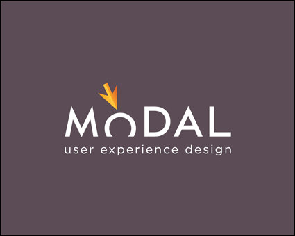
Color palettes, shapes, esoteric imagery, and typography exercises netted our new logo. It resonates digital because of the mouse, speaks to user experience because the “o” in the logotype is being affected by the mouse, and it’s a bit playful because the “o” drops below the baseline. That playfulness highlights our down to earth approach to how we work.

Once the mark and logotype were complete the stationary design began. It wasn’t too difficult from there because we had established the “who” and “how” part of the brand.

The Web Site
But the web site was a whole different challenge. And to be honest, it’s still not quite resolved. We accept that it is a work in progress though. What has yet to be done? It’s the tone of our voice, the way we communicate in text. We know that will come with time but the goals were met which were: create a site with no more excuses; convey who we are consistently; and introduce the world to our new brand.
Your Journey
All of this work could not have been done without lots of intense thought, acceptance of the reality of a tired brand, and an optimistic viewpoint on what lies ahead. If you find yourself making excuses for your brand take a moment and think about where you want to be. Your path may not be the same as the one we took but let me encourage you to begin the journey.
Share stories of your rebrand because we’d love to hear it and I’m sure others would also.
About: Daimon Caulk
 Daimon Caulk is the Principal of Modal, Inc.- a digital agency that specializes in user experience design and social media. Daimon’s a lover of typography and a true believer in simple design and simple interactions. You can find him on twitter at: @modalinc or online at: modalinc.com. Oh, and of course you can email him at dcaulk@modalinc.com.


0 Comments