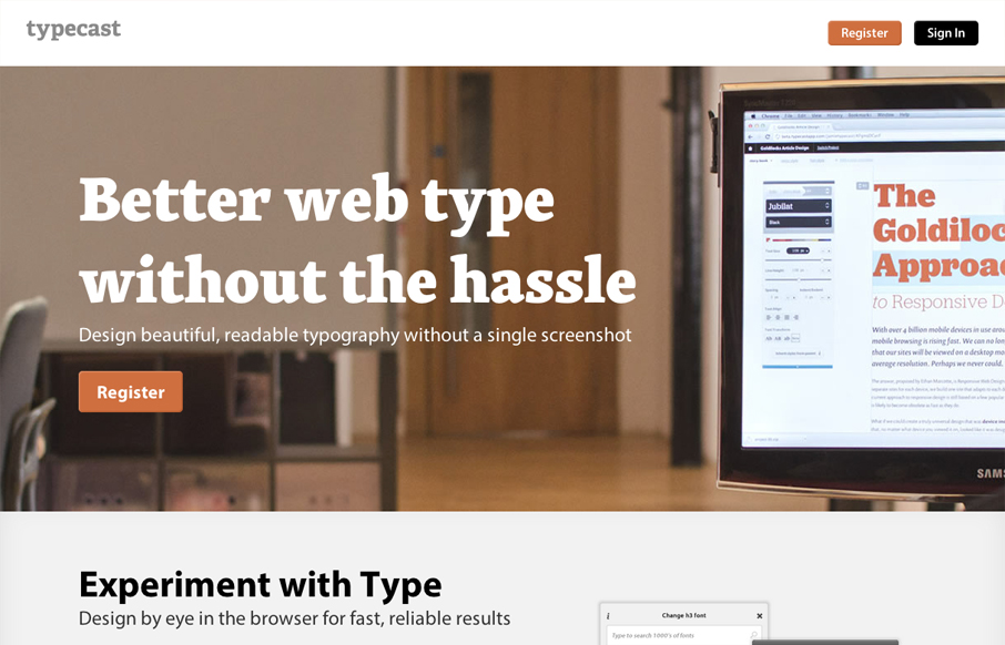
Aside from what looks like a brilliant app. The typecastapp.com website is very well produced. I like asymmetrical layout a lot, the right side is heavy with visuals and it really helps to draw you down the page more. Keeping your eyes focused on that right side somehow makes the copy heavy left side easier and faster to take in. Also, you’d expect a website/app all about type to be beautifully designed and this site doesn’t disappoint, from the type choices to the spacing and rhythm of all the discreet details. Wonderful work.


The Call to Action, Revisited
The Call to Action hasn’t changed in a decade, but the bar has. A fresh look at prominence, copy, mobile tap targets, and accessibility, with lessons from three major design systems.


0 Comments