Submitted by: Tristan L’Abbé @_Tristan
Role: Designer
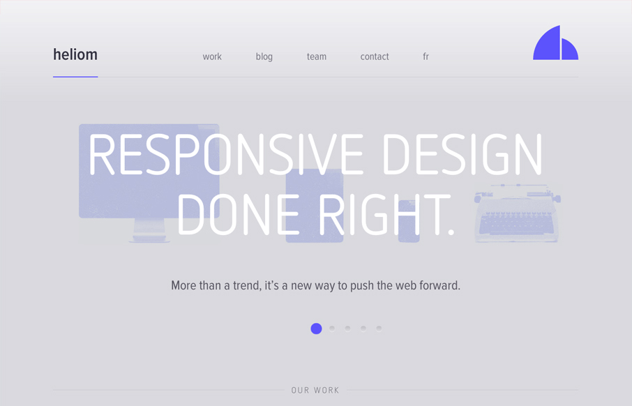
A wonderful looking responsive website design. I love the monochromatic faded looking feel to it. The slideshow is so well done and engaging as well is the top horizontal navigation. Really nice detail work to go along with a nice layout too. Love the look and feel of this design. That said please give the screencast a look if you would and tell us if you agree with me or Giovanni on the navigation issues we bring up.


I agree with everything you are saying. Expectation is not set for how the nav should work. Pretty site, very thoughtful in many ways. But it doesn’t jive with my brain, either.
FWIW, you can also use your keyboard arrows to navigate the homepage sliders 😉
We missed that little feature. Very cool.