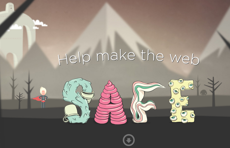
Web Design Inspiration Curated
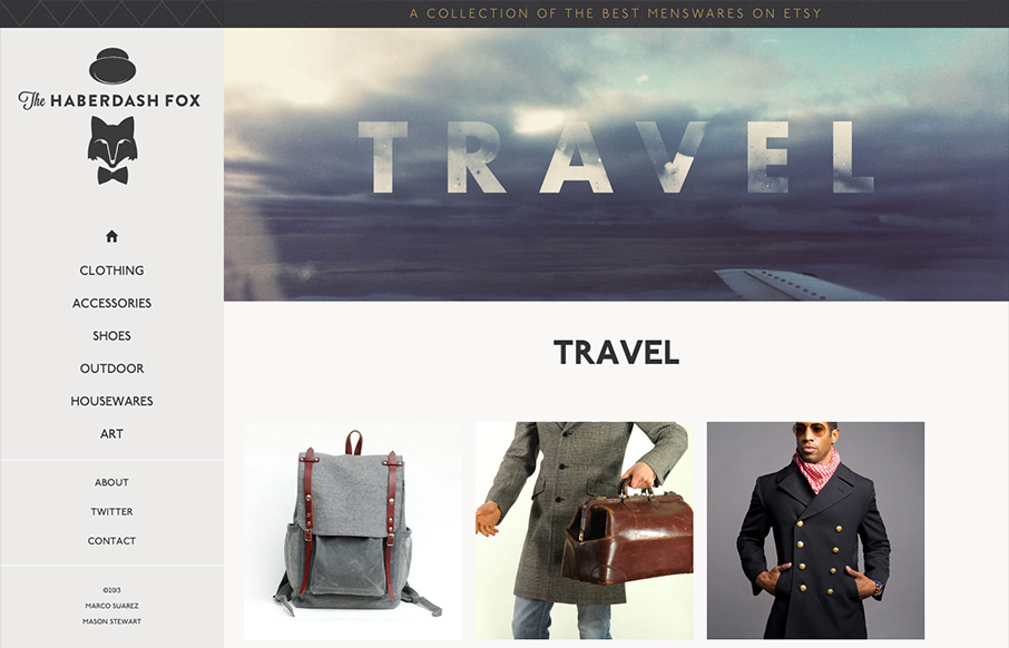
The Haberdash Fox
Aside from having a really badass logo this website design is one of my favs. It's super clean and blocky but also somehow has a nice homely feel to it. Like I can almost feel the store behind this site (not even sure it is a real brick & mortar store...) I really dig...
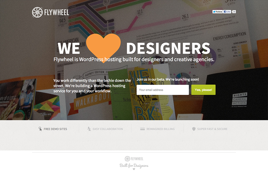
Fly Wheel
A very interesting design here with the Fly Wheel page. It's basically a coming soon page but being so well executed it almost passes for a full on site. The illustration work and slight animation of the fixed nav and footer sections keeps it visually interesting and...
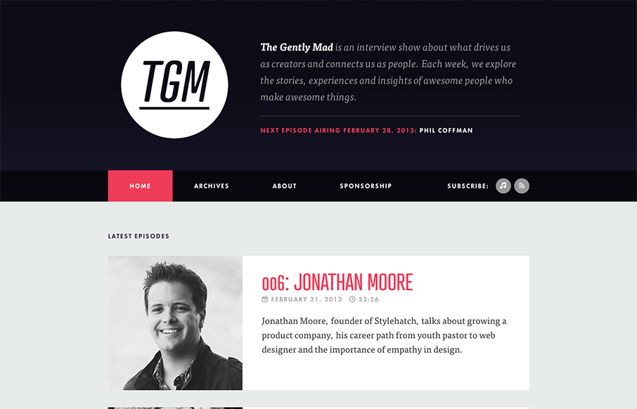
The Gently Mad
Nothing like a clean simple design that just get's the job done right? That's what The Gently Mad's website does. It has a clean and simple visual brand and the site design backs it up. It just feels nice and the website just get's out of the way. Nice.
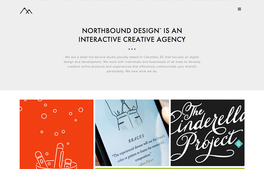
Northbound Design
It's not often we get to tout a local Columbia, SC web design shop's design. I love this new layout for Northbound Design! It's clean and simple and yet has a level of polish that makes you take a long look. There's so much detail built into this website but it's very...
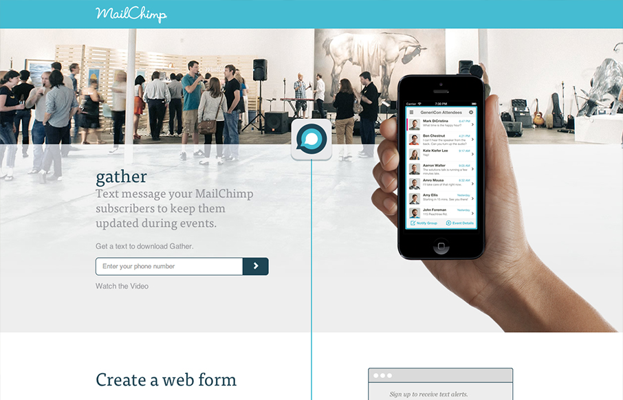
Gather
Gather is a neat little app that enables you to text message your MailChimp subscribers during events. The site is pretty straightforward and does its job communicating what the app is, however I wish there was a little more prominence given to the "Watch the Video"...
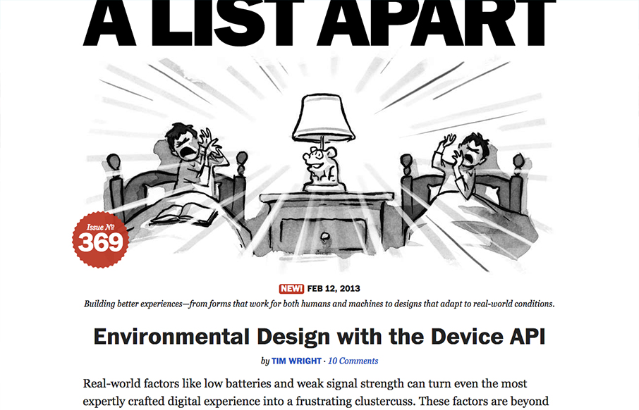
A List Apart
A very strong redesign by the fine folks at A List Apart. I love the focus on the articles, putting that front and center just brings home all the strategy they've been putting forth in the conferences and books. The minimal color palette works so well and helps the...
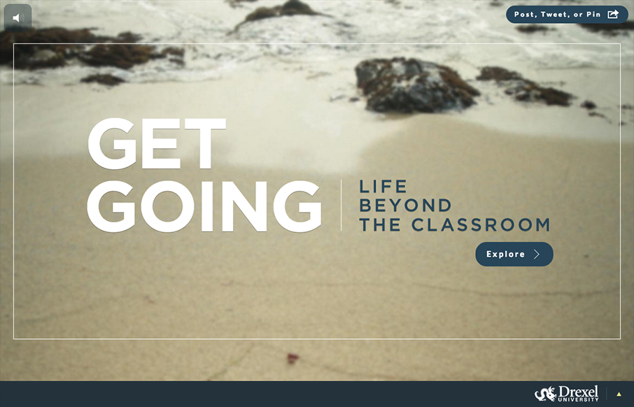
getgoingtoday.org
Sensory parfait. The layers of sounds, texture, and motion are only the beginning. I love the parallel, whether intended or not, of the site having a Choose Your Own Adventure feel. Metaphorically, it works so well on a site for getting a higher education degree. I...
The Pixel Bureau
Submitted by: Alex Berry @iluvrobots Role: Designer & Developer The Pixel Bureau site is a nice clean dark background site design. Nice illustration work to help pump it up and make it fun visually. I like the green and orange(ish) colors used here too. Good...
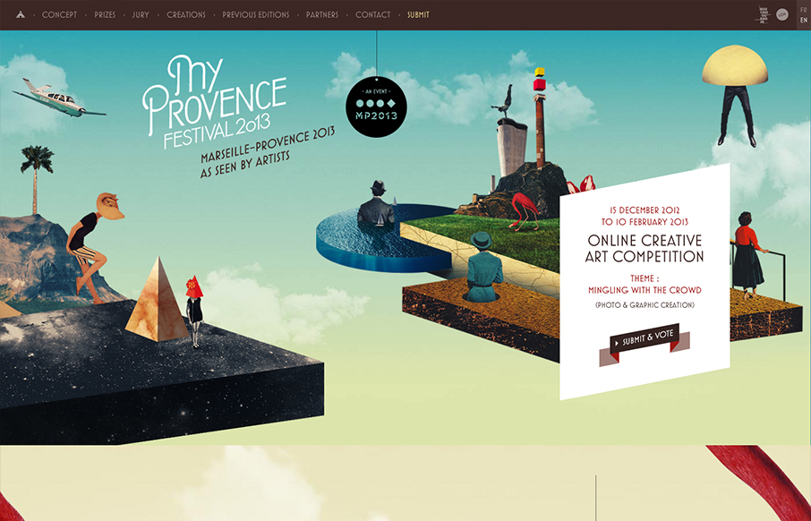
My Provence
Submitted by: Florian Monfrini @AgenceUzik Role: Project Manager My Provence Festival is an online creative art competition, open to all, and run by Bouches-du-Rhône Tourisme (France) between December 15, 2012 and February 10, 2013. This year the theme of the...
Browser Awareness Day
Submitted by: Ryan Ryan Role: Designer & Developer Saving the Internet, one browser update at a time. Pretty fun design. I like the illustrations very much, they feel like the Adventure Time cartoon.
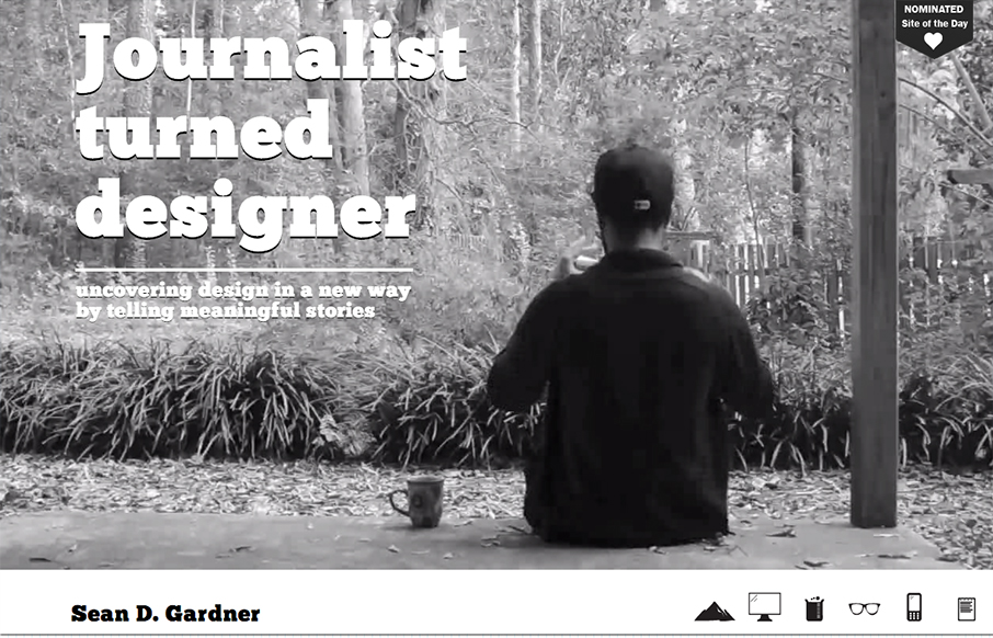
Sean Gardner
I love the freshness in this design. The soul of this website feels like exploration, from the video background to the navigation design using icons like it does, it just feels fun.
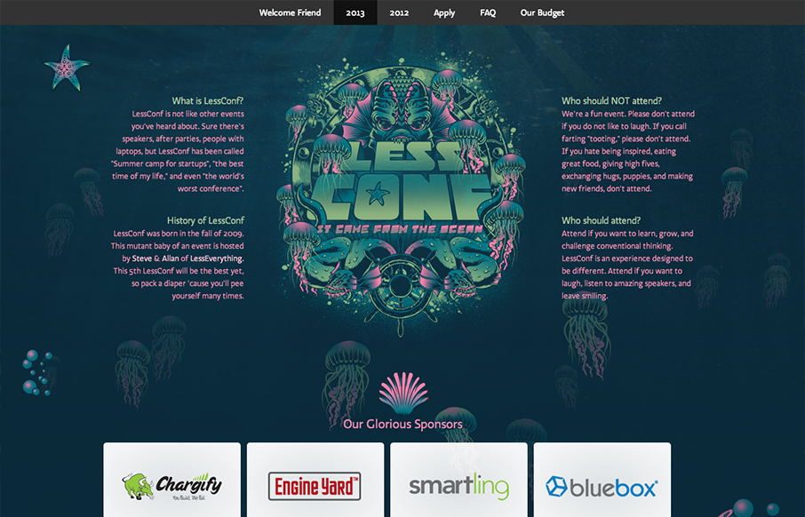
LessConf 2013
I love the LessConf guys, Alan and Steve. They put on a great conference (if you can call it that) and each year they utilize pretty fun and far out illustrations. It's almost theme like, but generally just fun. This year it's an animated under sea adventure/monster...
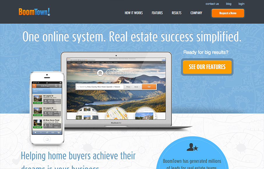
BoomTown!
had a blast working with the talented team over @boomtownroi on our recent launch. really proud of this one. boomtownroi.com— {e} house studio (@ehousestudio) January 16, 2013 Nice soft colors with a strong call-to-action makes this site look like a...
Mailchimp 2012 Annual Report
Nice work @seriousron and @aarron at @mailchimp mailchimp.com/2012/— Matthew Smith (@whale) January 16, 2013 Beautiful Annual Report website from Mailchimp. It is full of the humor and love that they put into everything they do. Damn, I just love these guys so...
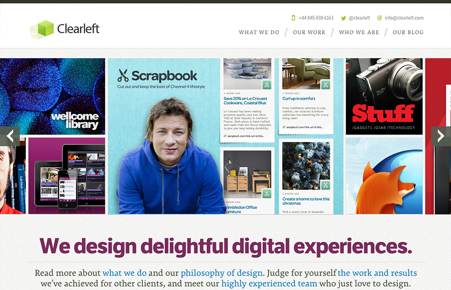
Clearleft
What a great re-launch of one of the companies I've watched for several years help lead our industry. The new Clearleft site is a thing of beauty. It's simplified yet not too much, it has some complex(ish) interactions with the slideshow and detailed links in it, but...
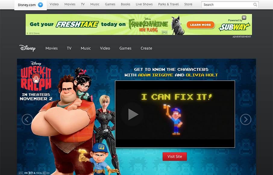
Disney
Congratulations to @dromano, @fillup, and the whole team on the slick new design for disney.com that launched today! (finally!)— Jesse James Garrett (@jjg) October 1, 2012 The new Disney.com site rolled out late in 2012. There's been a lot of linking and posts...
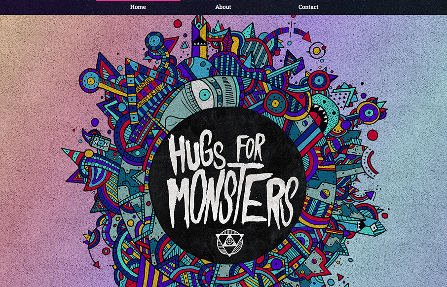
Hugs For Monsters
The latest update for Hugs For Monsters, the website of Joe Lifrieri @hugsformonsters, has me all smiles. From the initial loading/animation of the main art on the home page to the about page's illustration and content. Joe is always down to earth and real to me when...
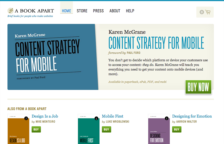
A Book Apart
I've long thought the A Book Apart site was well done but it felt a little too plain, just my gut feeling. With this re-work and it's not a total redesign, but just enough to tweak it and make it responsive it's truly a nice minimal(ish) execution of just the right...
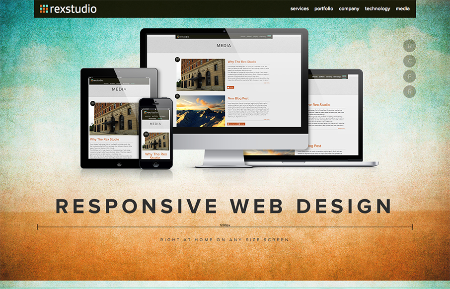
rexstudio
Nice responsive and parallax execution here. I like the side nav that takes you to the page's anchor points. Very cleverly done indeed. Nice colors and visual experience too.
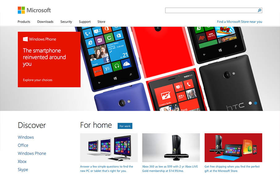
Microsoft
I'm remiss in not including the Microsoft site before the end of 2012. It's one of the best redesigns rolled out last year IMHO. Today I get to tell you that @paravelinc has been working with @microsoft to help build their new responsive homepage: microsoft.com —...
EMAIL NEWSLETTER
News & Articles
LessConf 3010
Julia Anderson and Giovanni DiFeterici from unmatchedstyle.com made a trip down to Atlanta to check out the LessConf 3010 conference and talked to a couple of attendees while they were there. In the above video Julia interviews John Ashenden @ashenden from Grooveshark...
Designer Chat Session with Aaron Irizzary

We discuss content for the design community and his recent post on “diluting content and un-necessary entitlement.”
Sign Up form design – best practices & design review

Looking at how to approach designing for sign up & conversions, plus a lot of design reviews.

HARD WORK. CLEAN FUEL. NO EXCUSES
Use “WARRIOR2023″ for 10% off.