Web Design Inspiration Curated
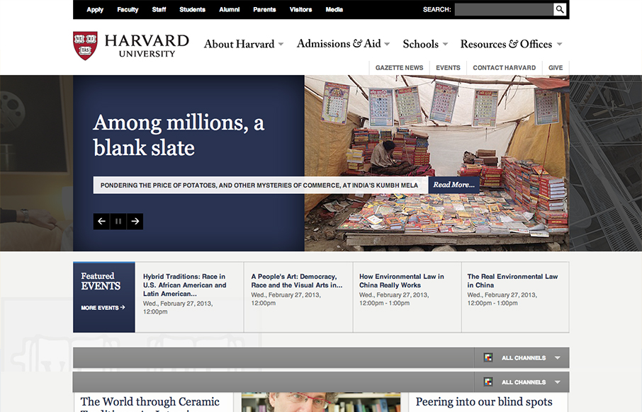
Harvard
This is a well structured website. The grid is clear and easy to visually track the different sections of links. College websites are traditionally over-packed with links, this one is no exception but it's designed in visual chunks so you can take it all in. I also...
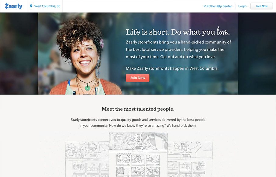
Zaarly
zaarly.com has a soft elegant aesthetic that beautifully balances multiple styles. The open layout and dark grey type keep the design from feeling cluttered, even on site specific pages (like zaarly.com ). It's a 'no fluff' design style doesn't feel utilitarian. Very...
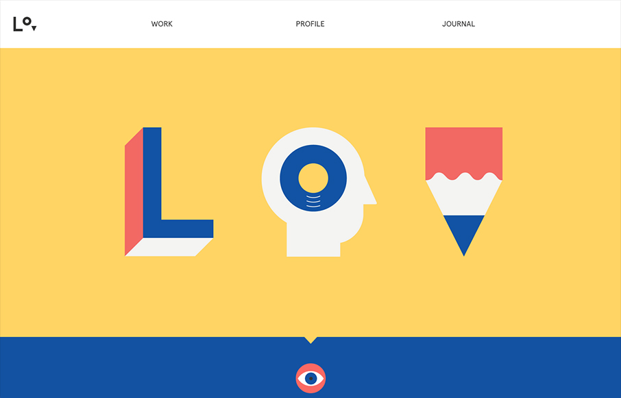
Lorenzo Verzini
lorenzoverzini.com is great. I love this site. Don't get me wrong, it's not the most groundbreaking design: minimal, super-flat, graphic, and spare. However, the balance of color, content and style is superb. I love the small SVG animations. They activate the page...
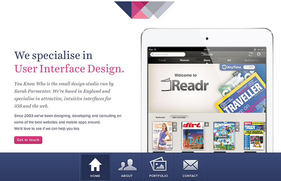
You Know Who Design
We have always admired Sarah's (@sazzy) design sensibilities and her activity in the community. youknowwhodesign.com is a perfect example of what's to love about her work. The design is simple, beautifully responsive and precise. Even the use of a bottom fixed...
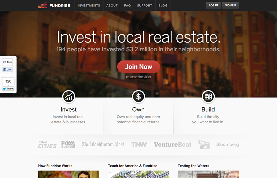
Fundrise
This site is so clean and solid feeling it makes me have trust in the folks behind it before I even know what it is they do. Then I read the text on the site and I kinda still don't understand it. Now, i'm not really a smart guy so that's working against me... but it...
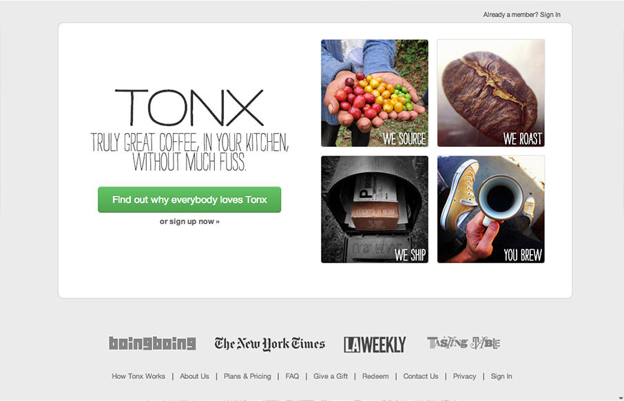
TONX
Having to go out in the world among the unwashed masses just to get a good cup of coffee is no fun. Fortunately, TONX is a service that will ship you what I'm sure is awesome coffee right to your door. At first glance, the site is very inviting and it's easy to...
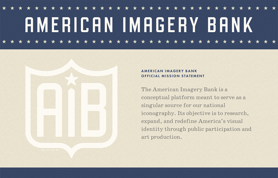
American Imagery Bank
Man I love the stark and bold nature of this site design. It's not just an oversimplified design either. There are lots of little details that flesh this thing out. Like the form and submit button interaction. Then it's responsive and the transition between screen...
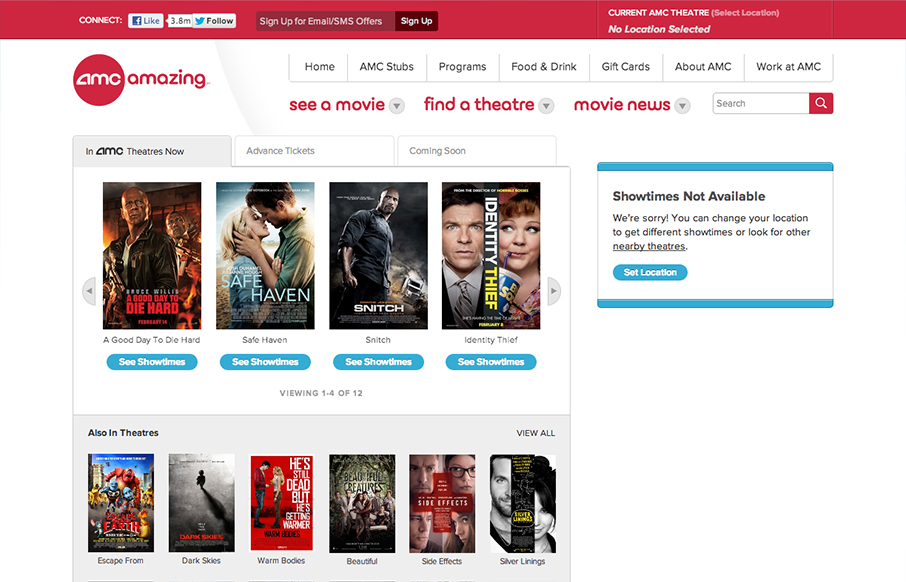
AMC Theaters
Presenting Happy Cog's redesign of @amctheatres for your responsive web design viewing oohing and aahing: amctheatres.com #RWD— Greg Hoy (@hoyboy) February 6, 2013 Really nice work. I love seeing a lot of the techniques and thought we all use on our personal web...
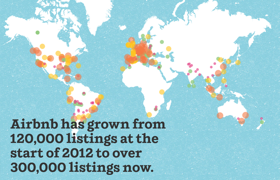
Airbnb Annual Report
The annual report has long been something that companies use to not only give their shareholders information about how their business is doing, but it's also often been used as a design showcase. That's what airbnb, a sort of social house/vacation rental service, is...
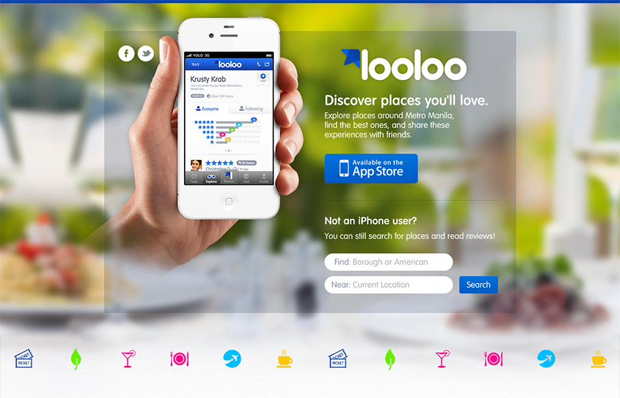
looloo
Pretty solid iPhone app site. It's pretty much just a single page design, you can search but generally it looks like an internal app page to me. Overall it is a solid design with some really nicely worked icon design. The overall design seems to fit into the app...
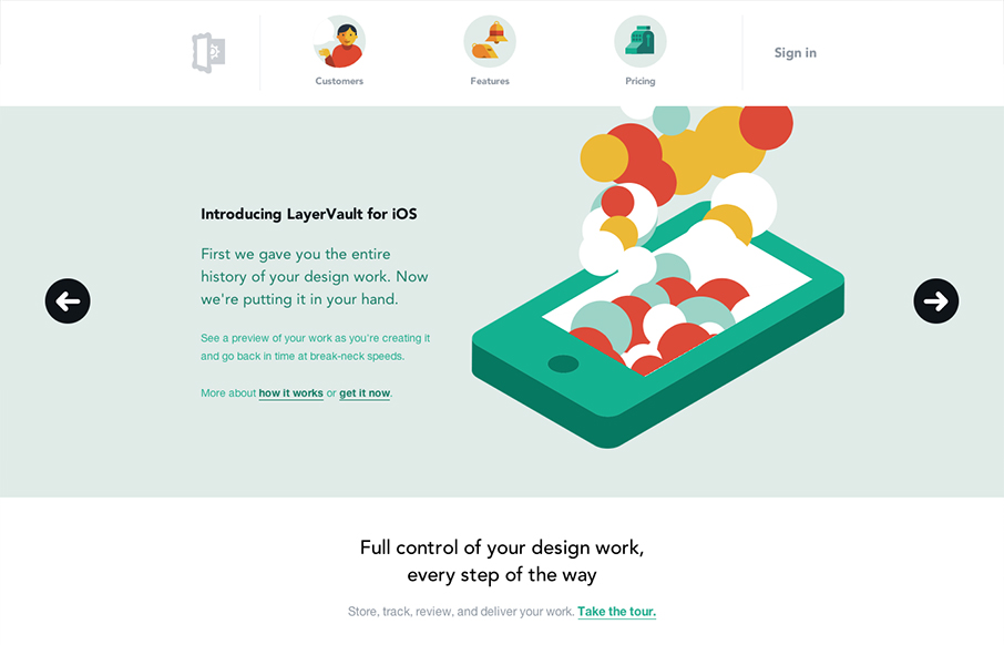
LayerVault
Just a beautifully illustrated website. I love the colors and vector shapes used throughout this thing. Every little piece of it is illustrated and matches up well. Also, Booya ascii art.
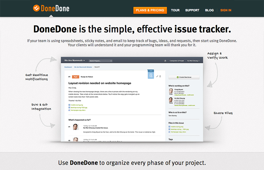
Done Done
Great scrolling product home page. I like how it tells the in's and out's of how the app works quickly and succinctly, there's even a little sub-nav thing that pops out as you get through a good bit of it. It's responsive too and interesting to study how the extra...
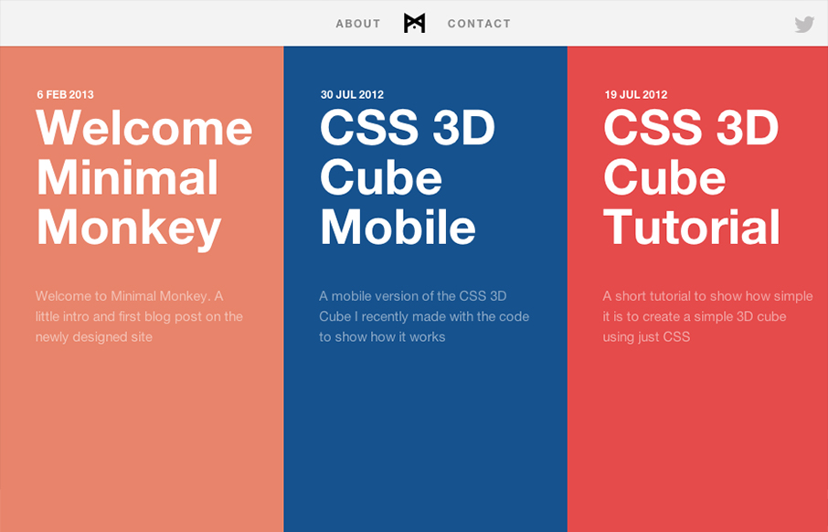
Minimal Monkey
Minimal Monkey is a blog/tutorial site from interactive developer Stephen Burgess. This site has a perfect amount of animation and interactive feedback that makes it feel slick and polished without getting in the way. The design is, well, minimal but it strikes a...
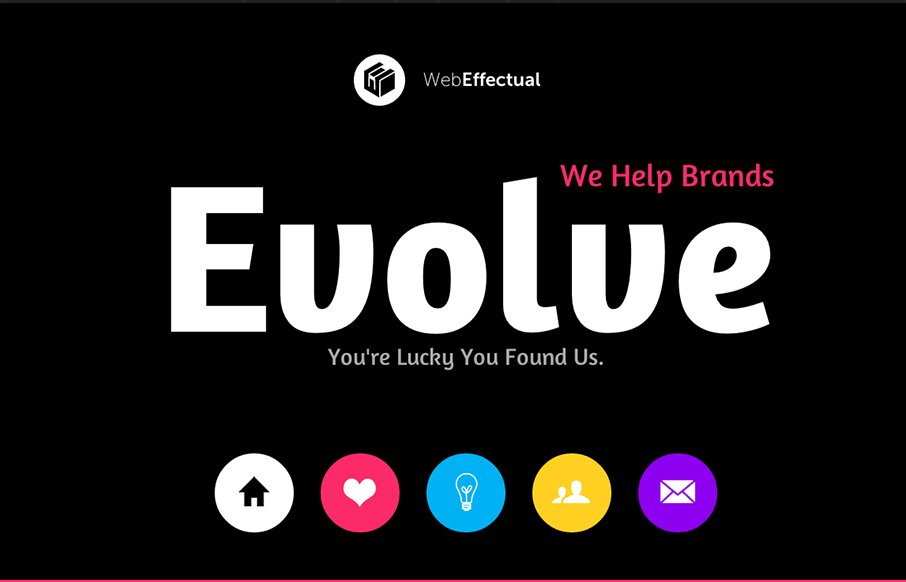
Web Effectual
Very nice smooth feeling design. I like the interstitials designed into this single page layout so much. THe smooth action of the slight parallax and the oversized navigation icons/buttons make this a pretty playful layout as well as highly interesting interaction wise.
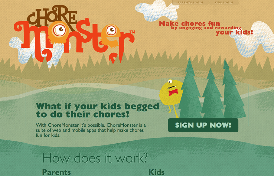
Chore Monster
So kids hate chores and love monsters, so enter ChoreMonster. My first reaction to this was a snort and then wondering whatever happened to cash and/or spankings (I kid!). In my day... Anyway, aside from whether this product is a good idea or not, it really strikes a...
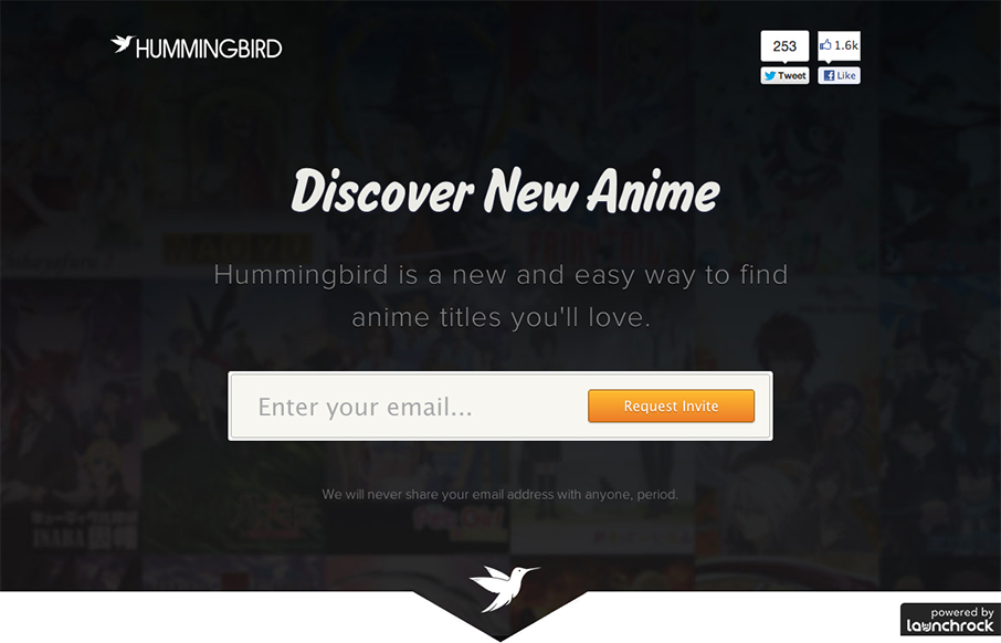
Hummingbird
This is an interesting single page site. I can't tell if it's just the gateway into the app or a coming soon style page, but it's well done nonetheless. I especially love the email signup form, the way the submit button looks placed within the field gives it a new and...

Mark Boulton Design
Looking over the newly redesigned (and responsive!) @markboultondsg, and really loving what I see: markboultondesign.com— Responsive Design (@RWD) February 8, 2013 New Mark Boulton Design website is lovely. I really enjoy the interactions most, the scroll and...
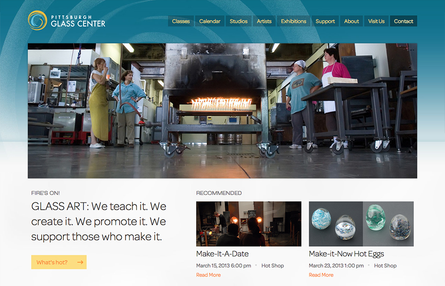
Pittsburgh Glass Center
@beardedstudio shapes pixels into beautiful #RWD @pghglasscenter shapes sand into beautiful glass art. True reflection of both brands.— Michelle Leonette (@mleonette) February 26, 2013 That pretty much sums it up for me. The bold layout and colorful...
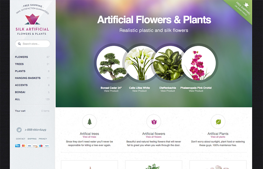
Silk Artificial
Nice ecommerce site design. I like the big sidebar nav that stays in place and the design changes as you get to smaller screens seem very reasonable and flexible. I like the rounded/circular images that gives it a very soft feel. Nice bold typography but not...
Tiny Big Studio
Beautiful clean and simple website. I love the hard corners and large(ish) type work. I really like how at first look the color palette looks limited but yet is very extended once you get into it. The animation in the footer area is nicely placed as well.
EMAIL NEWSLETTER
News & Articles
Front-End Design Conference Preview
Giovanni, Gene and I will be going to the Front-End Design Conference next weekend thanks to organizer, Dan Denney. Dan and his wife have done a great job putting all of this together with a fun website and great content. We're both really excited about a lot of...
Designer Chat Session with Christopher Schmitt

Talking about what you can expect with the upcoming CSS Summit online conference & we’re giving away tickets.
Basecamp Site Review
 Review of the conversion design elements on basecamphq.com.

HARD WORK. CLEAN FUEL. NO EXCUSES
Use “WARRIOR2023″ for 10% off.