
I’ve been wanting to pick apart the basecamphq.com website for some time now. And recently while working on our own sign up process and form designs for some upcoming unmatchedstyle expansions I spent a good deal of time really digging through many of the top web application or sales based websites I’ve come across in the past 6-8 months. Basecamp (actually the entire suite of 37signals product sites) is really at the top of that list and deserves some review.
The Home Page
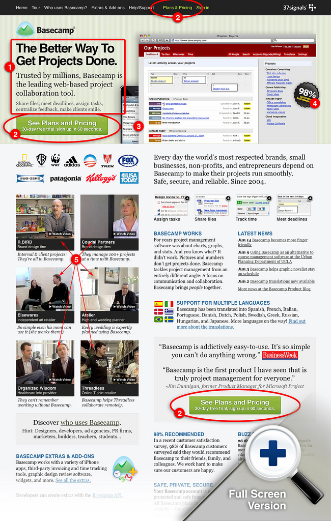
1. Copy
The first thing I notice on this website is that the copy is top notch. It’s informative, laid back sounding and plays to your needs as a manger. Your copy has to sell the product quickly and efficiently. I’ve read so many headlines on web app sites and portfolio sites that are confusing, cryptic or overly egotistical. It’s about the user/customer’s ego not yours and the Basecamp site puts the emphasis where it needs to be, back on you the user.
2. Call to action
The call to action is probably the most important link on your entire website. It needs to communicate that next action you want the user to take. Probably it’s to buy your product, maybe it’s just to read more info, whatever that may need to be. 37signals has been doing A/B testing and watching heat maps of their designs for a while now on various elements of the conversion process for their product sites. One of the best posts I’ve seen from them on this is the Highrise headlines testing post.
Jason Fried: We’ve been rotating some headlines and subheads on the Highrise signup page to see if they have an effect on signups. Answer: They do, sometimes significantly. Link
I’ve not seen a post on their a/b testing specifically on the call to action button, but I’m sure they have. The takeaway here is that they’ve discovered that their users aren’t quite ready to buy just having spent time on the home page, they still want to shop or need to see more info to convert. “See Plans and Pricing – 30 day free trial, sign up in 60 seconds” is really some of the best call to action microcopy I think i’ve seen yet. It feeds that notion that the user needs to get to that extra set of of info and drives them to it (it’s also placed in the header navigation and lower down the page too.) It’s also the correct next step in the process, often i’ll see “Buy Now” or “Sign Up Now” as the direct call to action, which is likely a good choice but the next real step is rarely singing up, it’s going to be pick a plan level or make another decision. I’m not saying it’s completely wrong, but in the case of a product that’s tiered similarly to Basecamp, this call to action is much better.
3. & 4. 98% What?
I’m not sure about this crackerjack graphic. I get the idea, they’ve done some surveying and found some impressive numbers about client satisfaction and referrals. It sort of looks like a call to action, and one that i’m not sure matters in the scheme of this site’s conversion path, if anything it may get the user off the scent a little. It’s my opinion these types of graphics don’t necessarily read as clickable and are often ignored like ads, but I don’t have any definitive data on that, just my gut as a designer talking. The image of the iPhone is a tad confusing too, though with their recent posts about making the actual interface of the app friendly to iPhones it makes sense a little more now. (See the article isn’t all fandom…)
5. Videos
I think the videos are a really great way to sell a glimpse into how these other successful companies are utilizing Basecamp. If you aren’t sold before you get to the site, watching these videos should really put you in the mood to at least try the product out. It’s also some great content because I genuinely wanted to watch them all after checking out he first one I loaded. This entire section of the site, from the bottom of the video stack up to the main intro copy is a nice block of design elements. As I scroll down the page through all the content it’s really where my attention is focused the most. The copy heavy right side sort of gets lost in it’s own visual noise and mixed hierarchy of font sizes.
Errata: I don’t really want to focus any on the footer design in this post, it’s very well done and effective, I mainly want to study the conversion process of the website.
Plans and Pricing Page
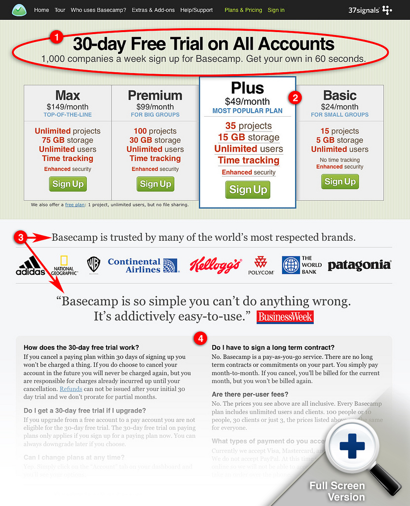
1. Headlines and Page Copy
Again with these guys nothing is every set in stone and that’s a great lesson. From the lessons learned on the Highrise headlines testing post that they did we see that the copy here wasn’t just made up quickly but instead was well thought out and tested for effectiveness. The thing I like about this copy is that it reinforces the fact that you’re not making a huge commitment to the app up front. Given the hurtle that Basecamp isn’t just an app you turn on and you’re good, you have to learn to start using it and get all your projects and clients setup using it too. That’s the commitment and it takes time, they need to ease that burden as much as they can.
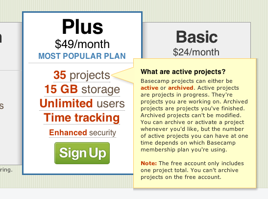
2. Plan Tiers and Selling The Account Levels
I think 37signals may have set the standard in the way these plan tier displays are done. Keeping it easy to scan the line items and copy for each plan and at the same time providing enough information for the user to make an informed decision to convert at this point is a hard balance to reach. I absolutely love the way they’ve chosen to display their “plan of choice” for the user. Making it visually pop out of the others in the stack works remarkably well. There is also a mouse over call out to help explain each line item in the features list.
3. Creating Trust
It’s an age old tactic to place customer testimonials and display your client list on your website, that’s marketing 101 right? I like how they’ve put this type of thing on the page just below the pricing levels to help cement the idea Basecamp is a solid product in your mind. By borrowing on the recognition of other bigger brands Basecamp is able to align themselves (if only somewhat second hand – hey it works!) with companies and products you already use and trust.
4. Answering Your Fears
Then finally if you’re not sold or if you have questions, they’ve gone so far as to work in some common ones into the bottom of the page. This is a great idea at this point as I can see how the answers to any of these questions could make or break the sale.
Sign Up Page
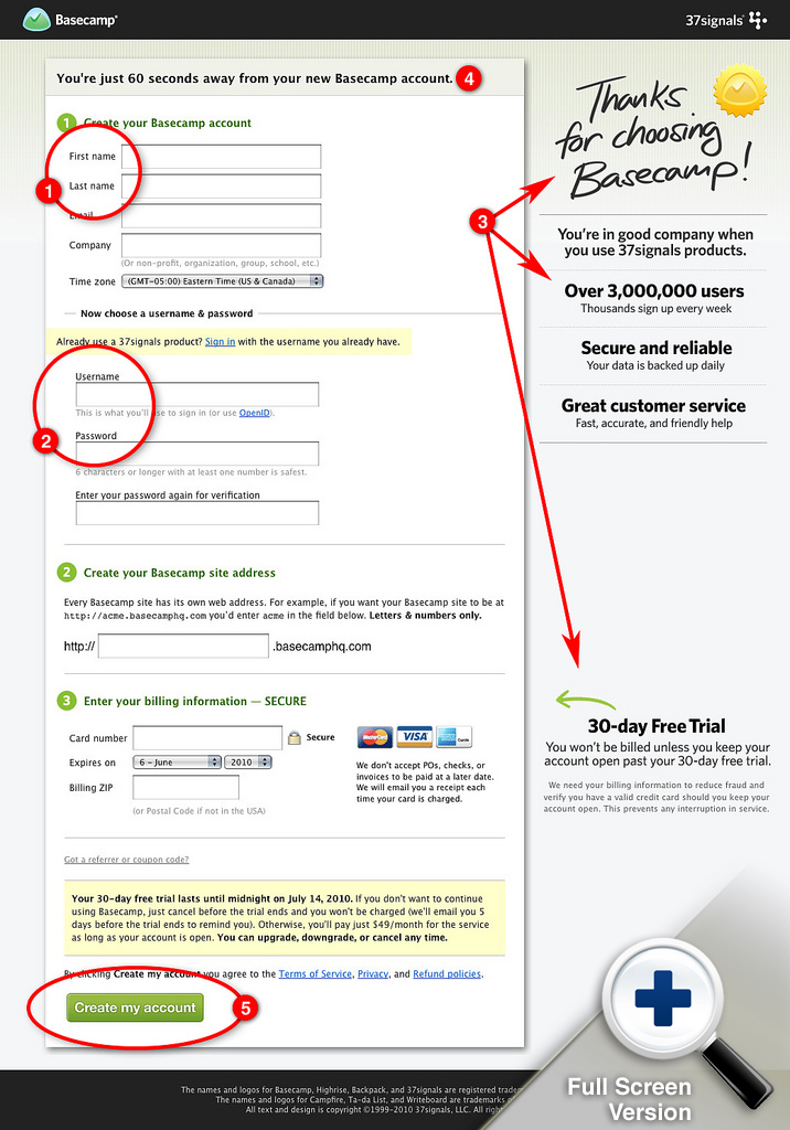
1. & 2. Form Field Label Layout
One of the first things I noticed was that this signup form was mixing the use of left aligned and stacked form field labels. I’ve always worked under the knowledge from past user tests I’ve personally been a part of and other’s i’ve seen performed that placing the field label next to the form field (ie. left side labels) will make the user slow down more than stacked labels while working through the form.
Someone else noticed this and asked via a comment on this post on Signals Vs. Noise and Jason Fried answered as follows:
Apparently, fields people know without thinking about (name, email, company, etc) perform best with left side labels (left aligned). Fields that people need to think about (user name, password, password repeat) perform best with field labels at the top. This is what some data from a trusted source suggests, so we’re giving it a try.
The book link was dead, if anyone knows of that source please let me know. 🙂
3. Creating Trust
Again they are reiterating the copy that helps calm your fears and sells you on the app being top-notch and trustworthy. “Over 3,000,000 users is a huge number to be able to tout. I’ve said it before if you’v got numbers like that, use them to sell your product with.
4. Answering Your Fears
One of the more annoying things when completing account sign up forms is that you don’t know how long it’s really going to take. You could be here for a while if the form is really complex. 37signals has helped relieved this anxiety with the copy above the form. Telling me it’s only going to take 60 seconds to complete the form pretty much ensure’s i’ll do it now. Really good call on that copy placement.
5. Microcopy and The Submit Button
Something I see a lot is the submission button on a long form will be labeled as just “submit”. I really like it when designers give the submit button an action label or some descriptive copy, like in this case “create my account” let’s me know exactly what’s supposed to happen next and that this is going to be the end of the road to be able to get into my very own Basecamp.
Update: The crew at 37signals has redesigned their website. I’m glad I got this published before they pushed the button but they have a really great write up about their design process on how they went about the design changes. Check it out here.


This is a great breakdown! Interested to hear what your thoughts are on the alternate homepage:
http://basecamphq.com/index2
This was an excellent post and well thought out.
One thing that I had never noticed before was the “mouse over” on the plans. I think it’s a brilliant way to again provide more info without crowding the overall layout and design.
Lots of great tips and nuggets – thanks for sharing!
@Josh – Man, i’ve never seen that page before, I wish I had before working on this review.
Thanks Stu!
Nicely illustrated what the importance is of a website and where you can convert it into action.
Love the writeup, well done.
With regards to the “Cracker Jack” 98% graphic: I’ve been trained as a designer to hate those too, they seem distracting. But I see them all the time on those ugly sites that are all about converting. Since this is 37Signals and they have taken so much care in crafting the other areas around their site I wonder what thought went into that. I would assume a lot.
I’d love to hear more on that too Brad. Some A/B testing on “cracker jack” graphics seems to be in order.
Great review. I’ve been trying to model our website based on some of these discussion points.
What in your opinion is the right amount of content that can go on to the single page. 37signals seems to have loooooong web pages with all kinds of stuff on them. Where as many good looking websites I know take a minimalistic approach : not much content on the main page, but links to other pages with related information. I know there are some SEO factors in deciding which route is better, but what about usability?
Hey Jagath,
I think the key is to keep it engaging, if your design/content winds up feeling to long then you should step back and see what you can edit. The basecamp site has a ton of information but it’s all fairly engaging from top to bottom. I don’t think the answer is to try to design a minimal page or a long content rich page, just look at what you are trying to say to your audience, flesh out the copy then go for a design that works well with all the pieces.
Great article…. but hang on. You comment field has names above and not left aligned.
About Form Field Label Layout
I think it comes from the book Web Form Design : Flling in the blans by Luke W
http://www.lukew.com/resources/web_form_design.asp
I’ve seen that book, but just never picked it up. It’s on my next to read list now. Thanks Corentin!
Thanks Gene. Good advice on choosing how to go about it. I think this is going to be an iterative process for us, to identify what the right blend is.