Web Design Inspiration Curated
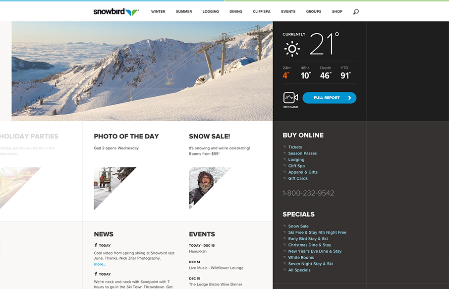
Snowbird
Well that's a nice looking' site. snowbird.com via @alliwagner— Chris Coyier (@chriscoyier) December 11, 2012 Agreed, it's an amazing experience as you use it. The interactions are spot on and even more it's fun to use. That's what's going to win business in the...
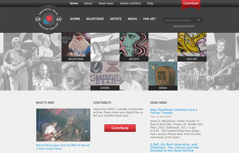
Grateful Dead Archive
Went to gdao.org & time got away from me. What a wonderfully done site. One of my favorites.— Samantha Warren (@SamanthaToy) January 1, 2013 The thing I most like about this site is it's information design. There's a ton of stuff here to slog through and the...
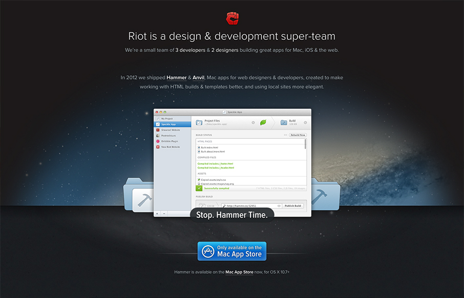
Riot
The crispness of this design just makes me smile. Then the subtle execution of the visual elements from the perfectly chosen color blue for the call to action, to the team display down to the faded map in the footer. There's so much here visually it's amazing that it...
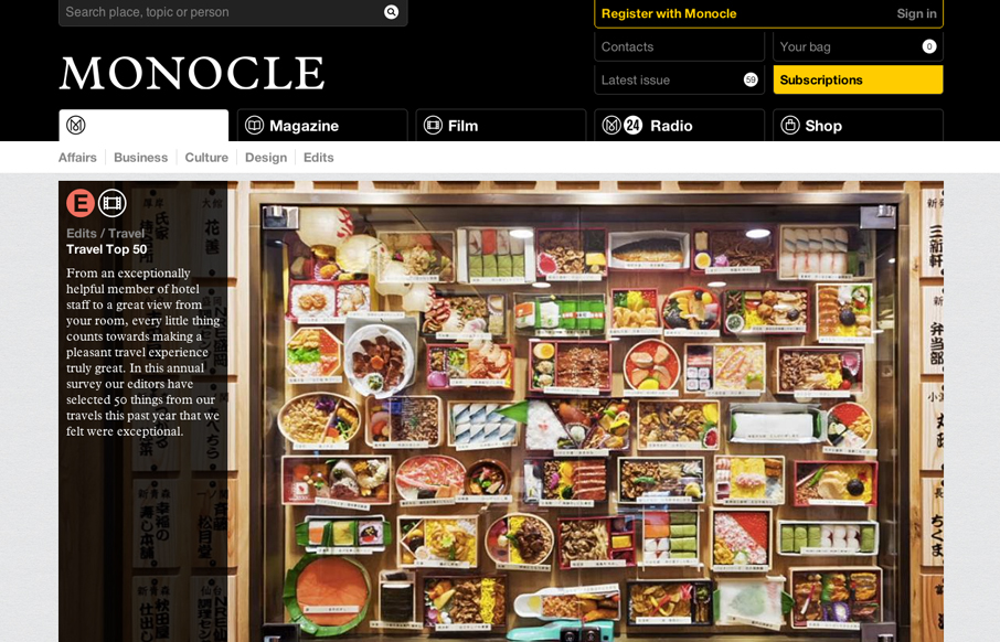
Monocle
The new Monocle design is smart and sleekly crisp. I really love the header interaction design. It goes from full height to small and sticky very fluidly. Then the asymmetrical feel to the broken up grid of story blocks as you make your way scrolling down the home...
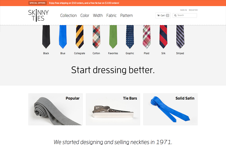
Skinny Ties
There's so much to like with this site design! The layout is nice and clean and so well organized. Then the interactions steal the day with the little bobbing the ties do and the drop down design on the main nav. Then, it's a responsive design to boot! Study this...
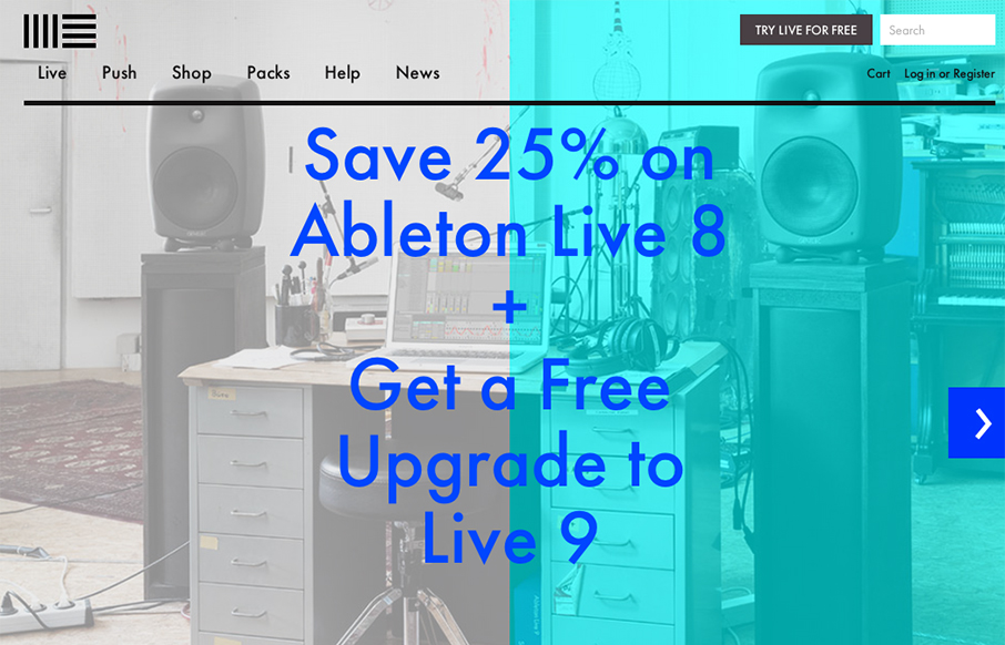
Ableton
The product looks pretty awesome and so the website has to continue that same visual brand. Start black and angular type, minimal colors and crisp lines when there are any mark both the physical product and website. I like the way the slideshow loads when you first...
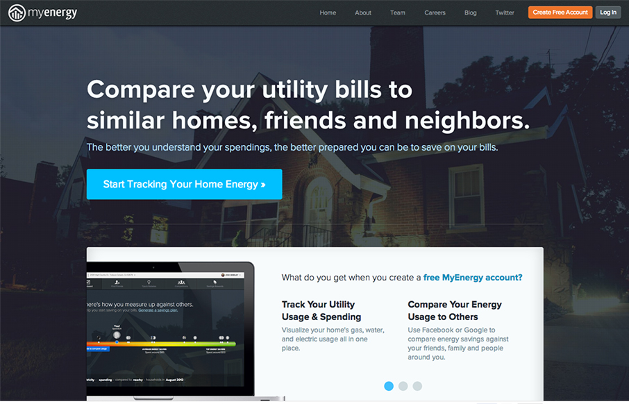
myenergy.com
Nice clean and strong call to action with the big blue "start tracking" button. I also dig how the header stays fixed and the slideshow is part of main content section - nice way to pack in more relevant stuff there.
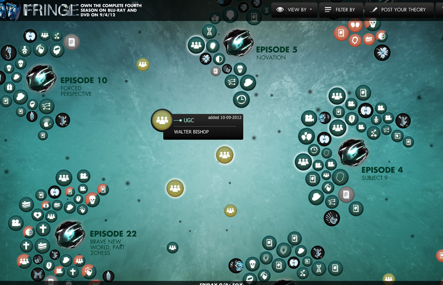
Universe of Fringe
This is a super cool experiment in interactive exploration. It's not entirely practical but it's stuff like this that keeps us pushing what we think of as a typical website interaction and we always need that. It seems a bit outdated technically - cufon still being...
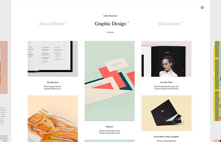
Lotta Nieminen
Very nice minimal layout with some nice design interest sprinkled here and there on the periphery. Then, BAM! You find out that stuff is actual navigational pieces to the site. What a great interaction surprise and reward for exploring as well as smart way to make...
Maker’s Row
This design is very crisp and nicely worked out. What I like most is the discreet interactions between scrolling/navigating down the page. The black to red shift in the line & icons keeps you informed and engaged on a visceral level. I just found this design a nice...
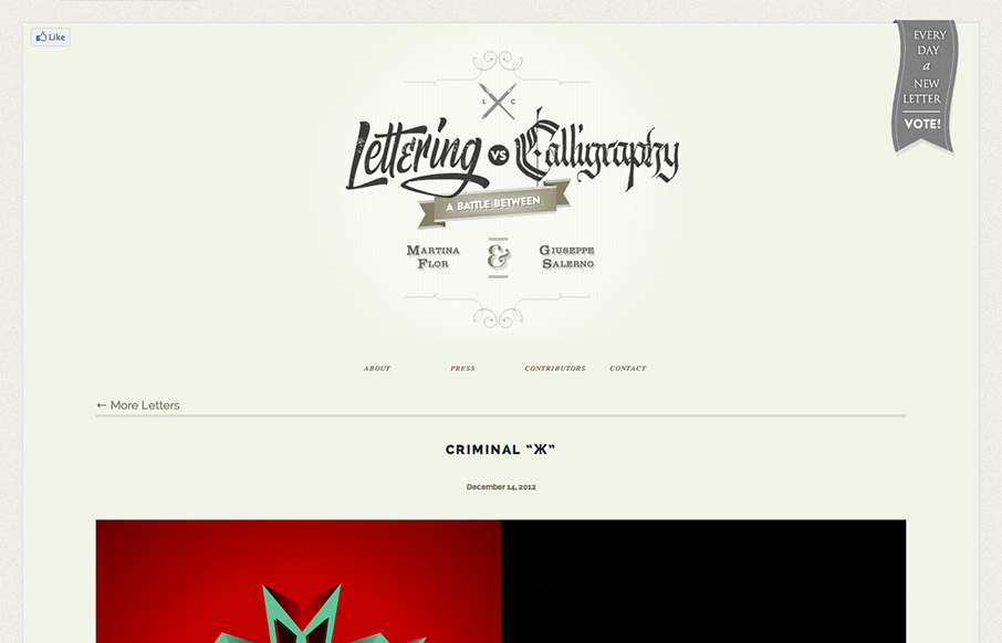
Lettering Vs. Calligraphy
First I didn't know whether to make this a radar resource or a gallery entry. Duh! The design is hot so it goes in the gallery. There's some nice little design flourishes here and there and I just want to keep scrolling and voting. Love this.
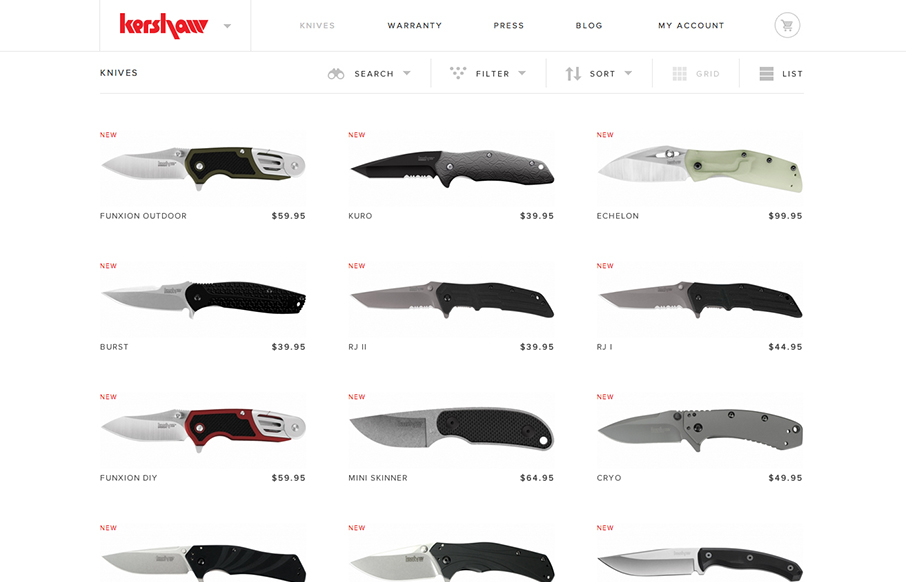
Kershaw Knives
Another superb responsive ecommerce website design. Looks like some image swapping going on for the different screen widths too. Smartness.
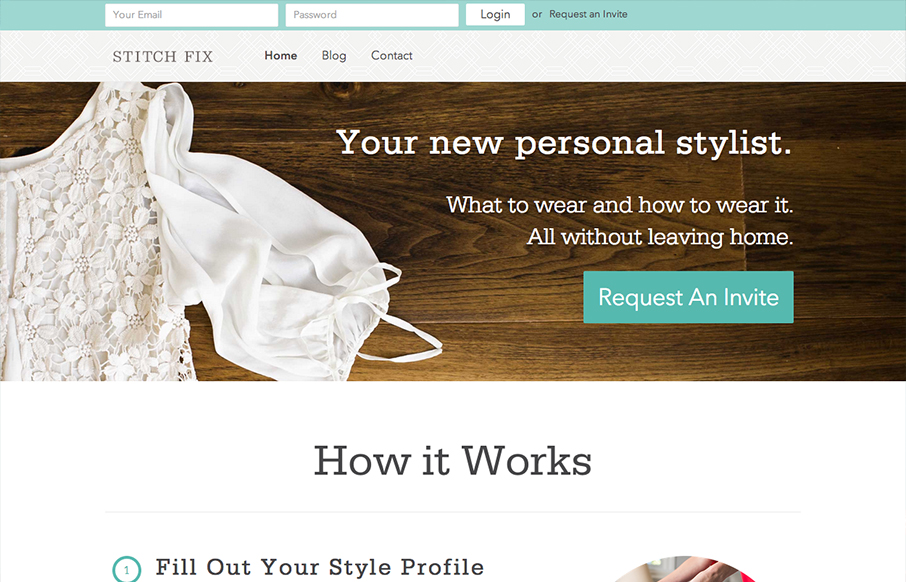
Stitch FiX
The new stitchfix.com looks hot! Bravo to @mrmrs_ !— Samantha Warren (@SamanthaToy) December 15, 2012 Looks good indeed. I particularly like the login box in the header area, the changes it goes through for each screen width design. I like details like that a...
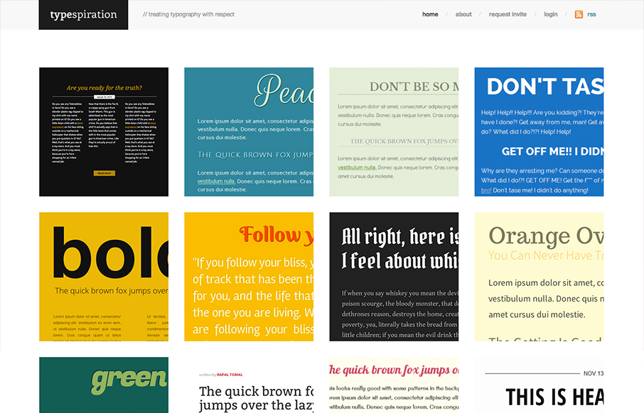
Typespiration
Love the content and idea of this website a great deal. The execution is also very nicely done. The responsive design and cleanliness of the site make me smile. Rafal Tomal has a great write up on his blog about building and designing Typespiration that you should...
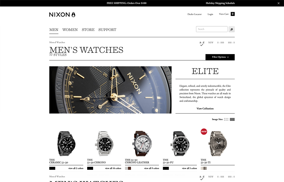
Nixon mens watches
A great example of responsive design used in an ecomerce situation. And the work and product are very high quality so they have to match and the design doesn't disappoint.
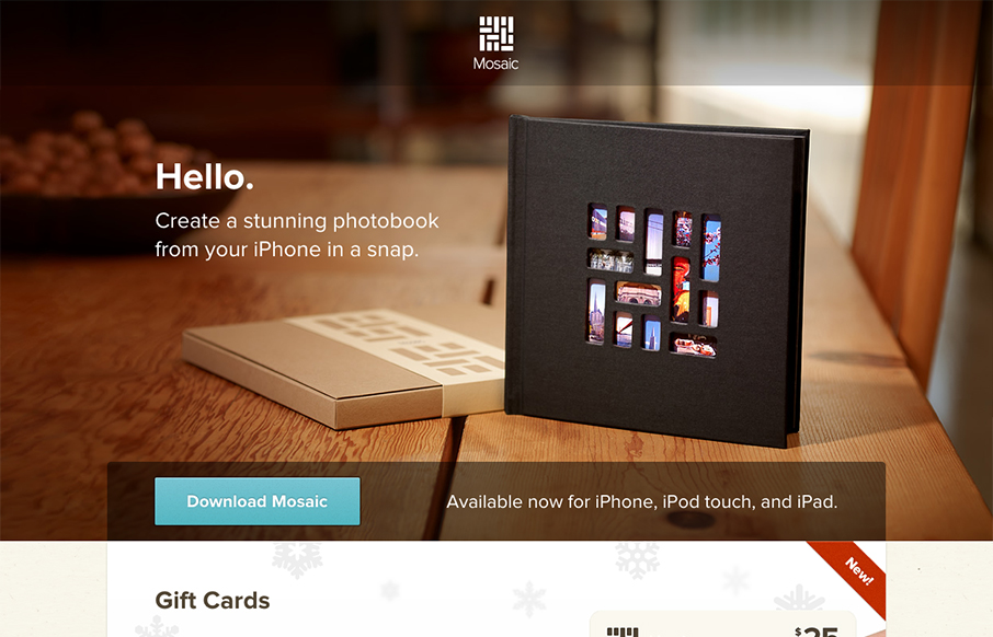
Mosaic
Beautifully simple website design for Mosaic. It has just the right amount of showing off the product, how it works and how you can gift it with animations timed to go off as you scroll. It has that Apple feel without going over completely. I love this.
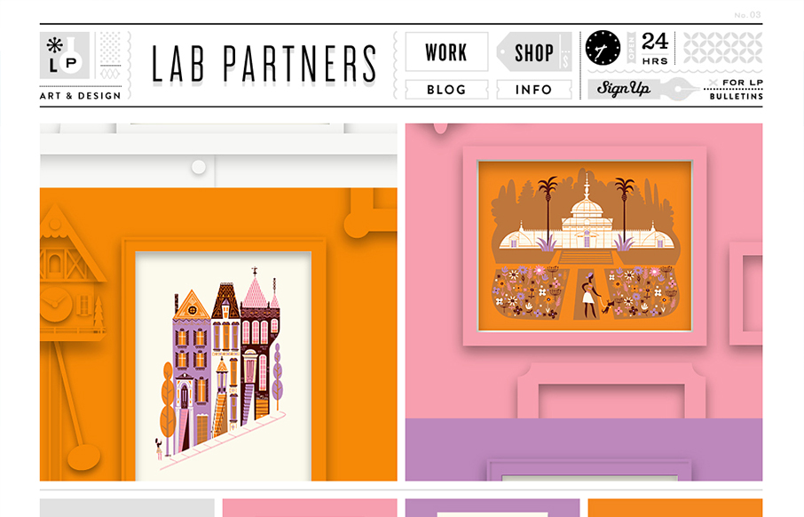
Lab Partners
This is just a visual feast. I love the work presented here and I love how it all ties together with the site design. That top header and nav area is pretty dang cool. The slideshow is very interesting too with the pieces coming together dynamically like that. Fun!
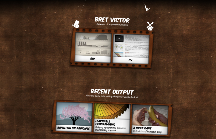
Bret Victor
The personal website for Bret Victor is a great experiment in both design and interaction. Yes it's pushing the boundaries of UX and how you take in a website but that's what I love about it. It's thoughtful and interesting to study on both the surface and...
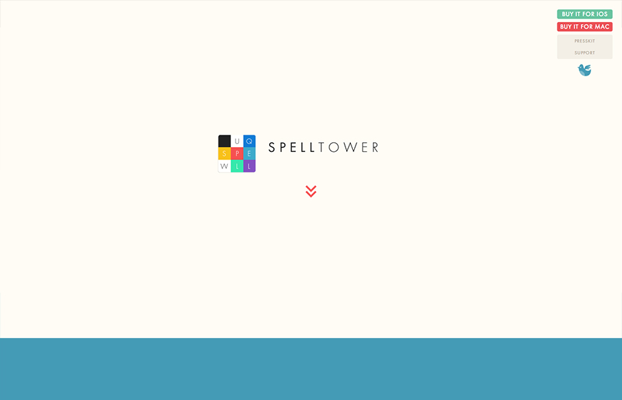
Spelltower
Superbly minimal design with the game's narrative told mostly through illustrations and quick witted copy. It works pretty much the same in most screen width environments too. Bravo, the site makes me want to check it out with out even reading a single word.
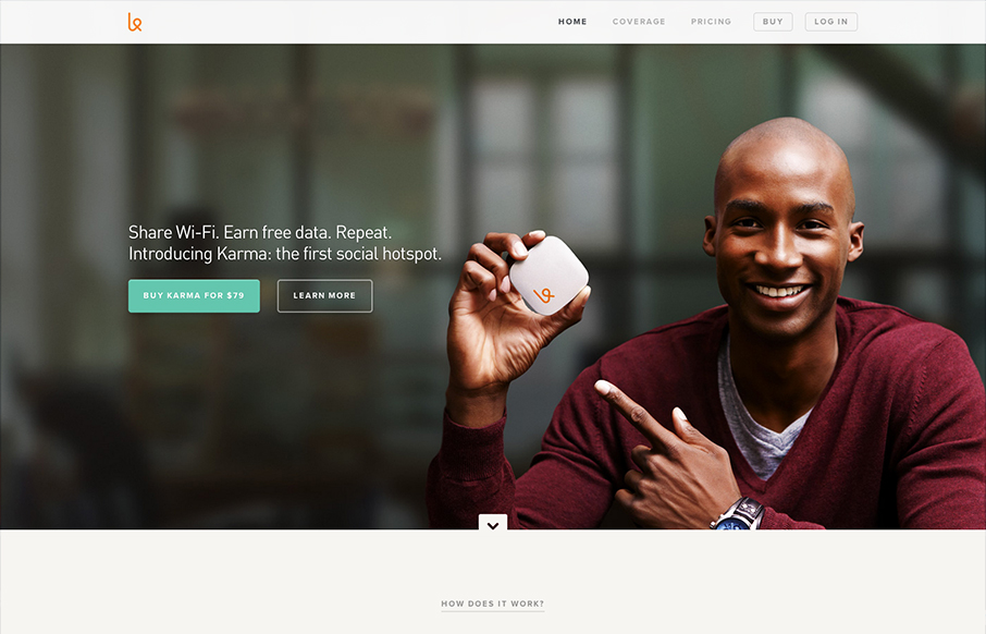
Karma
First off the design is gorgeous. The colors, typography and overall gestalt of the various elements make the design feel very welcoming and open. What I like most is the basic narrative, of "how does it work", "how do I use it", etc... I years past i've seen this...
EMAIL NEWSLETTER
News & Articles
Front-End Design Conference Review
Some of the UMS crew took a road trip (9 hours one way!) down to St. Petersburg for Front-End Conf. a weekend or two ago. We met some wonderful people, talked about the best place to punch a dolphin (if you are so inclined) and heard some great speakers spreading the...
Targeting for Flexibility with Media Queries
I’ll explain what media queries are and how they work and then show how I approached using them on my own website project.
Front-End Design Conference Preview
Giovanni, Gene and I will be going to the Front-End Design Conference next weekend thanks to organizer, Dan Denney. Dan and his wife have done a great job putting all of this together with a fun website and great content. We're both really excited about a lot of...
HARD WORK. CLEAN FUEL. NO EXCUSES
Use “WARRIOR2023″ for 10% off.

