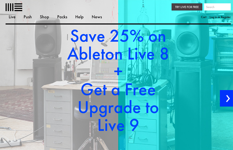
The product looks pretty awesome and so the website has to continue that same visual brand. Start black and angular type, minimal colors and crisp lines when there are any mark both the physical product and website. I like the way the slideshow loads when you first hit the site too.


The Call to Action, Revisited
The Call to Action hasn’t changed in a decade, but the bar has. A fresh look at prominence, copy, mobile tap targets, and accessibility, with lessons from three major design systems.


0 Comments