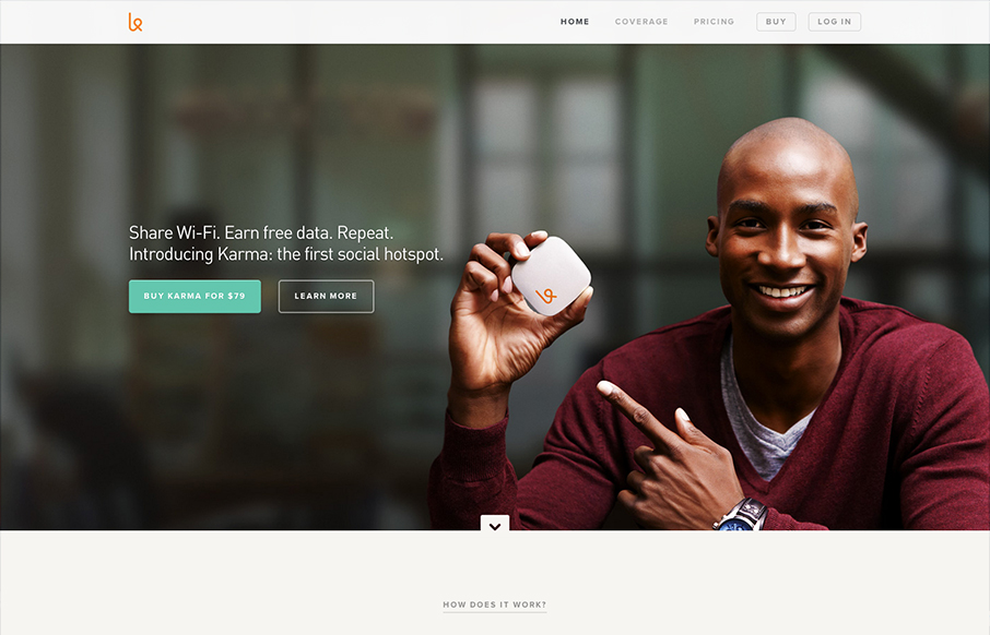
First off the design is gorgeous. The colors, typography and overall gestalt of the various elements make the design feel very welcoming and open. What I like most is the basic narrative, of “how does it work”, “how do I use it”, etc… I years past i’ve seen this type of “who, what, when, why, how” style of navigation built out as main nav elements, now on this design and others (which this is just a good example) it’s part of the narrative of the home page. Delivered witha solid layout and beautiful supporting graphics and photography. Well played and used, I love this kind of stuff.


The Call to Action, Revisited
The Call to Action hasn’t changed in a decade, but the bar has. A fresh look at prominence, copy, mobile tap targets, and accessibility, with lessons from three major design systems.


0 Comments