Web Design Inspiration Curated
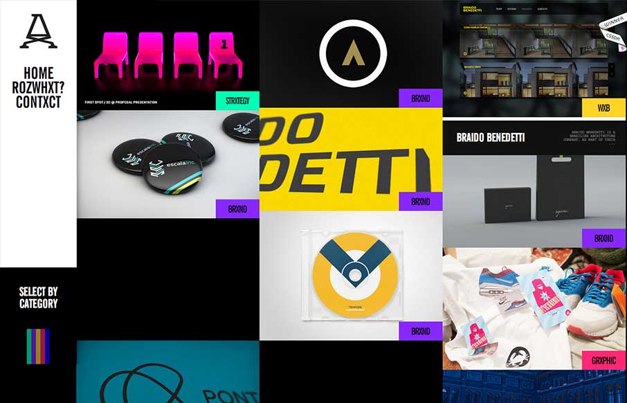
ROZMOWA
Submitted by: Advan Shumiski @shumiski We are a creative studio based on Sao Paulo, Brazil. Here we think that all is about people. Design is just a tool, humans are the subject. Really interesting interactions for this website. I like how the categories sort the art...
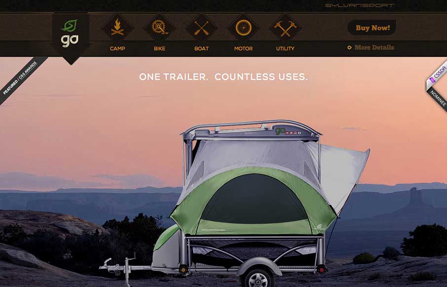
Sylvan Sport
Submitted by: Justin Bernard @fleeangrybear Role: Designer & Developer Damn, I love detail like this. The slight parallax on each image of the products down the the animations on the main navigation before you scroll it to the fixed layout spot. Lovely. The colors are...
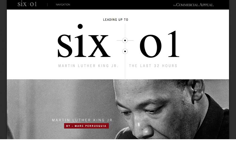
MLK The last 32 hours
This is about as beautiful a timeline as I've ever seen. The content is presented clearly and concisely. It's linear presentation is perfect for telling a story and the mix of images, video, and text creates a rhythm that punctuates the high points of King's story....
Hopskoch
Hopskoch is joyful and simple. It's subtle animations are perfectly appropriate for selling the brand and pair nicely with the easter color palette. I really dig how the main product image scrolls up a little and fades out as you scroll down the page and the reveal of...
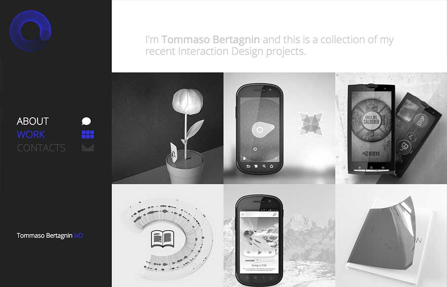
Tommaso Bertagnin
Deceptive simplicity. I love this stuff. This site is one of the first i've seen that goes from it's initial layout to something almost completely different as you get to the smaller screen sizes. Going from the left nav to a top nav like that is just cool when you...
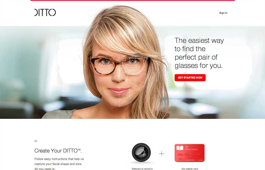
Ditto
Okay, lots of things to love about the Ditto site. 1. Super clean, beautiful design with no fluff. Gets the job done with style. 2. Awesome product. Haven't tried out the service but looks super cool. If anyone has gone through the camera thing, let us know how it...
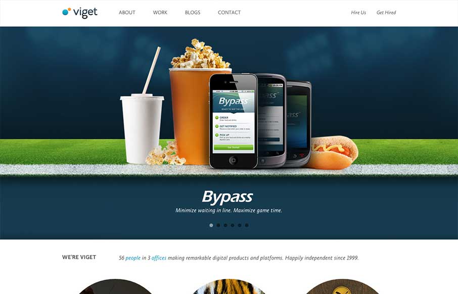
Viget
There is a lot of good looking design scattered across this website. Each page looks like it has had the same amount of love and attention paid to it as the home page has. I love it when I come across a site design like that, that's so thorough and finished feeling....
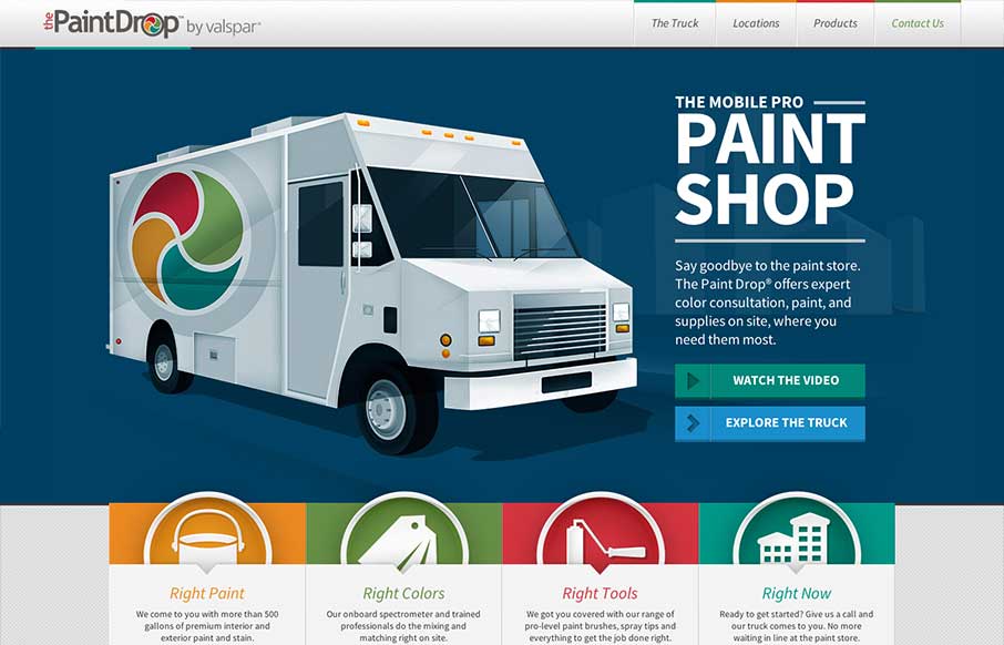
The Paint Drop by Valspar
Website by Viget The Paint Drop is a paint store on wheels offering color consultation, paint and supplies on site. Whew! What a finely crafted visual design and executed website for Valspar. I love the responsive design decisions and how that's been executed. Sharp...
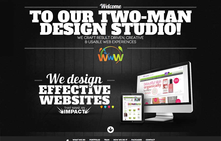
Vibes Design
vibesdesign is a site that takes bold typography to an extreme. The site has a simple structure and minimal interactions, both of which I like, and places character and content in the forefront. Every 'page' has a custom layout, which keeps the long, single scroller...
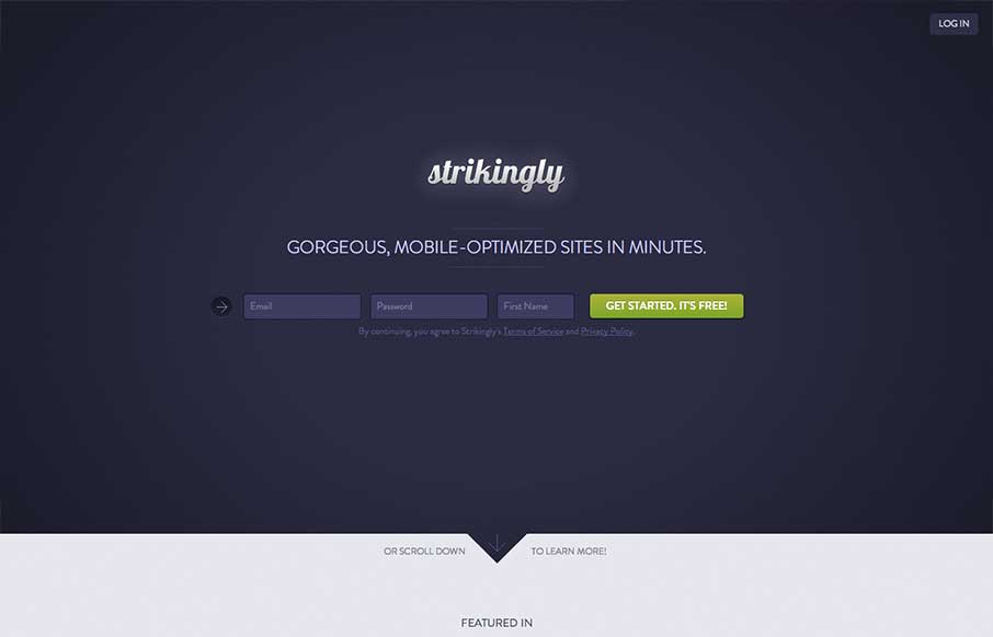
Strikingly
I like the minimal approach mixed with the full on product tour in the middle section of this site design. You start and finish with the same form layout as you scroll through the page. I also study sign up forms a good deal and I like the horizontal layout of the...
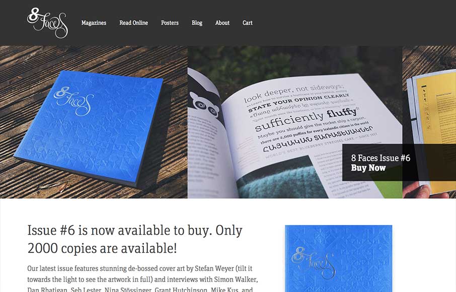
8faces
The whole point and appeal of 8 Faces is the tactile, printed objects that they produce, so much so that the website might seem like an afterthought regardless of how well it's designed. Luckily it's a great example of simple, effective design. The purpose is to sell...
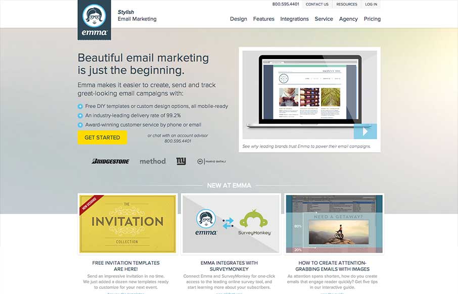
emma
There's a lot going on with this website design. There are so many different nav items and little things that you can click on, in a lot of ways it suffers the same issues that most big product websites do: too much stuff. They do a good job with keeping the call to...
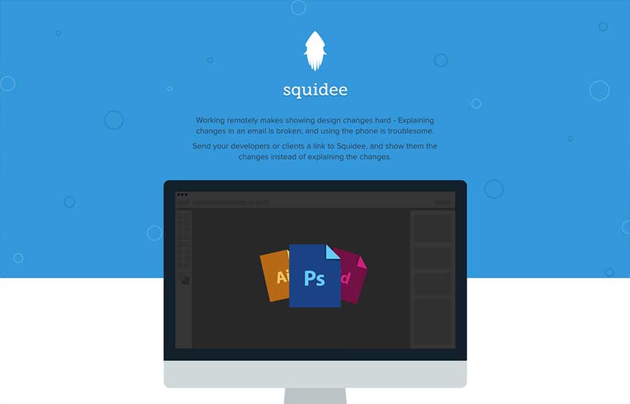
Squidee
Squidee helps designers send PSDs to frontend developers. The aesthetic of this site is pretty nice. There's a very clean use of shape and color which is balanced nicely with the amount and prominence of the type. I like the progression of content, and I dig the...
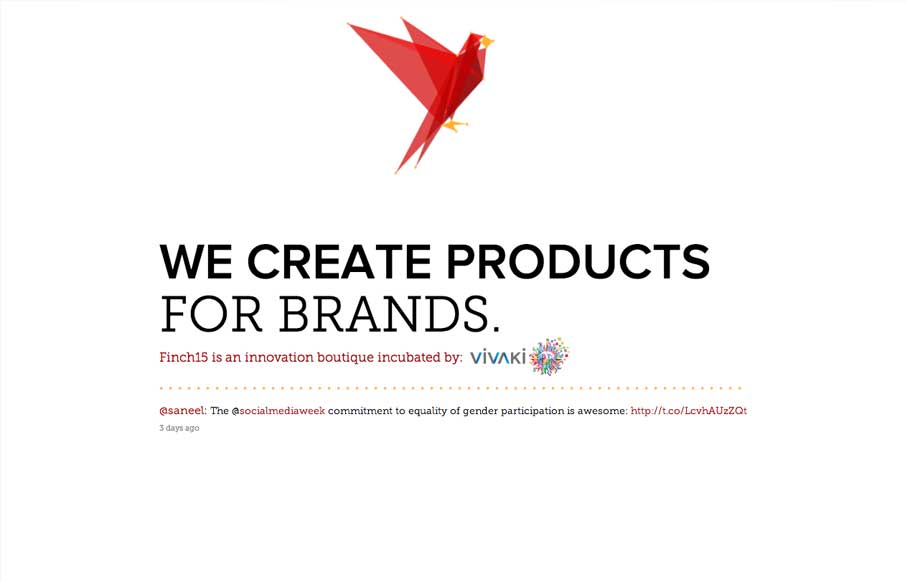
finch15
Oooooo, lovely morphing/animating logo on Finch15 finch15.com Make sure ya scroll. (thx @themaninblue) — Daniel Burka (@dburka) April 16, 2013 Okay, so. lovely little site. I like pretty much everything about it (except, maybe, a slight overuse of the word...
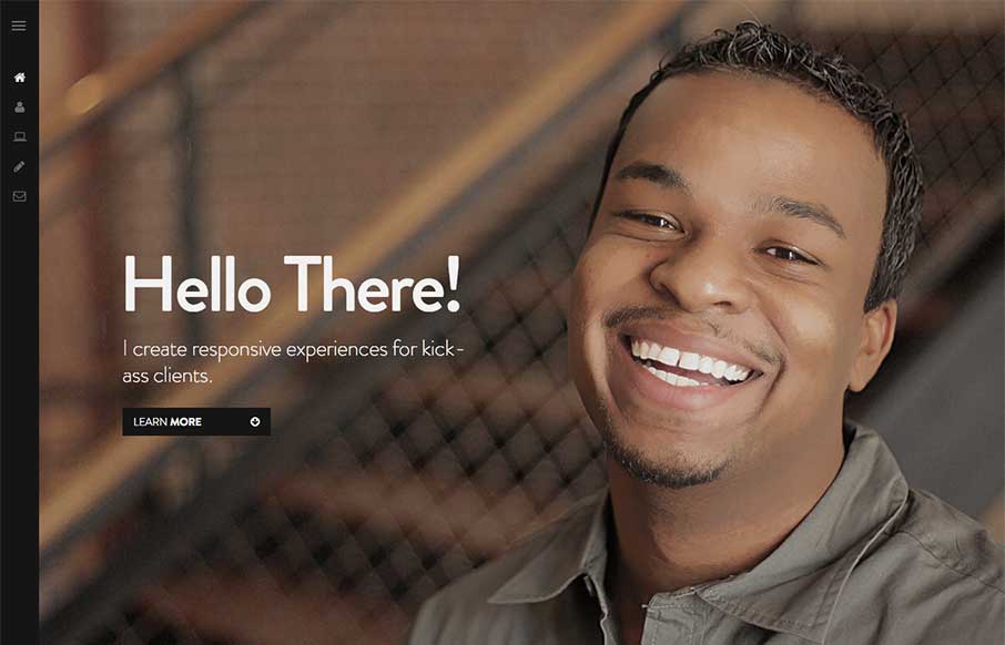
Nathaniel Deal
I like how the site is designed to be deceptively simple. It starts off with what looks like just a big head shot of Nathaniel but then as you click around you notice it's intricacies and how the side nav is design. Then you start to scroll and notice the load in...
Billy Kick
I really like all the detail work put into this design. It's well done visually, the visual branding is superb, and it's also executed well from a build p.o.v. I like the fixed nav and how it fades into view as well as the simple approach to how the site presents the...
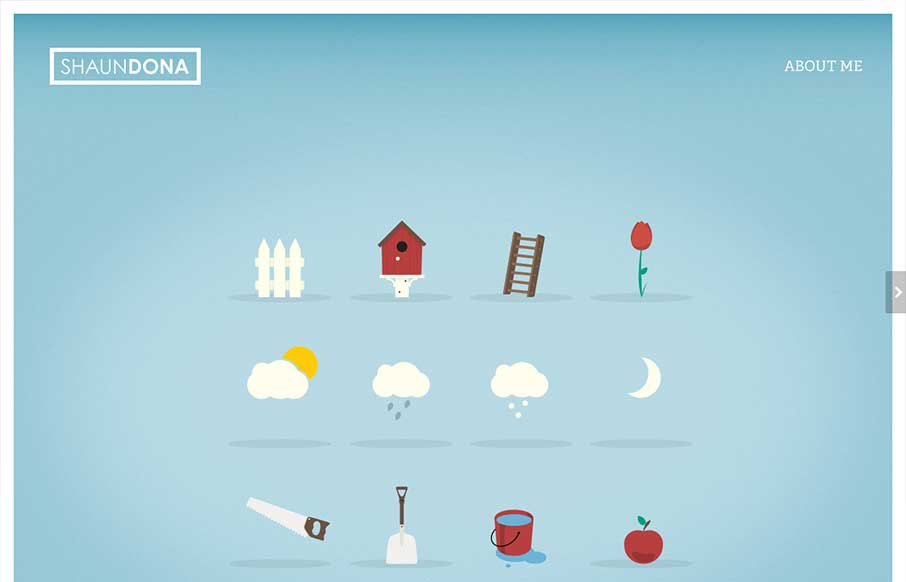
Shaun Dona
I like a site that largely lets the work speak for itself. Shaun's work is clearly very nice. I especially like the 'scroll to reveal text content' effect that is created by the full screen imagery. The site has some problems at mobile sizes ( I'm looking at it on...
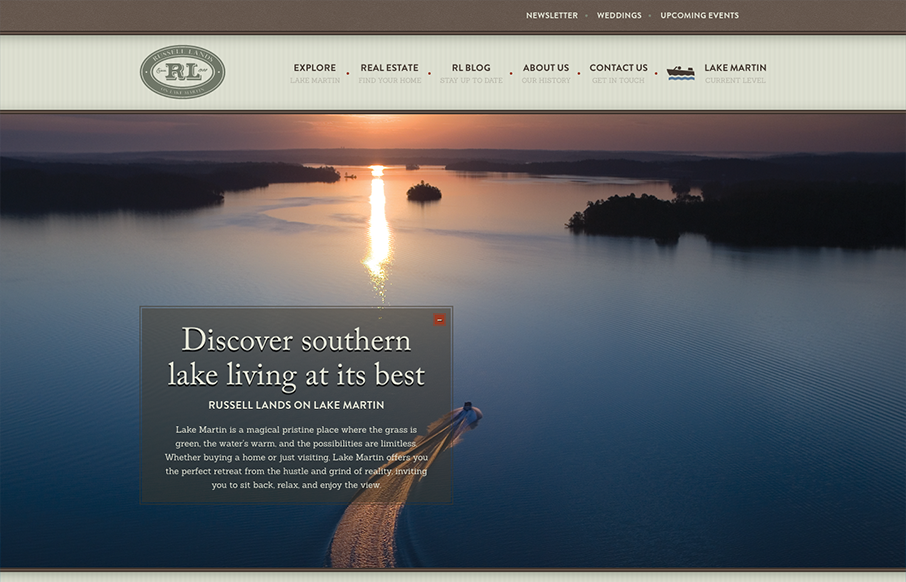
Russell Lands on Lake Martin
I love a real estate website that's not afraid to scroll. That's probably a weird statement to read but do your research and check out some other real estate sites... This design also starts off with an almost oversized set of images/slide show and then get's more...
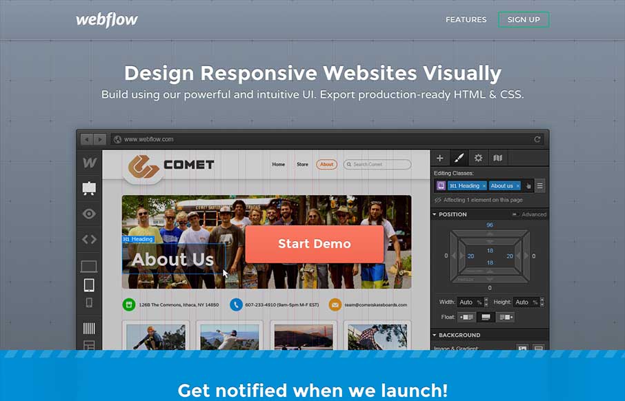
webflow
Yes, it's not often we feature a 'coming soon' page here on UMS but this one is very well done. I love how they've taken the product and the RWD building process and just told the story of the app around that. Both visually and copy wise that narrative is told in a...
Pixel Lab
Really fun and simple layout. The main illustration/animation is funny and worked over well. Dang, it's got to be awesome to put 'cut the rope' on your home page as client work. My favorite part is the post card designed contact form. Also ASCII FTW!
EMAIL NEWSLETTER
News & Articles
HARD WORK. CLEAN FUEL. NO EXCUSES
Use “WARRIOR2023″ for 10% off.

