Web Design Inspiration Curated
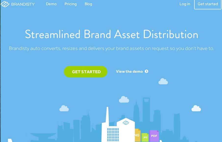
Brandisty
The Brandisty website design walks the line between whimsical and corporate very well. The layout and typography has a very nice solid feel to it while the animations and little illustration work keep it very personable. This is hard to do well and they deliver with...
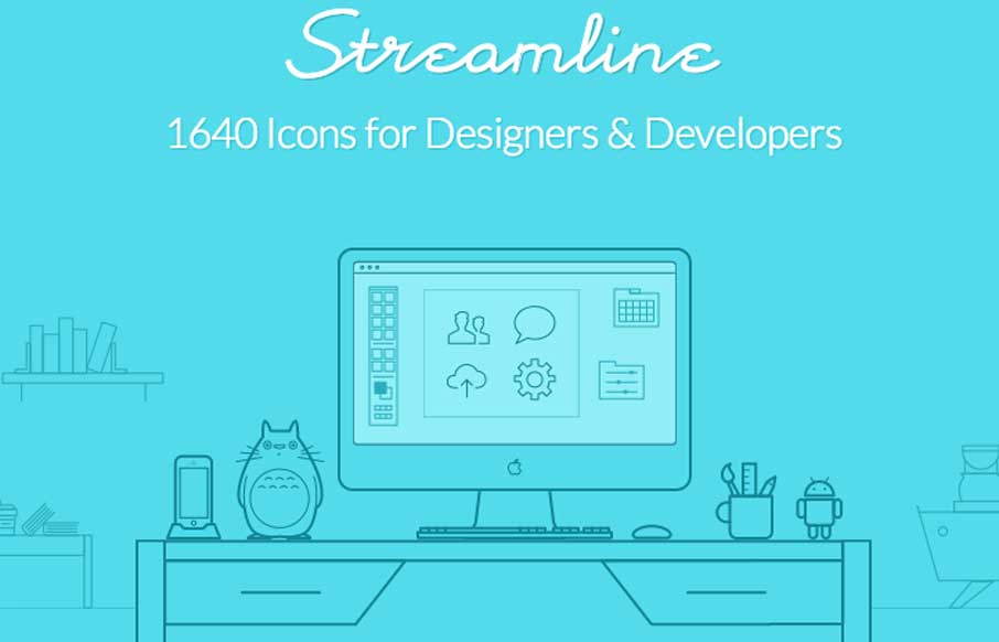
Streamline Icons
Beautiful icons, but moreover the website really shows off the work. The way the images/icons load with an animated delivery is nicely done too. It keeps your attention on the page as you make your way down and somehow keeps you focused on looking at the icons. Smart...
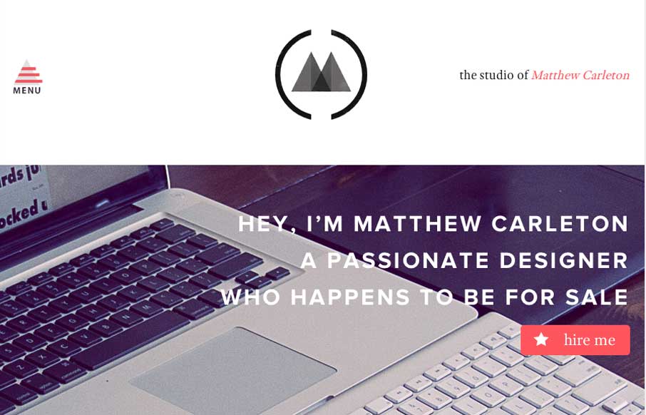
Matthew Carleton
I really dig the vibe of this website both visually and the content. It's a fairly simple design but just chock full of spit and polish. That's what makes it so damn beautiful.
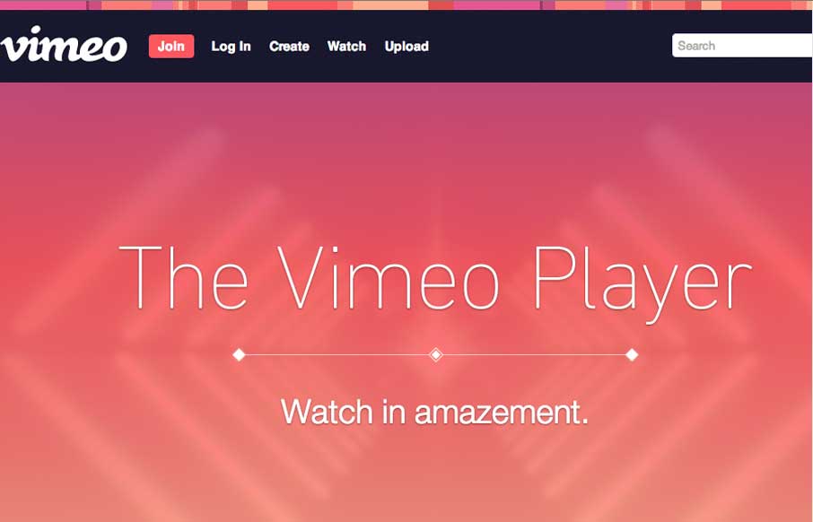
Vimeo Player
Vimeo's page to show off the player. Man is it well done and beautifully executed. I love the timed/targeted animations the pages uses to help tell the story about the player. Such a clever way to deliver the narrative here. Keeps me interested all the way down the...
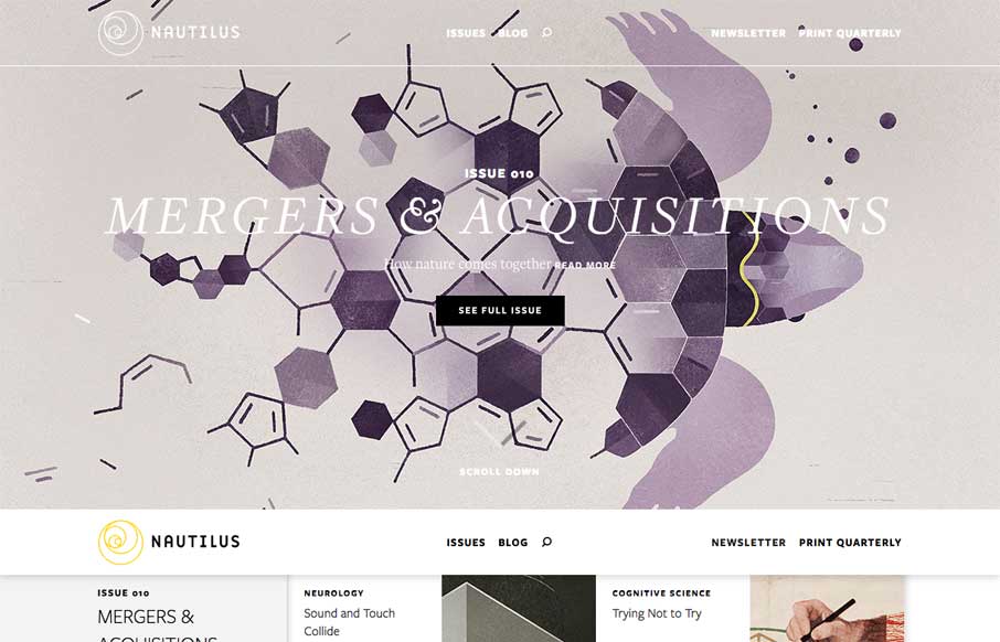
Nautilus
Such a great looking editorial design. Nautilus is basically a magazine that's published both online and in print. It's feel is very rich without being overly "interactive" - great design and solid story telling, this is awesome stuff.

Trippeo
What a great experience the Trippeo website is. It is succinctly designed but rich visually. The timed animations that fire off as you scroll down the page are great and there is no real "scroll hijacking" to speak of. The signup page is super well executed design and...
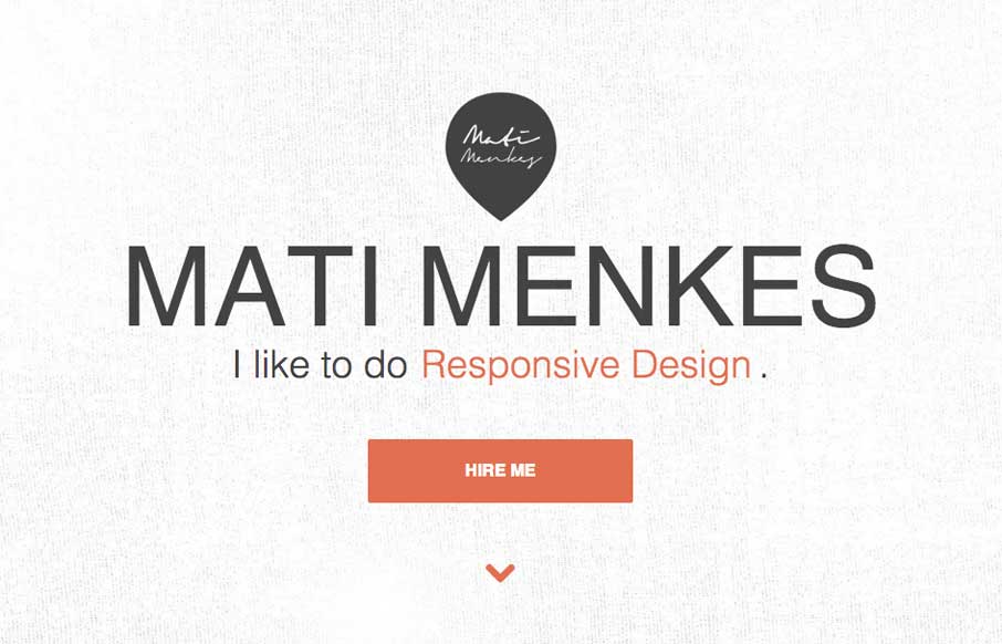
Mati Menkes
Clever use of the "fold out nav" on the left side of the page. It has the interaction of being opened and closed but it doesn't feel hidden for hidden's sake, if that makes any sense... I like the responsive design details and the E.T. illustration on the contact form...
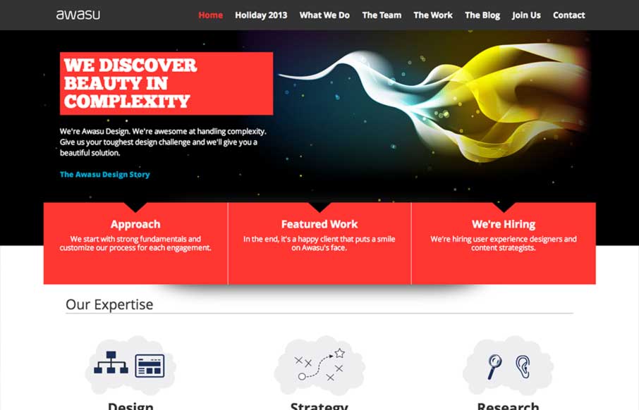
AWASU Design
A really great graphically rich design that isn't overkill visually. There is a clear focus on intent, they work really hard to focus you where they want you to go and there's not a lot of excess noise to distract you from that path. I like the illustration of the...
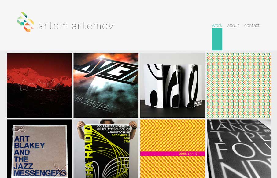
Artem Artemov
Great portfolio site design. I like the choice to keep it a single page. I also like the fixed nav/header design. Then the large and simplified contact form is placed well and looks great.
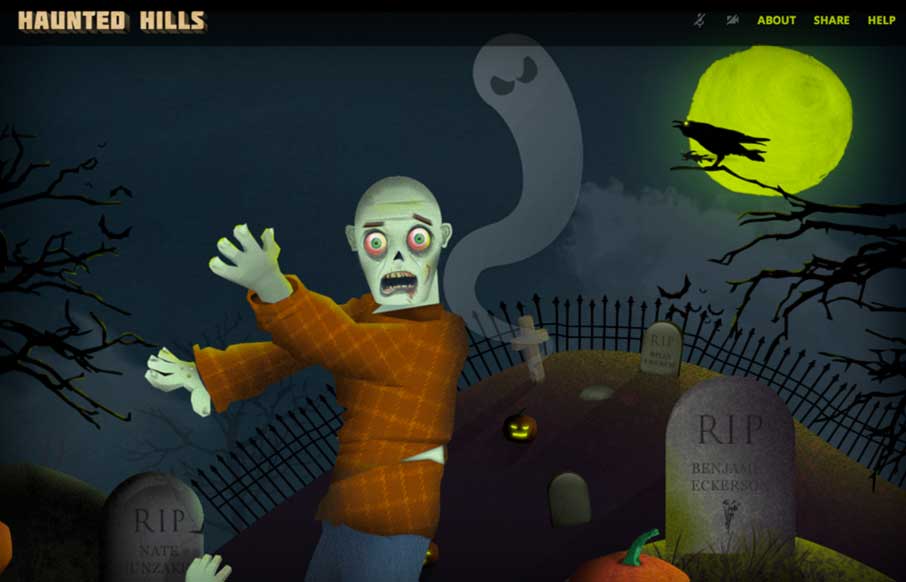
Haunted Hills
Just a fun addition to the gallery here. I love the parallax vibe connected to the mouse movement. Fun stuff all around.
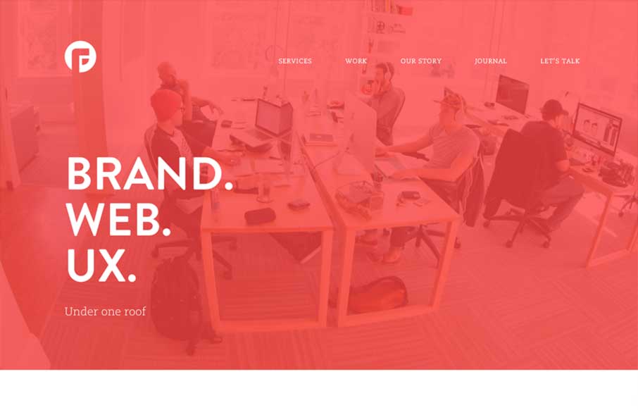
Focus Lab
I lurrrrve the new Focus Lab site design. It's full of minimal beauty and some very thoughtful interactions. Simple stuff, like the "get started" form link on the footer, check out that dropdown to start off the conversation on working with these guys. Smart stuff.
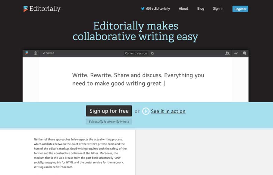
Editorially
This may not sound like the smartest review; but I love websites that are mostly words and wind up feeling like they are graphically rich. The Editorially site does just that. It's a website selling and app that's built for writing where all the crud of a word...
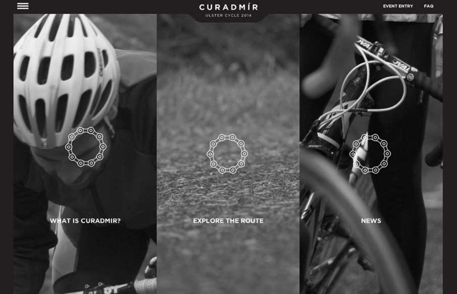
Curadmir
Curadmir is a whole lot to take in at one glance. It has a lot of visual moving parts and is filled with little visual treats that pop up as you interact with the content. It also utilizes video to nicely create a bit of narrative to the content. It's also kind of...
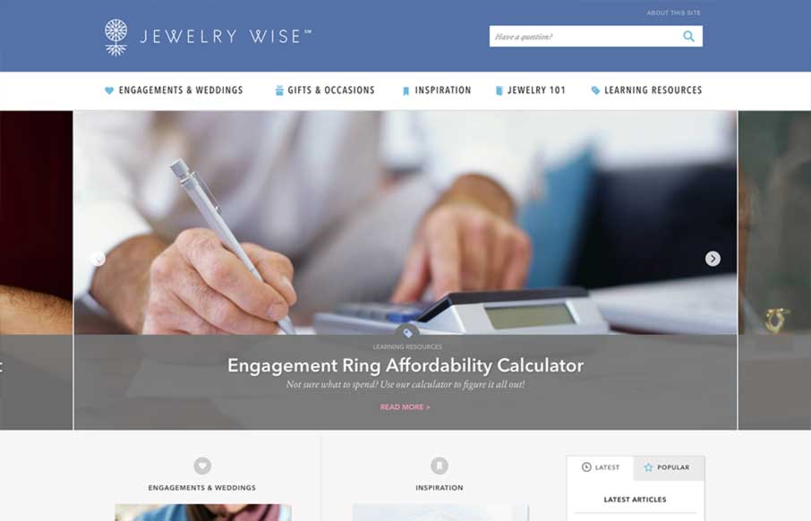
Jewelry Wise
The Jewelry Wise website is a great example to study if you're considering one of those mega-navs. This design utilizes it quite well on both the desktop and mobile versions of the design. The page also has good rhythm and leads you down the page in a succinct manner...
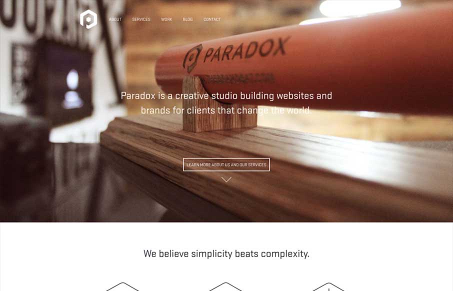
Paradox
Paradox is beautifully minimal design with a clear focus on funneling potential clients into a conversation. The site is clearly conceived and simple in execution. The differentiator is the quality of the work. Minimal design at its best.
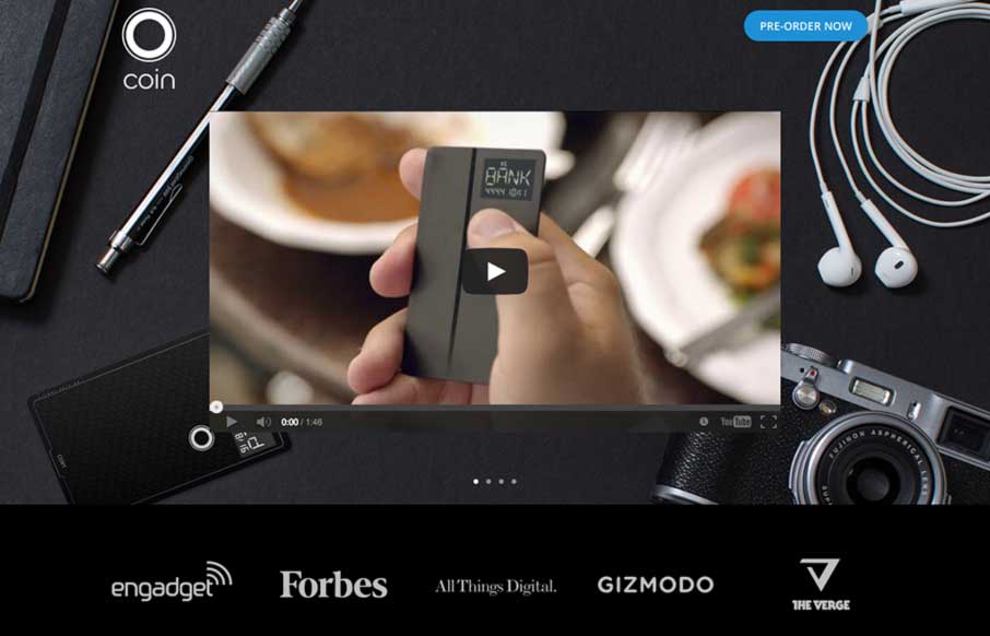
Coin
Animate all the things. Love the clean and bright look of this site. The narrative created by the animations is just wonderful. I love simple designs that feel easy and light, but clearly took some savvy. It's just enough sex to be awesome.
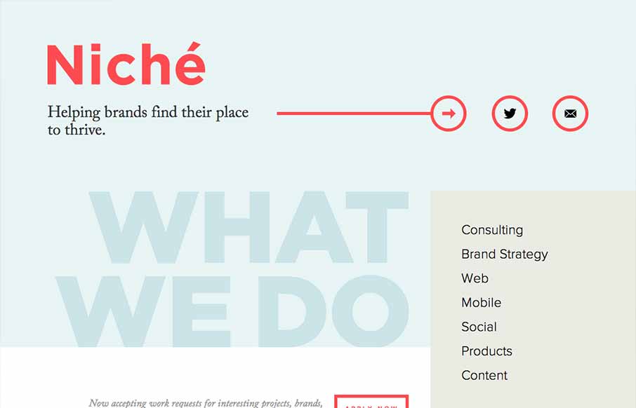
Niche Creative
Niche Creative is ultra minimal. It's minimal design, minimal interaction, and minimal content. You can't get more minimal than that, and yet, the site feels complete and useful. The beautifully soft colors are wonderful. If their list of services looks just a little...
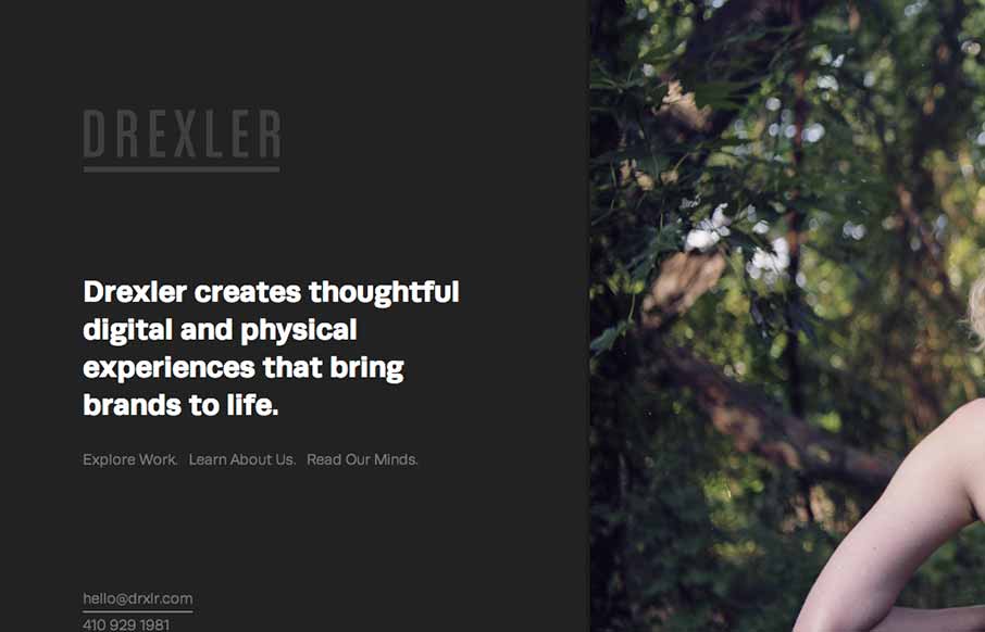
Drexler
The Drexler website is both minimal and highly interactive. There's plenty of javascript here for everyone but it's not overly distracting. Things move around smoothly and it's still fairly easy to generate a good mental picture of what's going to go on each page as...
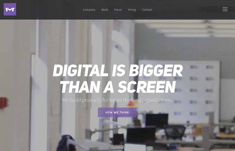
One Mighty Roar
I like the first pass minimal look to the One Mighty Roar website. However once you start to click through the site you find that the pages are lengthly and deep with content and imagery. I also like how they've used the hamburger icon to show you what's beyond the...

Fitstar
Fitstar is a beautiful site that uses animations to quickly focus the viewers attention on the most important content in the viewport. The effect is engaging and varied enough to stay interesting. Each transition and animation is appropriate the the content and...
EMAIL NEWSLETTER
News & Articles
Jonathan Kay: Grasshopper Group
 Talking about hiring practices and how helping others to help yourself is good business.
A Dozen Sales and Marketing Tips for Your Best Year Ever
12 pieces of advice for bringing in new business. Keeping your calendar full and your business moving ahead, by doing a little bit to create new opportunities every day.
CSS-Tricks.com

Breaking down the new CSS-Tricks.com website design with Chris Coyier. From media queries to css transitions to the forum this site has it all.

HARD WORK. CLEAN FUEL. NO EXCUSES
Use “WARRIOR2023″ for 10% off.