Web Design Inspiration Curated
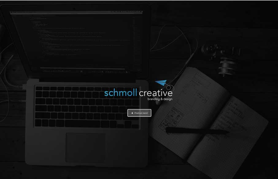
Schmoll Creative
Love the minimal color palette. Smooth transition between the topmost section and the main nav load too. Then plenty of little visual interaction pieces across the page as you scroll to keep things interesting. Lovely site.
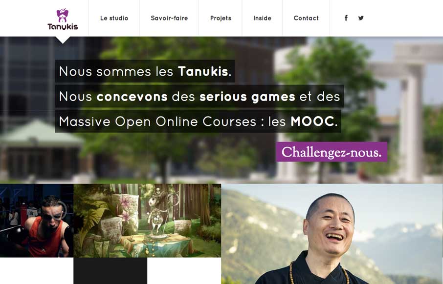
Tanukis
I really like this new pattern that's emerging where the main nav changes slightly once you move past the initial page load. I do also dig the interactions placed with each of the main images on the home page too, very smart use of animations.
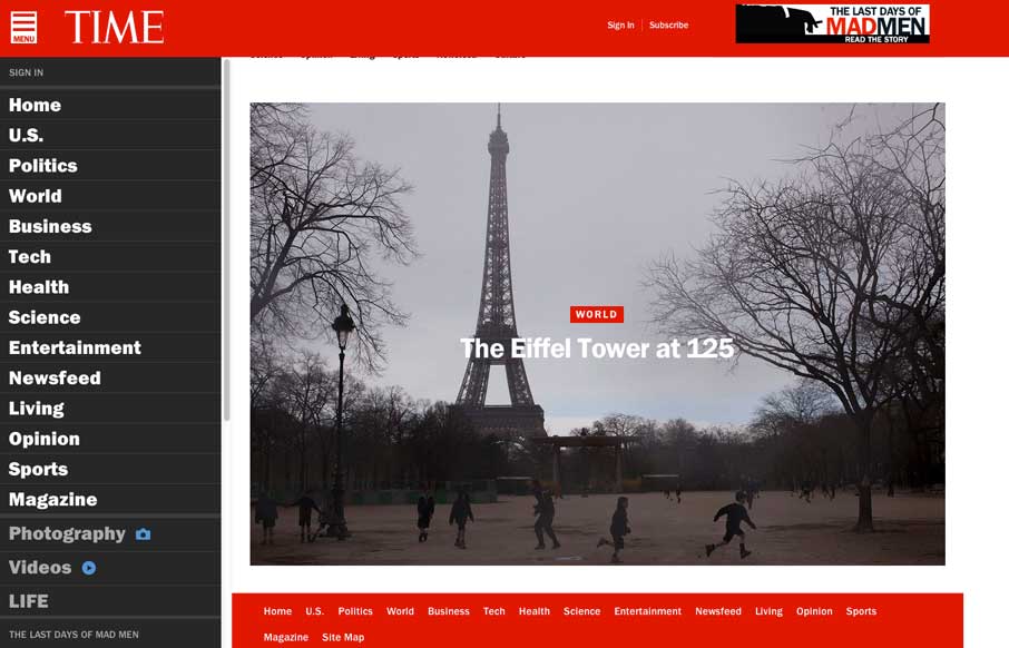
Time
Really great transition to a responsive website from Time Magazine. It's really beautifully done. There are also sections like this World Trade Center article that show they are really trying to push the boundaries of online writing. Well done.
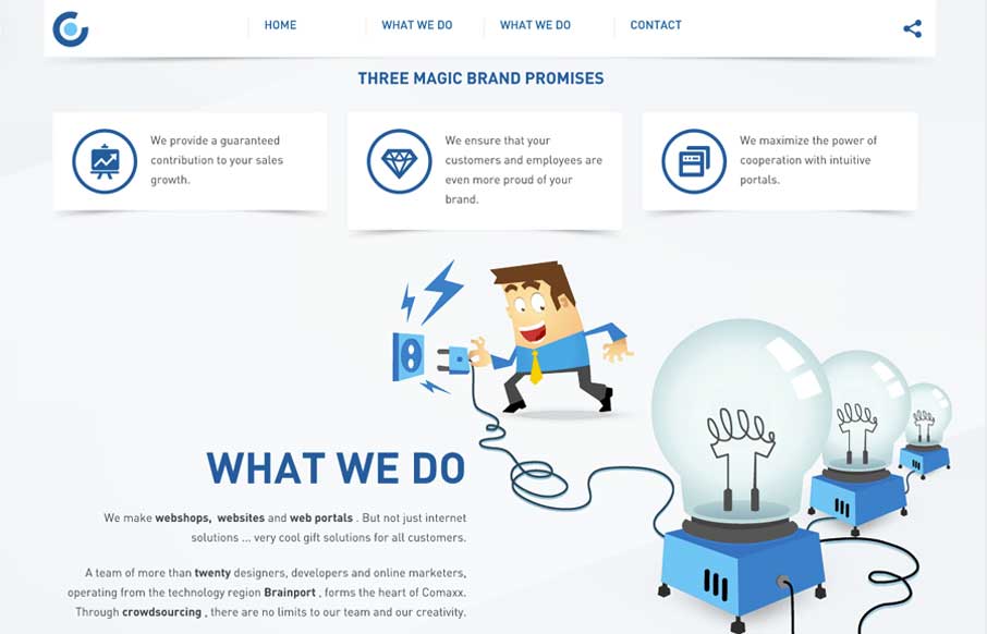
Comaxx
I like this nav design. It's a different idea to include, pretty much, a sitemap as your main nav if you can (if the site is small enough). I also dig how the illustrations are used and interact visually with the copy.
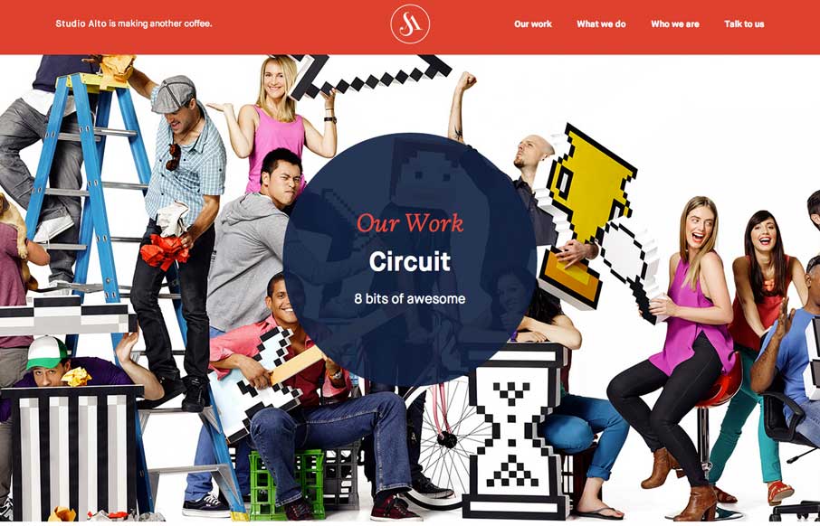
Studio Alto
Pretty slick movement on the site as you scroll. I like the way the colors flip around too on interaction with the main nav. Clever stuff here.
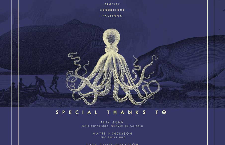
Chant Des Baleines
Really beautiful single page site for this band. I luurve the illustrations.
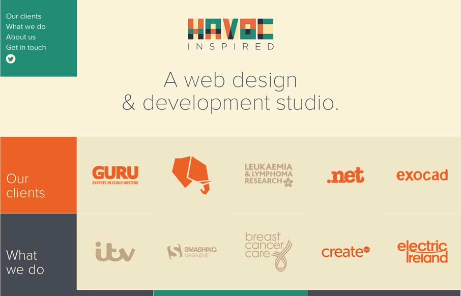
Havoc Inspired
Pretty nifty site design. I like how the main nav stays fixed but in the box shape that overlays the site. Also, resize this badboy, that's a cool way to hide the transitions but also making it interesting for us that build sites too. Bravo.

waterbugapp.com
Clever app. It's a simple page for the app but I really dig it. I like the iPhone image that changes out and slides up slightly as you scroll down the page.
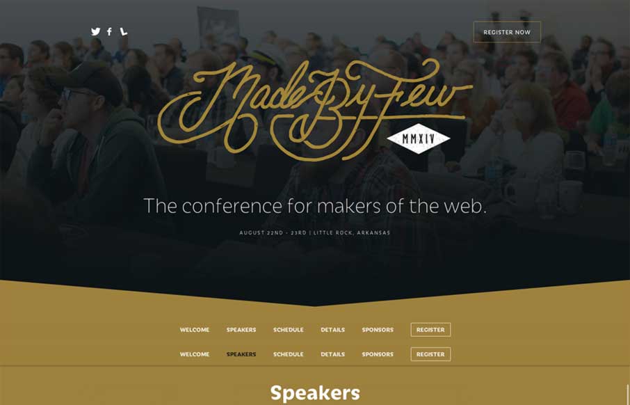
Made By Few
The new Made By Few site for 2014 is marvelous. The lineup is looking good too. I really dig this design pattern where the top of the page is used for a big hero area and as you slide down the page the main nav sort of sticks into place and is set. This site does that...
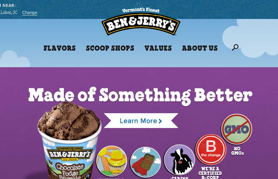
Ben & Jerry’s
The new Ben & Jerry's site, done by Happy Cog is super nice. But there's more here than just a pretty face. There is a ton of strategy behind it and you can feel it as you use the site. Mmmmm Ice Cream.... They have a pretty epic case study and a video about the...
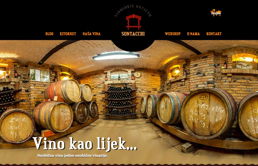
Sontacchi
Here's a fun website. Chock full of compelling imagery and effects. It's fairly simple and straightforward with it's single page approach but there is enough here to really entice you. That first image of the casks alone makes me want to give them my money.
150px
Nice effect with the background video and how it stays in place as you scroll down. I really like the contact form and how the field labels are handled - very nice.
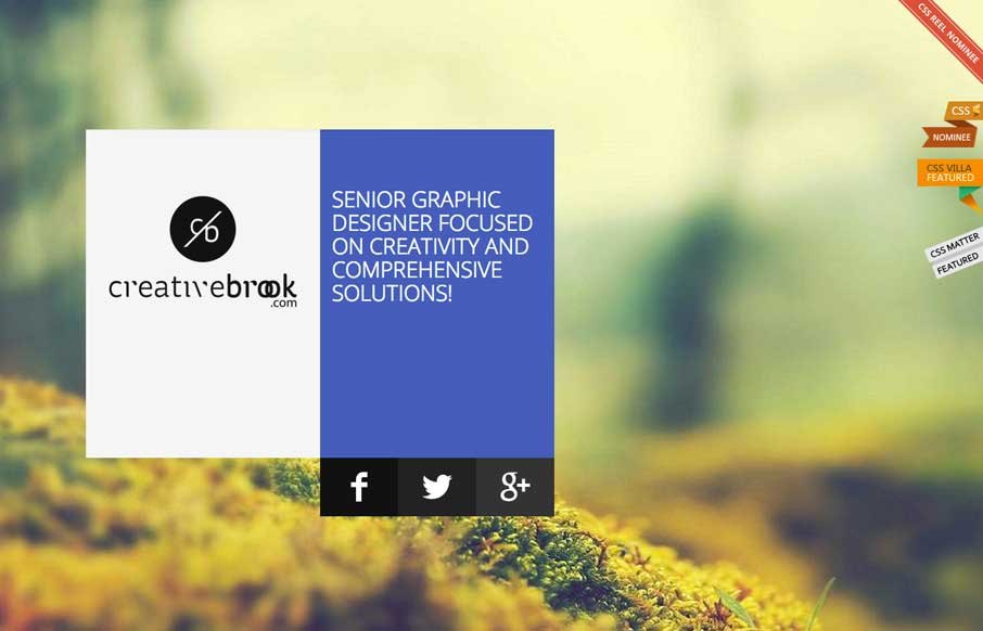
creativebrook
I like the overall treatment to this site design. It feels a bit like Microsoft esthetic (but better executed) which is just fine and looks great here.

Endgame
I love the visual changes that happen around the page as you scroll down. The way the logo and main nav get smaller. The way the laptop image stays put and other graphics interchange with it is smartly done too.
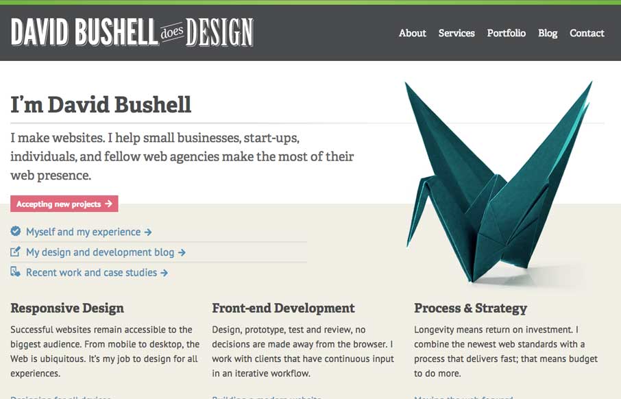
David Bushell
I really dig how this site design has the vibe of a larger agency but it's really just for a single person. It instills trust that goes beyond a single person shop to me. I like the treatment on the origami swan as you resize the browser too. It all feels very...

Breath
Aside from being hilarious this site is pretty cleverly designed. I like the animations that trigger as you scroll down, they make you stop and read which is the goal. Also, don't forget to breath people.

Harvard
Nice, Harvard has a responsive site design now. Not sure how long it's been relaunched but I like it. It's one of the better collegiate designs as far as i'm concerned. I really dig the featured marquee area and how they change for focus based on the screen widths,...
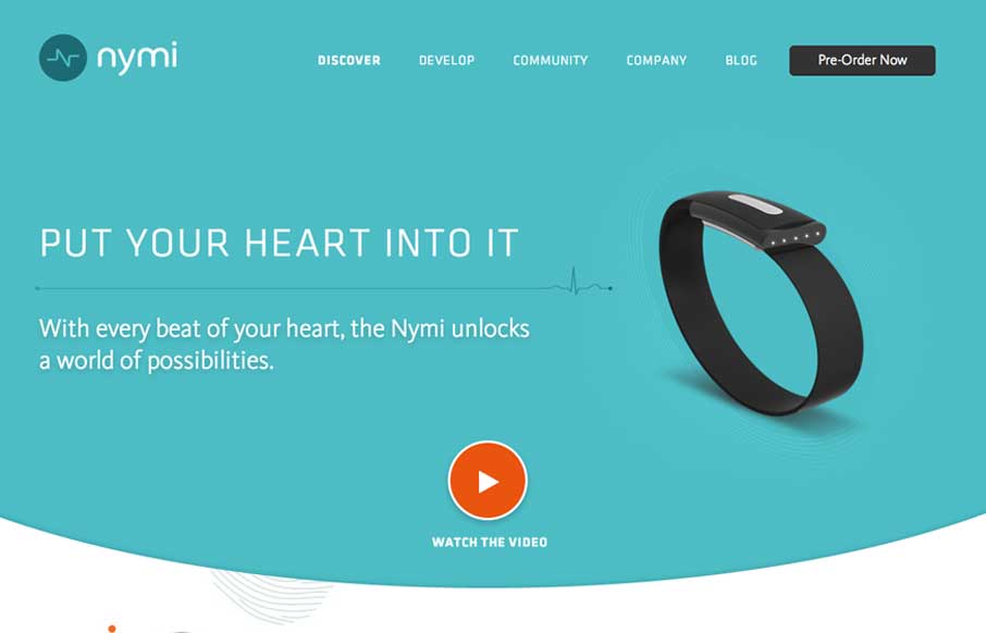
nymi
Nice product site design here with nymi. I really like the main featured area and the focus put into designing for different screen widths for it. The little radiating lines animation is a nice subtle touch too.
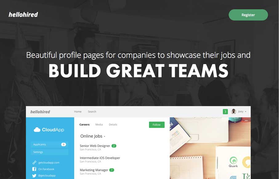
hellohired
My favorite part of this design is the hero image area. I love how it slides down and fades as you scroll down the page. Then check it out when you resize it for the mobile screen widths. Very clever design.
Eddie Diaz
Nice clean look to this portfolio site. I like the about text on this site, typically on portfolio websites it's largely useless but on Eddie Diaz's it's actually informative. Bravo!
EMAIL NEWSLETTER
News & Articles
Charlotte User Experience Meetup
 Video from Charlotte UX’s panel discussion on how to integrate UX into the business, design & development processes.
Campbell McGuiness: StackLayout
 Talking about StackLayout, a new flexible width component based CSS layout system, with it’s creator Campbell McGuiness.
Book Review: Card Sorting, Designing Usable Categories
 Book review by Giovanni on Card Sorting by Rosenfeld Media, plus we’re giving away a copy.

HARD WORK. CLEAN FUEL. NO EXCUSES
Use “WARRIOR2023″ for 10% off.