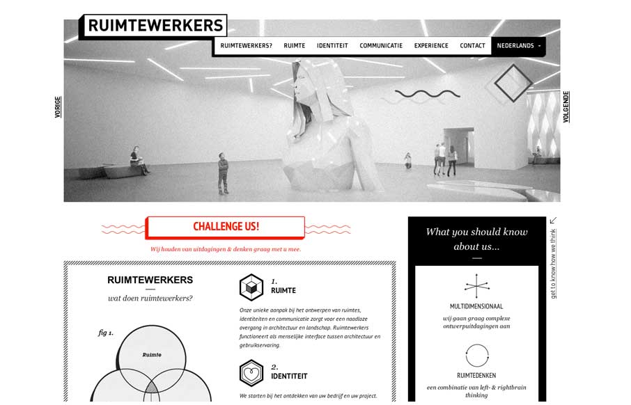
I like the stark black and white box design of this website. Very simple and clean yet it almost feels gritty due to the way the boxes are used. That fixed nav section is pretty slick. I like how it just folds down to “nav” for mobile screen widths too.


The Call to Action, Revisited
The Call to Action hasn’t changed in a decade, but the bar has. A fresh look at prominence, copy, mobile tap targets, and accessibility, with lessons from three major design systems.


0 Comments