Web Design Inspiration Curated
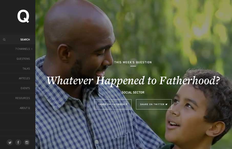
Q Ideas
Nice design that's responsive, that really takes into account different screen "types". I dig the layout through and through here. Submitted by: Eric Brown @whiteboardis Role: Designer & Developer Q is a learning community that mobilizes Christians to advance the...
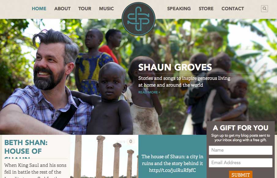
Shaun Groves
I like the grid layout here, it's not typical feeling and the slight movement of the images as you scroll under the content blocks is a nice touch. Submitted by: Ben Stewart @loudermedia Role: Designer & Developer Shaun Groves is a storyteller and musician...
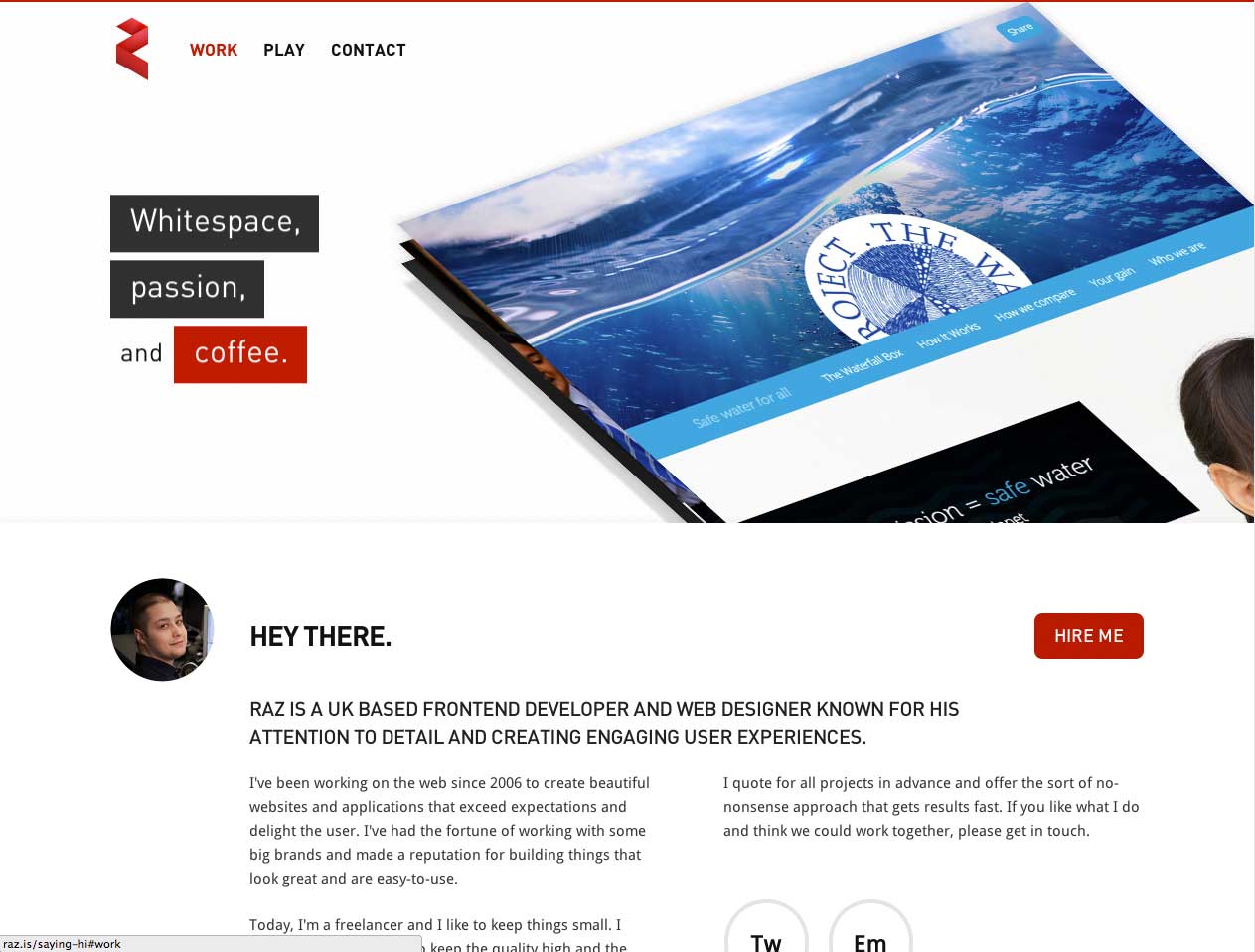
Raz
Crazy interaction on the hero area for the case studies. Lots of other interesting interactions too, check it out when you get a sec. Submitted by: Razvan Cercelaru @raz_c Role: Designer & Developer
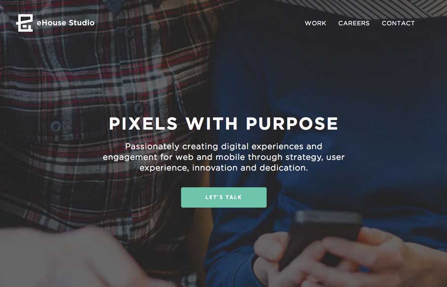
eHouse Studio
Digging on the simplicity of the execution of the new eHouse Studio website. I love the new mark too!
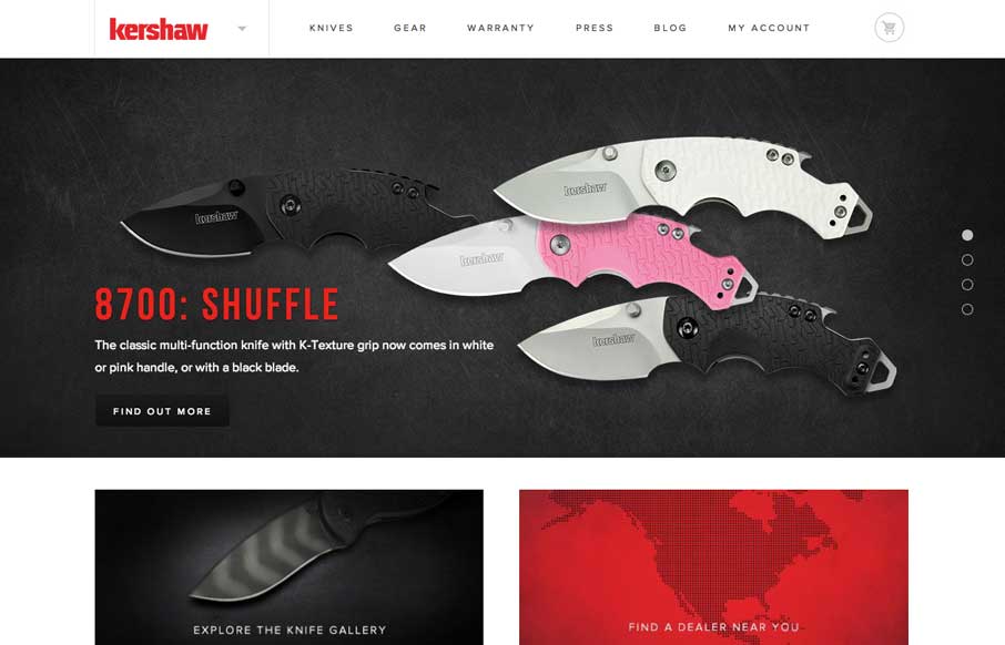
Kershaw Knives
Nice redesign of the Kershaw Knives website. I love the animations on the hero slideshow area. The rest of the site is well balanced and full of great little details. Also Tomahawk!
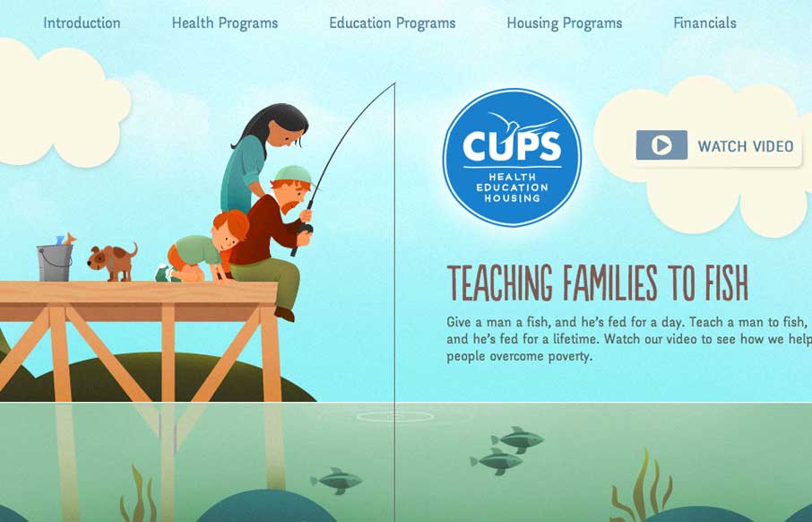
Cupsannual.ca
Really beautifully illustrated and animated site. I love just about everything about this layout. Once again narrative in design wins out.
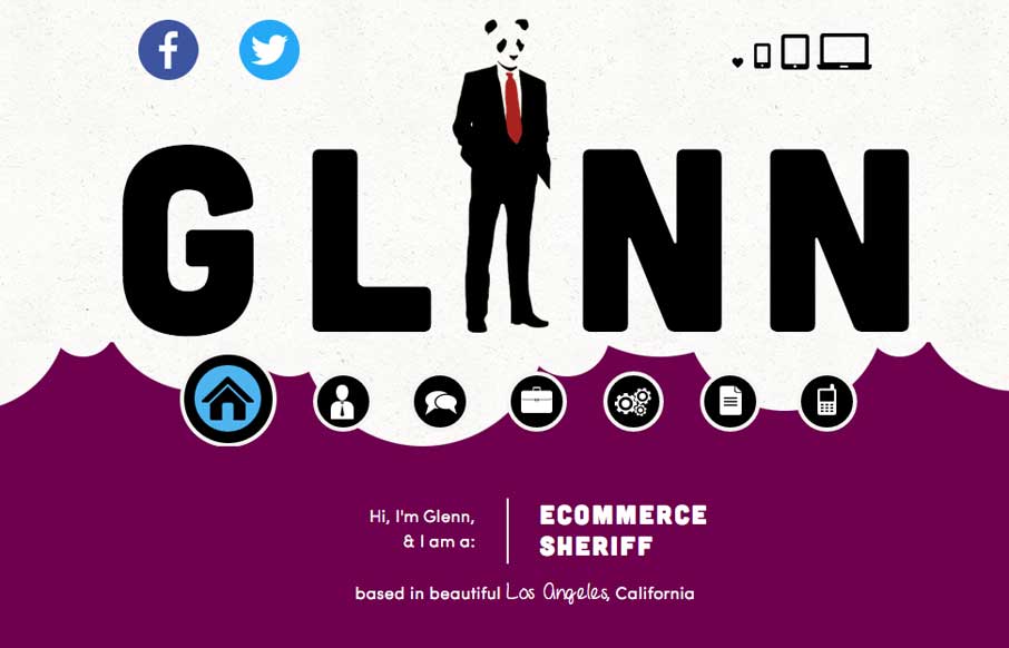
Glenn Roman
You're portfolio site is where you get to show off. Glenn get's this and really show's us some fun and how it's done. Love this site. "Ecommerce Sheriff" is my favorite too.
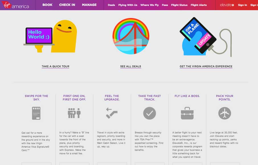
beta.virginamerica.com
Great new experience for the Virgin America website. These guys get it and it shows. Lovely stuff. They have a really great "get to know it" page setup too. Here's a cool post about the experience too, read it up here.
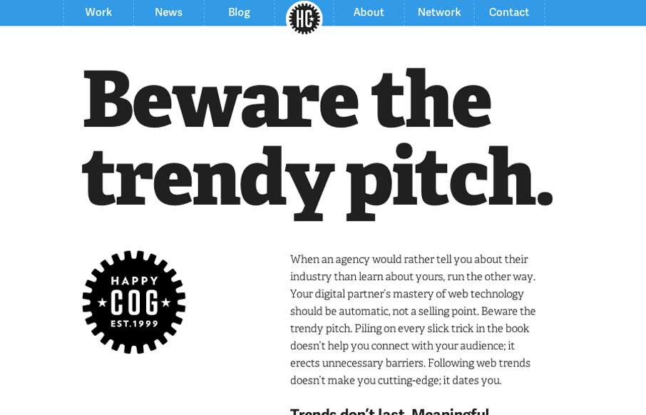
Happy Cog
New updated on the Happy Cog site. I love these guys and just about everything they do, so always take notice when they relaunch their own stuff. It is of course smartly executed. I especially dig the employee profile pages.
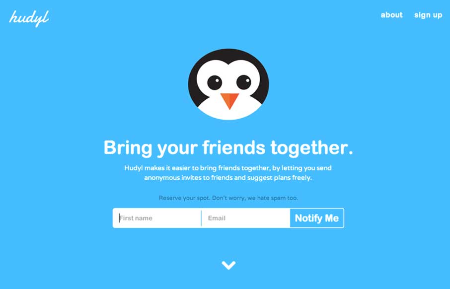
Hudyl
Nifty splash page for the Hudyl app. I really like how the newsletter signup form is designed. Inline like that, I'd love to see some real users using it but my gut says it's a nice idea that should be well received by people using the site. Submitted by Anders Kravis...
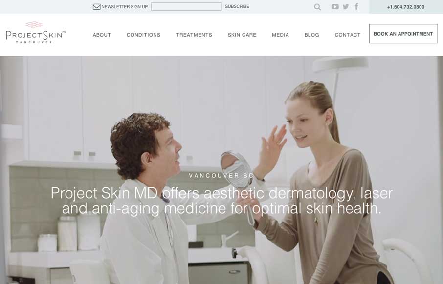
Project Skin Vancouver
This site exudes a nice cool feeling. From the wistful line work and light typeface choice to the washed out photos it feels airy and relaxing. I also like the way the services are laid out on top of the images along the bottom of the page like they are. Good stuff....
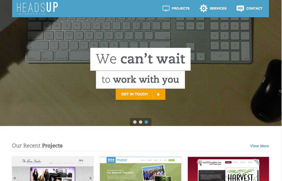
Heads Up
I really like the animated details and some of the off-kilter layout items on this site. It's just square enough and just animated enough to make me stop for a while and poke around. Job well done!
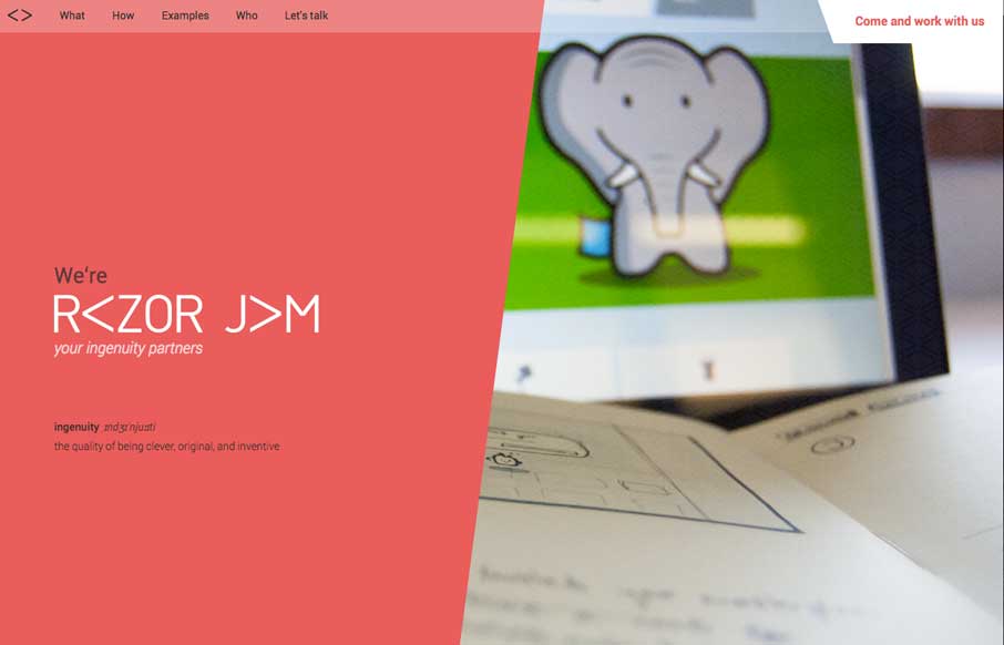
Razorjam
Not a standard layout at all with Razorjam. I can get into too, I dig the stuff along the bottom of the page, fixed positioned like that. Then when you hit those pages they are pretty cleanly designed and fun.
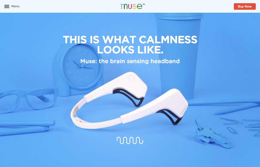
Muse
A solid experience from top to bottom. Full of good narrative and imagery the Muse site really brings it home from a product marketing standpoint. Submitted by Scott Boniface @playgroundinc Muse, the brain sensing headband. It’s a brain fitness tool that helps you...
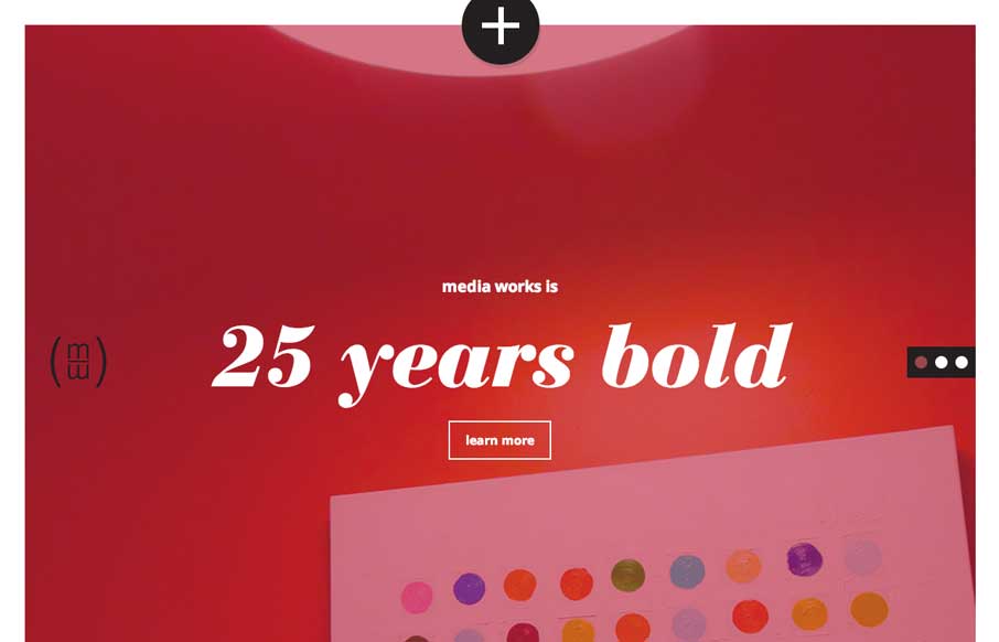
Media Works
Very much like the big square areas of this layout. The fly over navigation is smartly used here too. It's a nice take on this design pattern overall and executed well to boot.
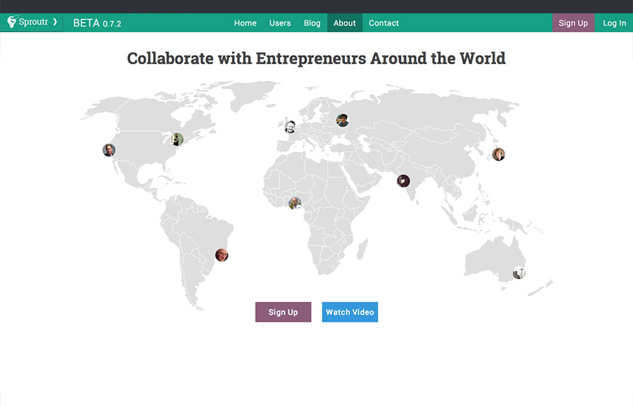
Sproutr
Sproutr is great because there are lots of different forums and communities on the web for communicating with entrepreneurs, but none that have put the same amount of consideration into the design and UX of their site. Sproutr is very clean and easy to use. Within...
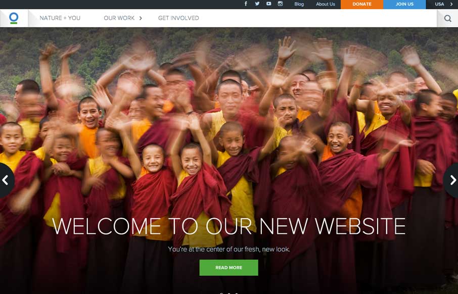
Conservation.org
Darn nice web design here for Conservation.org from Viget. I especially like the interactions on the who we are section of the home page. Very nice work. There's a pretty good case study setup on the Viget website about this one as well. Good stuff to read through for...
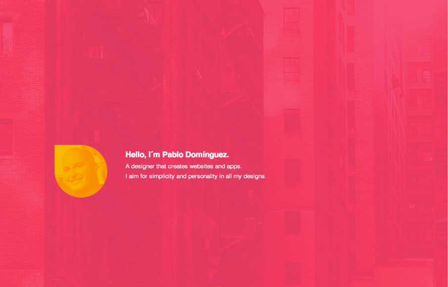
Pablo Domínguez
Great minimal approach to this designer's site. I love it. There is some special work done to each case study page too. Check it out.
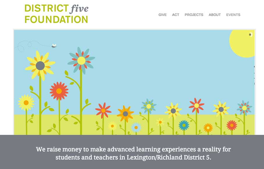
District 5 Foundation
I love simple design, it's not as easy to pull off as you first think it is. This is why i'm always impressed when I find someone who has. This site for District 5 Foundation is one of those. Well thought out, well designed, deceptively simple websites. By our good...
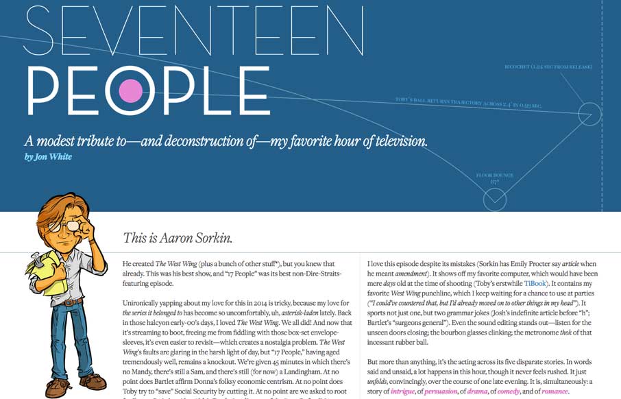
Seventeenpeople.com
Not only is http://t.co/ACZ3CGlSq8 a lovingly written, designed, and illustrated essay about a favorite TV episode of mine, it’s responsive! — Responsive Design (@RWD) May 21, 2014 Wow, what a great page. The illustrations are very nice and everything is so...
EMAIL NEWSLETTER
News & Articles
2011 jQuery Summit
 Check out the upcoming jQuery Summit online conference plus leave a comment to be entered to win a free pass.
Kyle Steed
 Audio interview about his creative approach to design with Kyle Steed.
A Web Afternoon
 Great half day event that left me inspired and fired up.

HARD WORK. CLEAN FUEL. NO EXCUSES
Use “WARRIOR2023″ for 10% off.