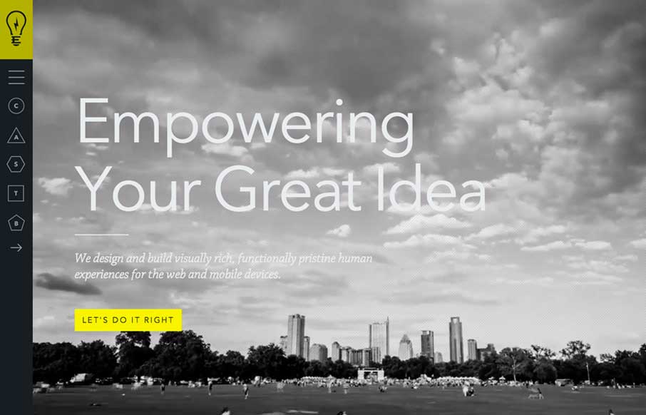
Cool vibe to this site. I like using it. The use of the “hamburger” icon to show the names of the pages/sections instead of only relying on the icons is a good idea. I love the yellow and black with the B&W imagery to boot.


The Call to Action, Revisited
The Call to Action hasn’t changed in a decade, but the bar has. A fresh look at prominence, copy, mobile tap targets, and accessibility, with lessons from three major design systems.


0 Comments