Web Design Inspiration Curated
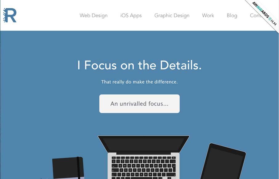
Ryan Gittings
Super nice illustrations to kick the page off with, then followed up with some nice detail work and good copy. Love this straight forward but thoughtful approach.
Beaconia
Very slick details. I love the mix of illustration/icon work and the photos. Add in that nice little interaction with the animation and i'm thinking you've just grabbed people's attention. Good work. Submitted by: Darius Krisiunas Role: Designer & Developer A start-up...
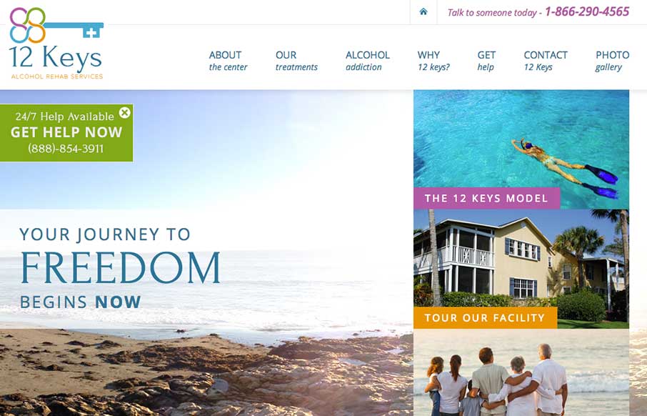
12 Keys Alcohol Rehab Services
There's a lot going on on visually with this page, lots of content and sections. The overlay with the help line number is good and smartly placed. I do wish the page was responsive too. 12 Keys Alcohol Rehab Services provides a retreat for those suffering from...

Emantiss Portfolio
Really slick visual style for this portfolio site. I really dig that header/hero area photo, good stuff. The icon work and vector feel across the page is real nice. Hire this guy for some projects!
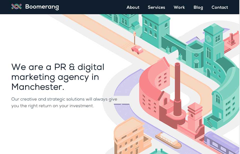
Boomerang Communications
The visual style of this site is really slick. I love the colors and vector icon work as well as that main illustration/animation of the factory. Smart, smart work here. Event the pictures have been color corrected to fit into the overall colors of the page, subtle,...
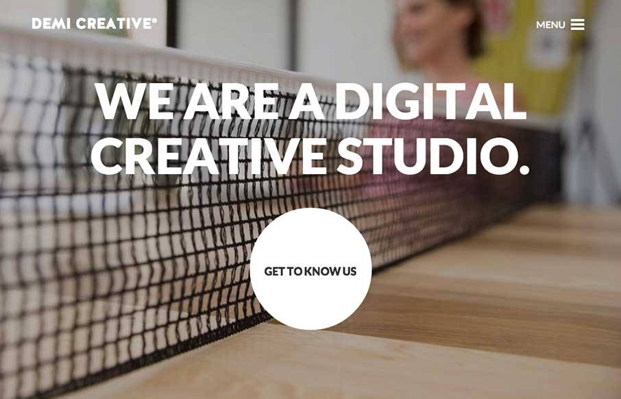
Demi Creative
Big bold visual style for Demi Creative. I dig it. I like the simplicity implied into the site design, the main link is the "get to know us" call to action and it draws you in. The nav under the hamburger icon feels slightly lost but once you dig into the about page...
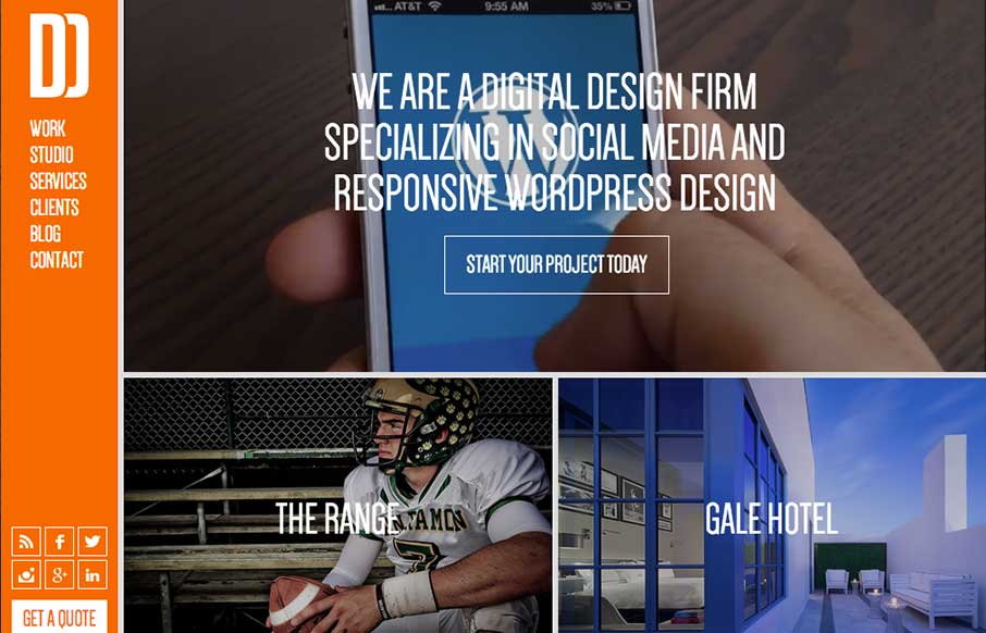
Daddy Design
You don't see many site designs that have that fixed nav bar layout anymore, it's not part of what's trending. But when you find a site with it done and done well, it's good stuff indeed. I really dig this layout, it's very intuitive and the content is placed in a...
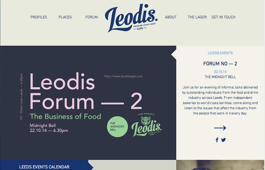
Leodis
Man I love this layout. It feels very unique to me and trust me when I say that I see a ton of website designs... Love that header interaction and the way the rest of the content is laid out. Very smart design, spend some time here guys.
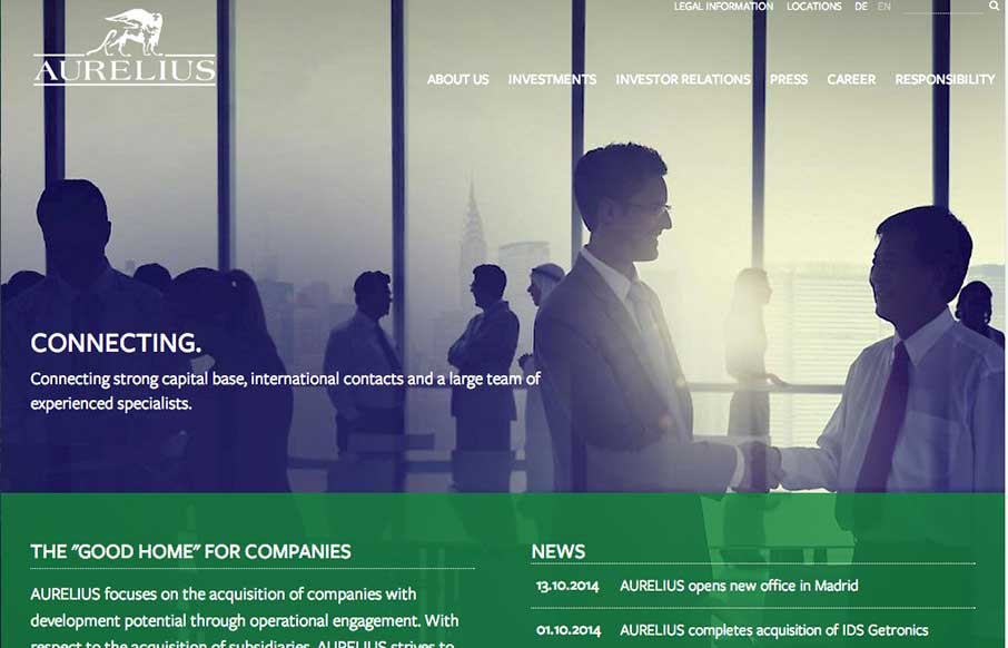
aureliusinvest.com
Really cool usage of transparency across sections of the layout here. I really dig how that header's background fades into white then back out as you scroll back up. Smart details make this site really stand out to me. Submitted by: Marc Hinse @MadeMyDay Role:...
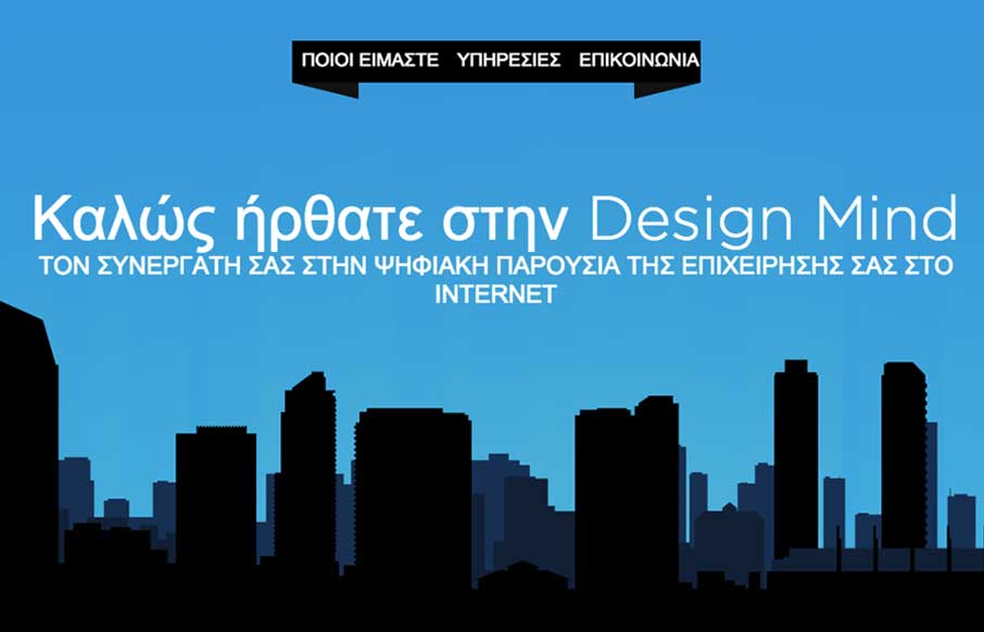
Design Mind
Really sweet, mostly full page width animations here. I really dig the one of the room that swings around as you scroll down. Fun! Submitted by: Yiannis Karas Role: Developer
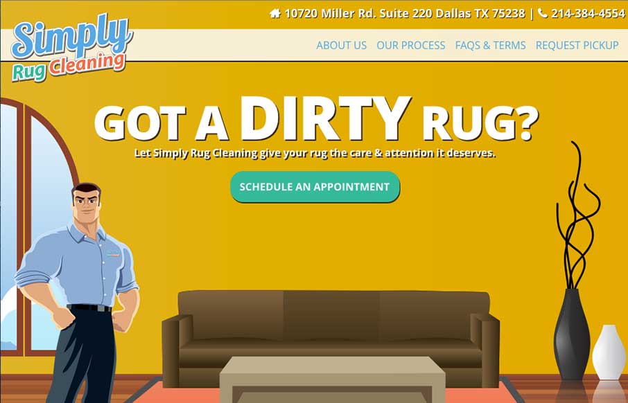
Simply Rug Cleaning
Like Chris says below, it is indeed a nice responsive site. I love seeing work submitted that is for clients and not necessarily portfolio websites for designers or agencies. Good work here for sure. Submitted by: Chris R @therstyle Role: Designer & Developer...
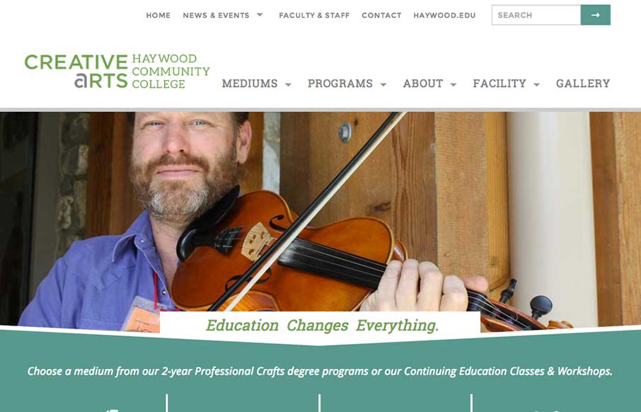
Creative Arts at Haywood Community College
Sweet responsive site for Haywood College. I like the downward angle used to anchor the page visually, that's a nice touch. Marisa Falcigno @helloODDS Role: Designer & Developer The website project was integral in highlighting the new identity while providing a...
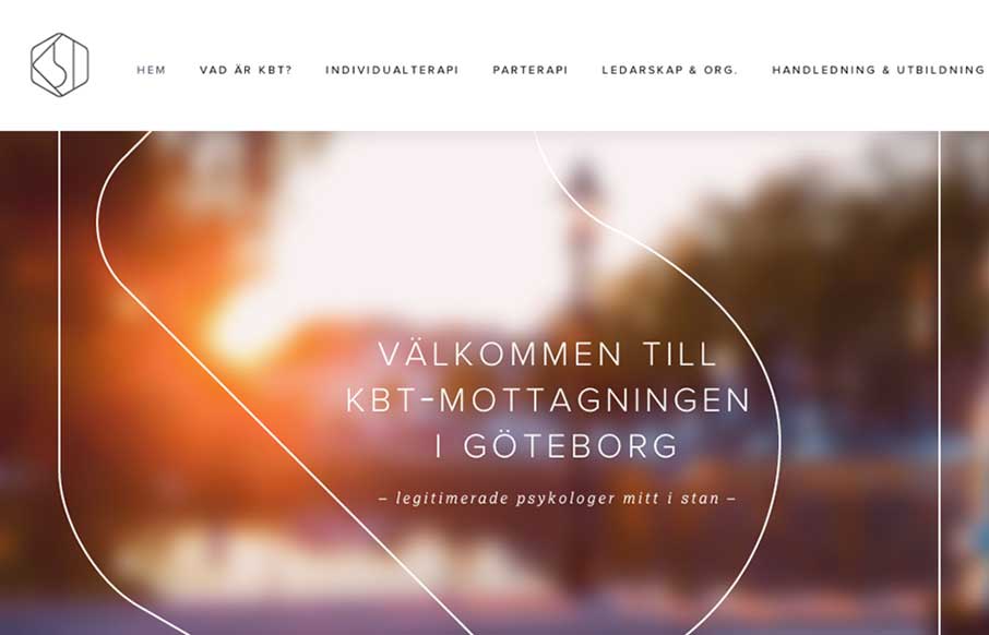
KBT-mottagningen
What a great visual mark; the KBT logo. I'm probably biased, since I love everything Swedish. But man it's hot. I love the light feel to the design and the colors throughout. I do wish it was responsive, but it's hard to tell sometimes how old a site is. Great work...
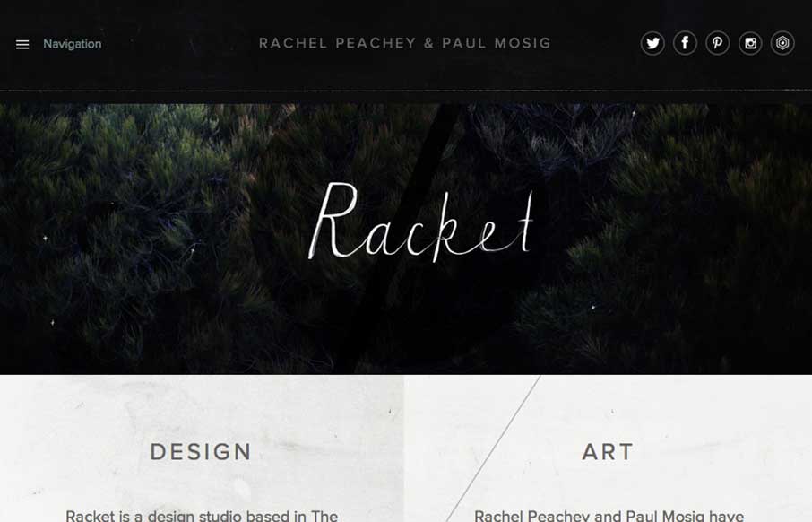
Racket
I love the dark and light mixed on the page here. The hand written type is very nice and makes the work gel as well. Lovely responsive approach finishes off a really nice website. Submitted by: Paul Mosig @r_a_c_k_e_t Role: Designer & Developer Re-design of Blue...
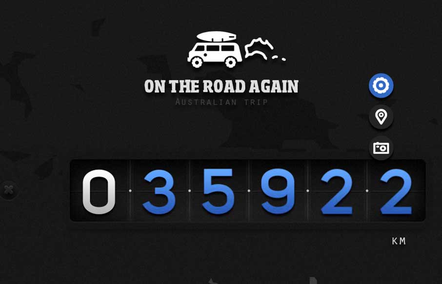
On The Road Again
Really nice little single page(ish) website for traveling in Australia. Super nice photography and maps and a fun way to explore the page. On The Road Again is a website dedicated our Australian roadtrip done in Van. This presents an overview of our entire journey....
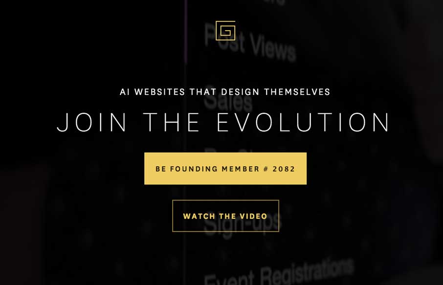
thegrid.io
The page just keeps going and going, but it's all good stuff. That's rare for website's I come across.
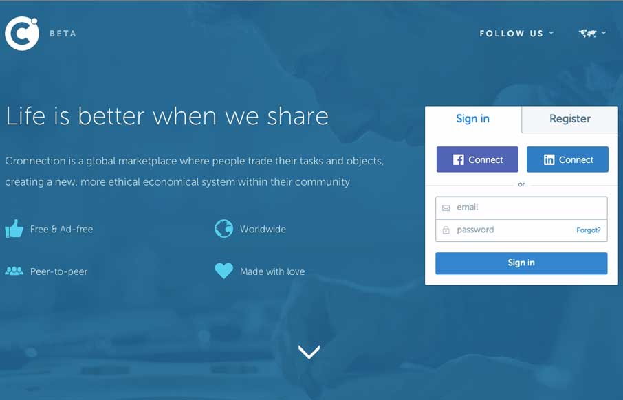
Cronnection
I love a lot of the detail work in the different visual sections of this site. The way things are stacked and lined up is pretty tight and while very similar to other website's feels a little different somehow. Submitted by: Álvaro Castaño @cronnection Role: Designer...
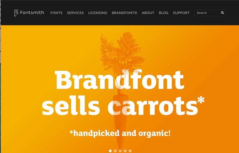
Font Smith
Very clean and simple design but very effective. Especially for font websites brevity is clarity. Luuurrve this.
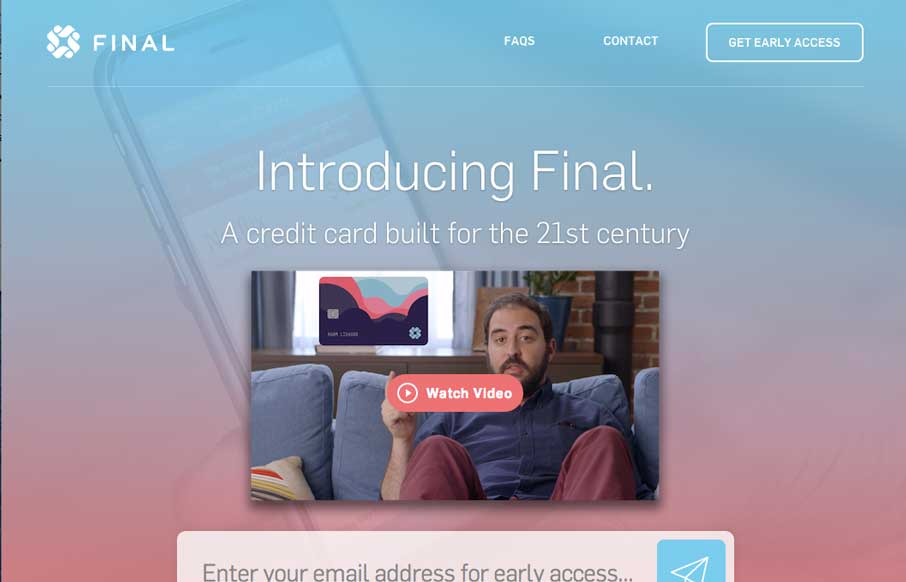
Final
You just have to love a website design that get's spacing. That's the thing that hits me the most on this site, the spacing and timing of all the elements and sections as you scroll down. Put that together with the soft feel they've used for all the elements and this...
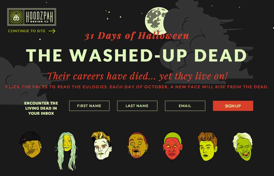
The Washed-Up Dead
Oh man! So much fun! There's not much to say about it, but really awesome stuff for October.
EMAIL NEWSLETTER
News & Articles
Introducing the UMS Book Club
 Sign up for the UMS Book Club. A Live Q&A with book authors, it’s a members only thing so make sure and get signed up.
Professional Product Review: Silverback
 Professional product review of the usability testing app Silverback. By Jenn Downs usability expert at Mailchimp.
Chat Session: Parker Wightman
 Talking with Parker Wightman of Mysterious Trousers about their new iPhone/iOS learning app.

HARD WORK. CLEAN FUEL. NO EXCUSES
Use “WARRIOR2023″ for 10% off.