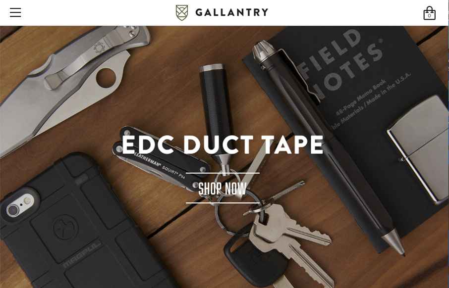
Pretty standard faire as far as an ecommerce layout goes. But I love the way the photography and overall simplification and coloring of the website itself is done. It all goes seamlessly together. That footer area too, nice.
Glassmorphism: The Transparent Design Trend That Refuses to Fade
Glassmorphism brings transparency, depth, and light back into modern UI. Learn how this “frosted glass” design trend enhances hierarchy, focus, and atmosphere, plus how to implement it in CSS responsibly.


0 Comments