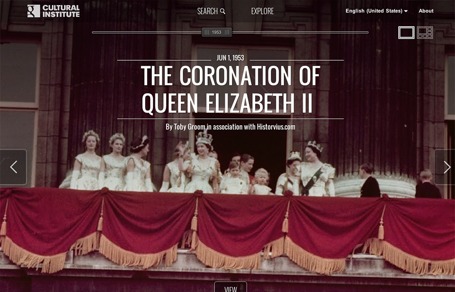
by Gene Crawford | Oct 17, 2012 | Education, Gallery
This design is just crazy. Super intense interaction work both full window then grid style ways to get into the content/stories. Spend some time on this site and really dig into it. It’s worth it.

by Gene Crawford | Oct 16, 2012 | Education, Gallery
There is a ton of stuff going on with this home page. There’s buttons and links everywhere but somehow they’ve managed to keep it all straight visually so you can scan it and get around. There are 3 main navigation sections/schemes in play but...
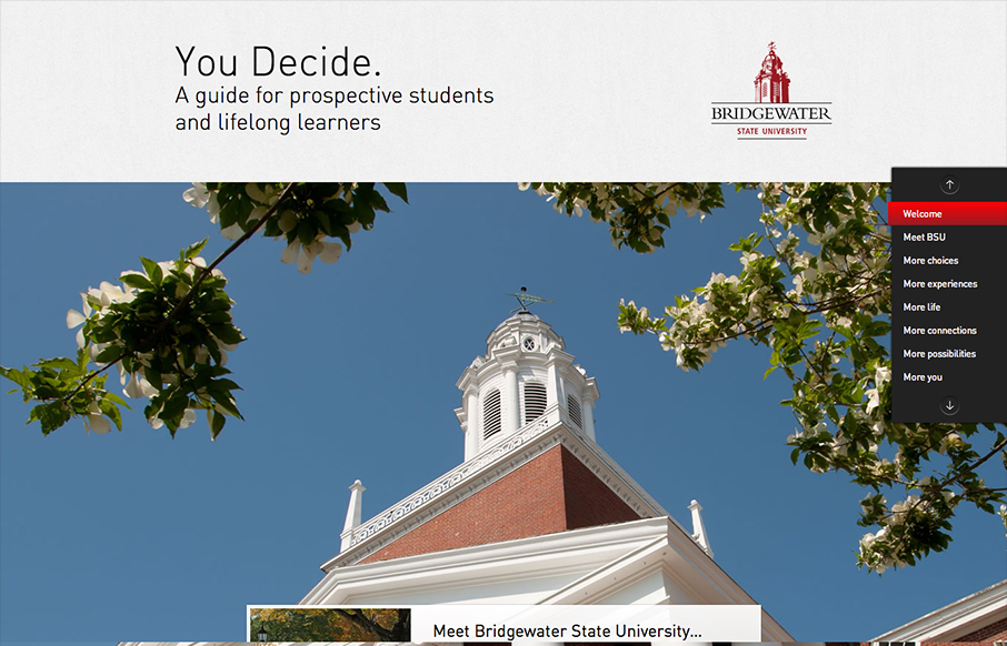
by Gene Crawford | Oct 9, 2012 | Education, Gallery
The whole purpose of this site/page is to help you decide to become a student at this school. It’s a great linear narrative and it uses some cool techniques to engage you and some super great photography to show you around. I dig the fixed navigation design, it...
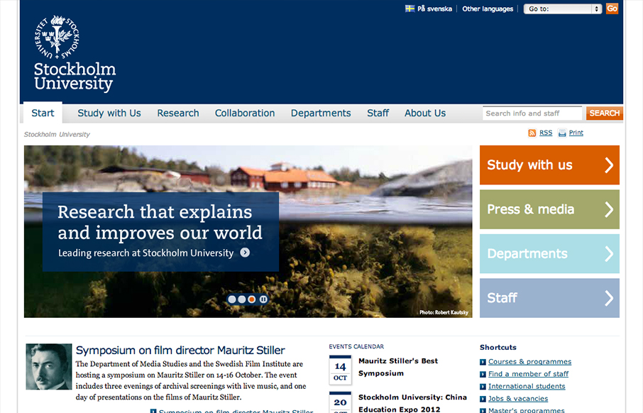
by Gene Crawford | Oct 9, 2012 | Education, Gallery
Looks like @stockholm_uni just went responsive! su.se/english/ /via @jan_lof(Some nice adaptation patterns in there, by the way.)— Responsive Design (@RWD) October 8, 2012 Really dig into the main “hero” area and main navigation and look at the...
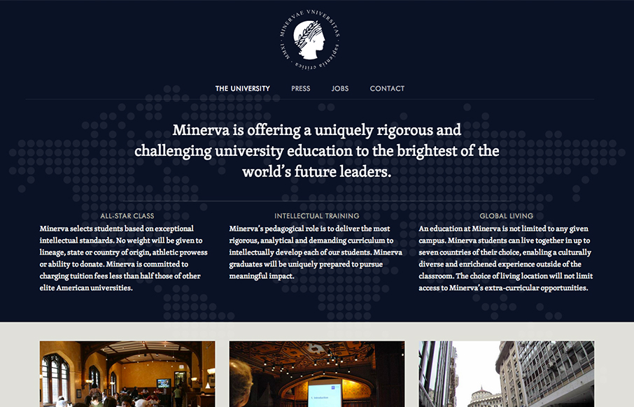
by Gene Crawford | Oct 3, 2012 | Education, Gallery
I like the patter of going dark to light with a top down design for websites like this. It makes the transition into more dense content very palatable to me for some reason. The way the navigation get’s fixed as you scroll down the page on this site is a nice...
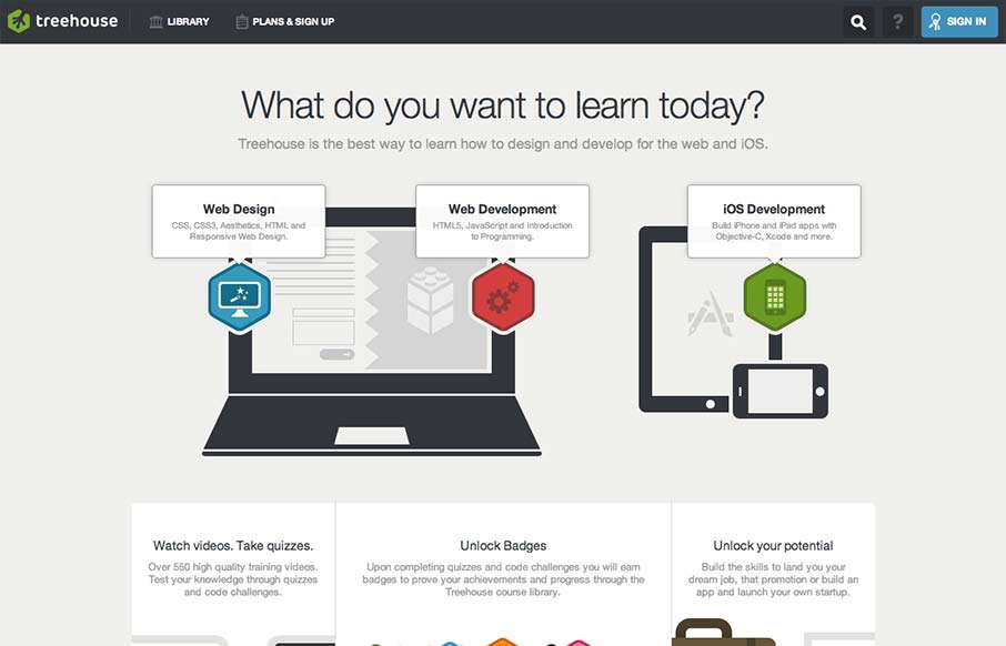
by Gene Crawford | Sep 4, 2012 | Education, Gallery
Really tight design for the Treehouse website. I love the main graphic with the interactions that make the other elements on the illustration disappear. They work really well to pull you in deeper into the chosen section. I equally like the fixed header and how...