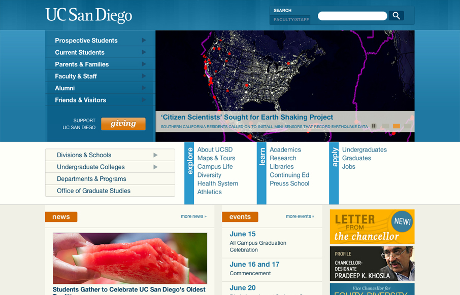
The UC San Diego website is very modular and square which is softened up a bit by the colors and a few slightly rounded corners here and there. There are a few sections of the home page that fall into a sort of “i’m just tired of designing” sort of vibe, like all the badges/ads on the lower right side. I know how that can happen in the design process of a website like one this large and sprawling. I just had to get that off my chest.
The thing that’s really beautifully done is the responsive design. There are quite a few breakpoints designed for and some really interesting decisions made on how elements move and get treated as it get’s broken down. It really is worth spending some time resizing and watching what happens on this site, lots of stuff to take in.


0 Comments