
by Maria | Feb 25, 2013 | Education, Gallery
Sensory parfait. The layers of sounds, texture, and motion are only the beginning. I love the parallel, whether intended or not, of the site having a Choose Your Own Adventure feel. Metaphorically, it works so well on a site for getting a higher education degree. I...

by Gene Crawford | Jan 7, 2013 | Education, Gallery
The @happycog-designed responsive redesign of delval.edu is seriously stunning. Love. /via @zeldman— Responsive Design (@RWD) December 19, 2012 I love the visual style of this site. It’s blocky and squared off and generally feels very graphic. I dig the...
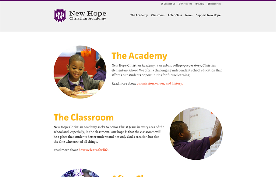
by Gene Crawford | Nov 16, 2012 | Church/Religious, Education, Gallery
This new site launch by SimpleFocus is very intriguing to me. It has a nice simplified feeling to the layout visually but there’s still just about as much “stuff” on the page as any typical site I’ve seen. I can’t help but think this is...
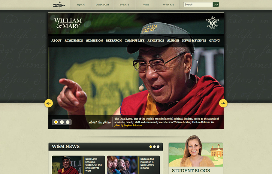
by Gene Crawford | Oct 22, 2012 | Education, Gallery
The William & Mary website is gorgeous. Solid responsive design solution, dig it. Then I just love the proportions of everything, it feels really natural to me to use. I also like the bottom half, as I know the designers are forced to put in a bunch of...

by Gene Crawford | Oct 22, 2012 | Education, Gallery
The navigation design for Regent College is quite interesting. The multi-colors and angles make it visually dynamic. Then there’s a strong drop-down design too. Good responsive execution to boot makes it a pretty dang nice design overall to check out.

by Gene Crawford | Oct 19, 2012 | Education, Gallery, Music
By SimpleFocus out of Memphis TN. Beautiful website design for the Memphis Music Hall of Fame by the fine team at Simple Focus. I really love the interactions on the images, it let’s people know right away by way of visual feedback what’s an active link....