by Matt Keogh | Aug 22, 2013 | Education, Gallery
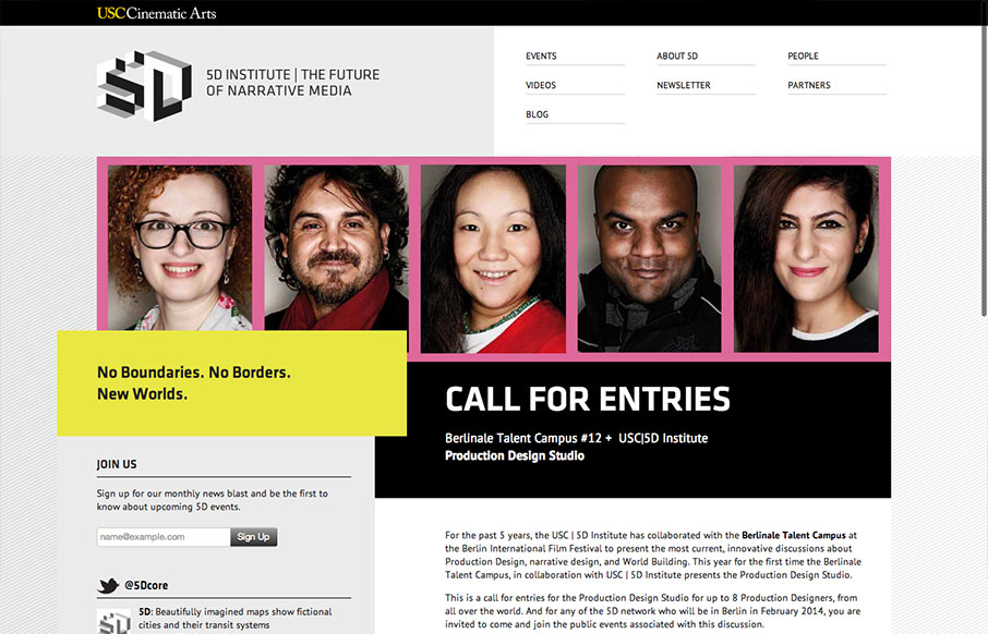
I was immediately drawn to this website by its unusual use of the grid on the larger screened “desktop” layout. The navigation and logo area are split into two 50% columns. This simplicity allows other elements to be moved purposefully “off grid”. It’s eye-catching,...

by Maria | Aug 19, 2013 | Education, Gallery
The new VCU site (specifically the home page) is chock full of info that’s nicely organized and presented. Despite all that’s going on here, I feel like they struck a good balance between practical and promotional elements. Even more impressive is the...

by Giovanni DiFeterici | May 30, 2013 | Education, Gallery
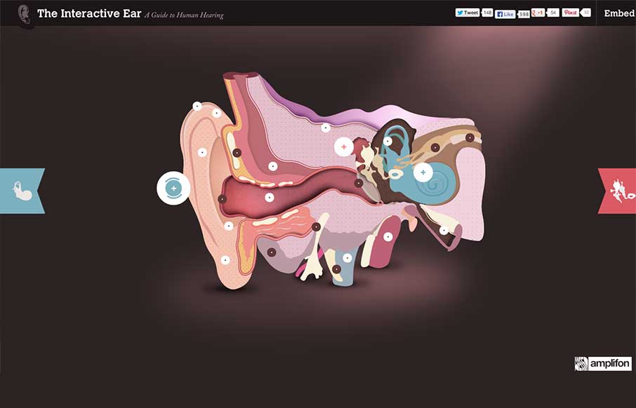
This site is wonderful. It’s a perfect marriage of incredible art, information, and interaction. I often find that designers working with information make an arbitrary distinction between content and artwork. The artwork is treated as a supplement to the...

by Giovanni DiFeterici | May 16, 2013 | Education, Gallery
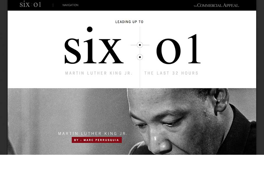
This is about as beautiful a timeline as I’ve ever seen. The content is presented clearly and concisely. It’s linear presentation is perfect for telling a story and the mix of images, video, and text creates a rhythm that punctuates the high points of...

by Gene Crawford | Mar 11, 2013 | Education, Gallery
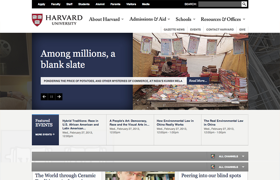
This is a well structured website. The grid is clear and easy to visually track the different sections of links. College websites are traditionally over-packed with links, this one is no exception but it’s designed in visual chunks so you can take it all in. I...

by Maria | Feb 25, 2013 | Education, Gallery
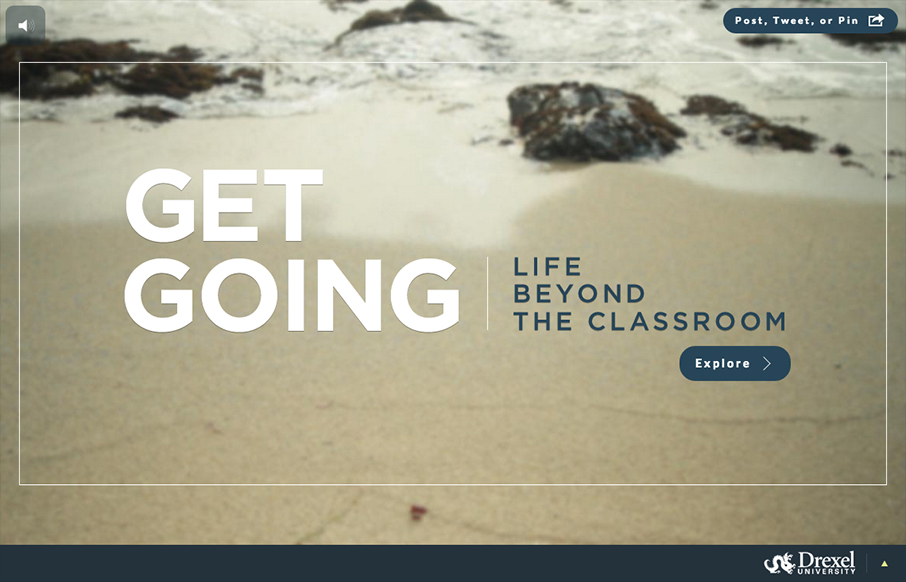
Sensory parfait. The layers of sounds, texture, and motion are only the beginning. I love the parallel, whether intended or not, of the site having a Choose Your Own Adventure feel. Metaphorically, it works so well on a site for getting a higher education degree. I...
