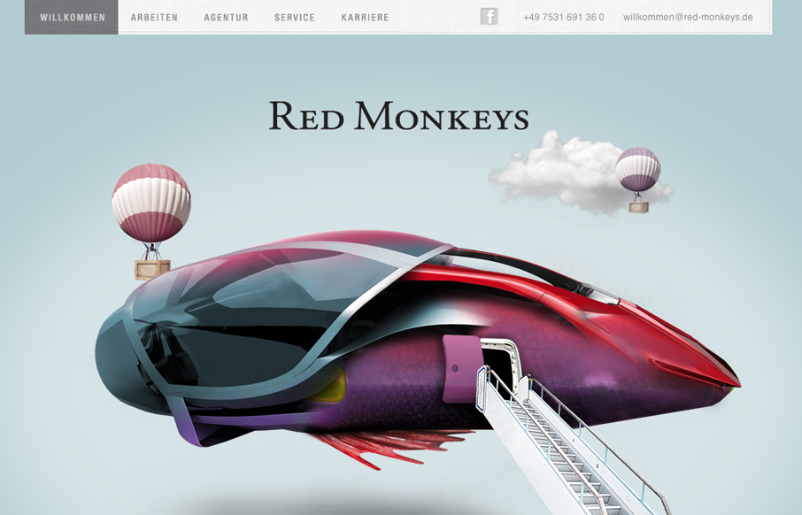
by Gene Crawford | Jul 24, 2012 | Design Firm, Gallery
Nice mix of fantastical illustration and parallax here. It’s fun and keeps you engaged with enough eye candy then the visual structure behind it delivers what it needs content wise. One little detail I both like and dislike is the tool tip that shows the...
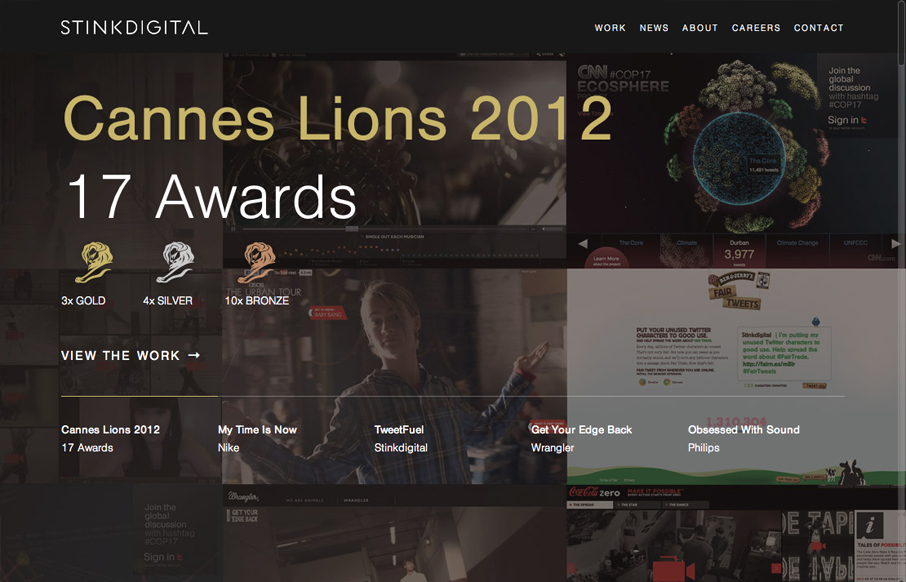
by Gene Crawford | Jul 23, 2012 | Design Firm, Gallery
Really love the parallaxy effect with the background images and the main text/copy on the home page it makes a nice stark difference between the home and sub pages. THe use of different colors for each sub page is nice overall design decision too. The website feels...
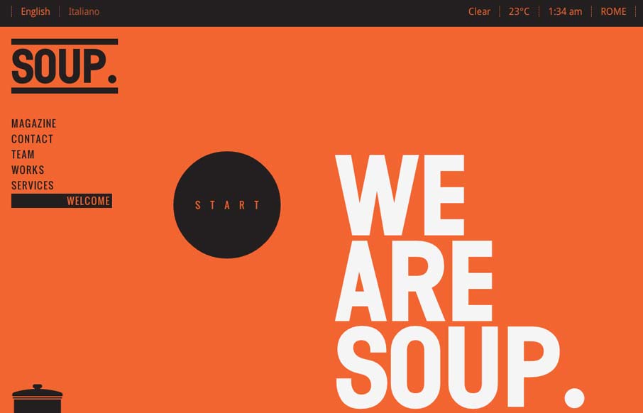
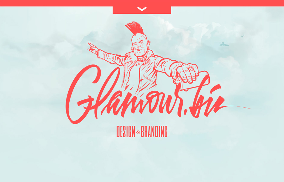
by Gene Crawford | Jul 12, 2012 | Design Firm, Gallery
Pretty cool work with such stark colors and imagery. I really like the heavy graphic feel to this layout, it’s an underutilized style these days IMHO. It’s bold and also slick with it’s build out. I dig how when you initially load the site it scrolls...
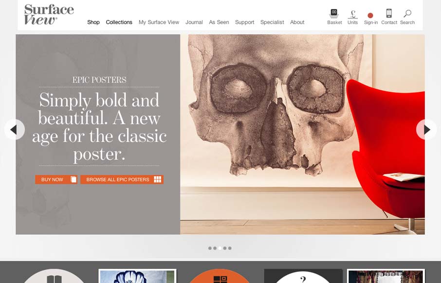
by Gene Crawford | Jul 11, 2012 | Design Firm, Gallery
I dig this mixture of fixed width elements then the jQuery Masonry section with all the products and content in it. It’s not fluid or adaptive or anything 100% – probably not the target result with the design. I still like it’s effect. Begs the...

by Gene Crawford | Jul 10, 2012 | Design Firm, Gallery
Submitted by: Iain Harper @iainharper Role: Director Working on your own projects is often the hardest and this was no exception. After three long years we needed a new site to reflect the evolution of our agency. We took a fairly pragmatic approach, trying to...
by Gene Crawford | Jul 9, 2012 | Design Firm, Gallery, Screencast Review
Submitted by: Jan Sovitsky Role: Designer & Developer Both Giovanni and I dig this design. It’s chock full of great illustration work and details. In general it’s a nice tight design that’s all kind of impressive visually. We had a few things to...