Submitted by: Steve Craw @AguruStudio
Role: Designer
I’m often against splash screens, but the one presented by agurustudio is really helpful and definitely improves the experience. The simple animation is easy to understand and introduces visitors to a behavior that might seem a little alien at first.
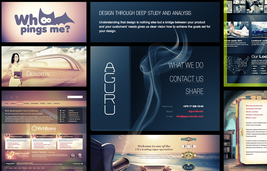
The wall of design work has great power. I love the way that it allows me to see a huge number of projects all at the same time. It has visual impact and doesn’t place the work in any specific hierarchy. I think that encourages a visitor to browse and explore. It feels intuitive, like I’m casting around photos or something.
Each detail page is gorgeously laid out as well, with little explanatory copy getting in the way.
I think this is a damn near perfect portfolio site. It’s lush and puts the work in the forefront of the user’s experience; it’s slick and has interesting and intuitive interactions; and it doesn’t bog me down with flippant or extraneous copy.
Sadly, not responsive. The drag functionality actually works really well on the iPhone, but the sub-pages are almost worthless at such a small size.
Oh, well. I don’t even care. I love it!


0 Comments