by Maria | Jul 2, 2012 | Design Firm, Gallery
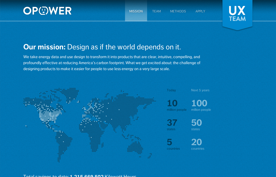
Digging the new Opower UX team site bit.ly/LBtazr with fun facts & some friendly energy savings competition (cc: @jimjones) — Samantha Warren (@SamanthaToy) June 27, 2012 This is a nice representation of the Opower UX Team from their collective mission down to...
by Gene Crawford | May 16, 2012 | Design Firm, Gallery
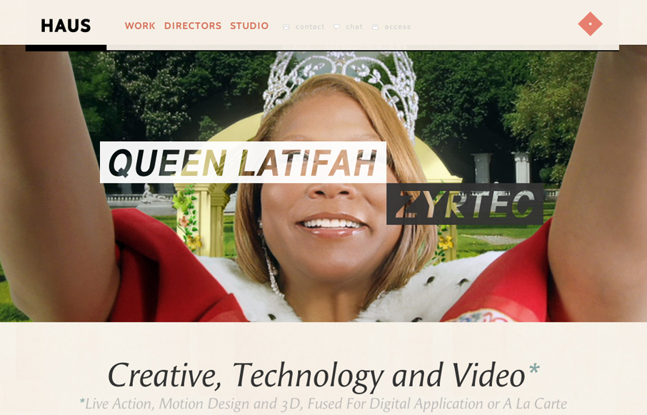
I immediately love the content hierarchy on the home page, the shapes and spacing of the content groupings really let it ease into your view. The fixed header is a nice touch, especially the slight transparency as you scroll. Really loving the circle images and the...
by Gene Crawford | Apr 12, 2012 | Design Firm, Gallery
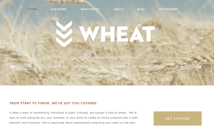
Just a beautiful design, simple as that. I love the big bold image of the wheat and the large WHEAT set on top of it. Subtle yet not at all. The rest of the site is a display of restraint by the designer, which shows maturity to me. Love it.
by Gene Crawford | Apr 4, 2012 | Design Firm, Gallery
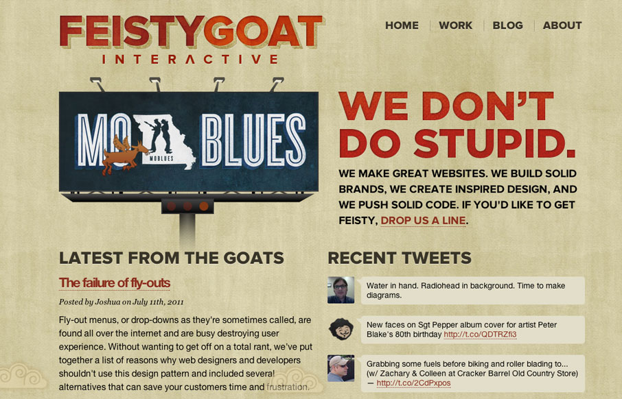
I love the bold two column layout of the Feisty Goat website. The animations are fun and the overall tone is indeed feisty. I really like that they have thought out their brand’s tone so fully and push it with the copy and everything. In this case it really...
by Gene Crawford | Mar 13, 2012 | Design Firm, Gallery
I love the tone and vibe of this website. It’s subdued a bit and super tight on subtle detail. The photos are all really crisp feeling and inviting – people, and they look like folks i’d like to hang out with. It’s also a well worked out...
by Gene Crawford | Mar 7, 2012 | Design Firm, Gallery
The new nclud site design is a nice example of advanced trickery and nice narrative. I love how things “unfold” for you as you mouse around. The animations are nice as well. The way the work samples slide into view is beautifully done. They even made it...