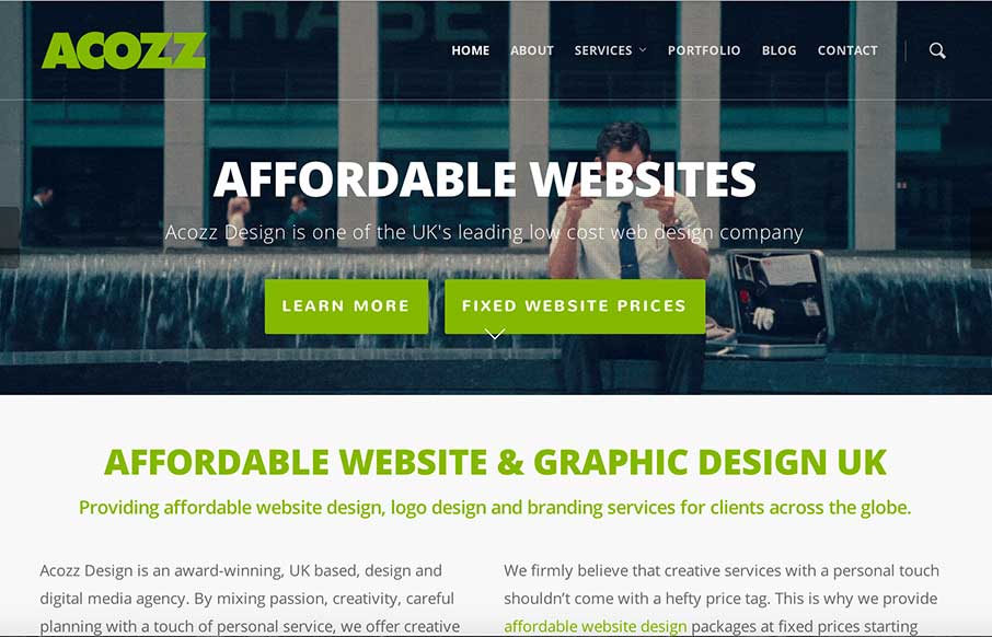
by Gene Crawford | Nov 18, 2014 | Gallery
Pretty clever and simple looking site for the web design agency Acozz Design. I dig the colors and the amount of content they’ve developed is wonderful. I particularly like the animated gif work on the headers. Though i’m not wild about the transition...

by Gene Crawford | Nov 17, 2014 | Entertainment, Gallery
Pretty cool experience with the content of this site. It took me a bit to figure out what this website/company is about, but when you do it’s cool. Make sure you watch the video – and see the “live” news feed at the bottom of the home page...
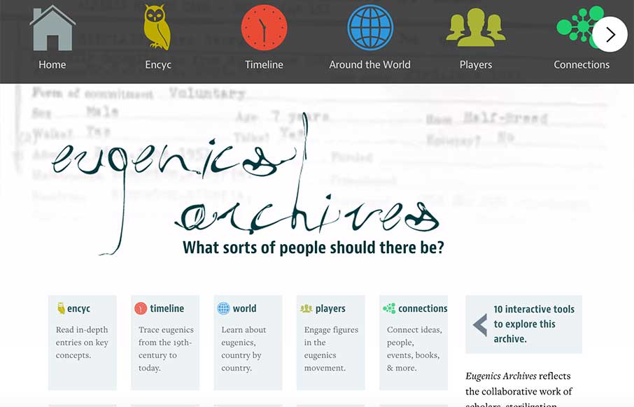
by Aaron Griswold | Nov 11, 2014 | Gallery, Social Cause
This is a fascinating site for two reasons. The first is the amount of work that went into each section of interactivity (re: every page is wholly different from the rest of the pages). The second part is of the information itself. The about page info is a little hard...
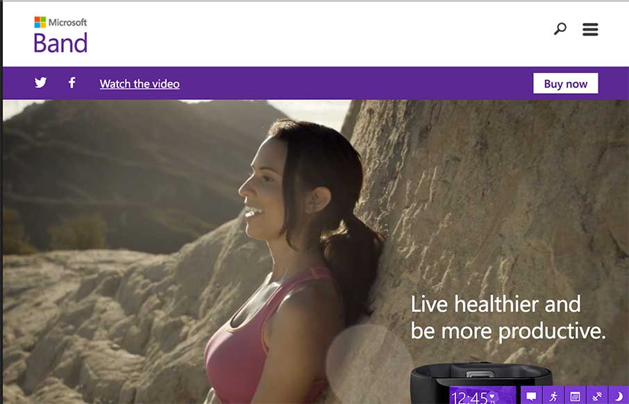
by Aaron Griswold | Nov 10, 2014 | Gallery, Sports/Recreation
My first thought after going through this site was, “me want.” Which should be the point of a site like this. Then I remembered that I’m looking at the site for a different reason… so… basically, I had a good time on the the site –...
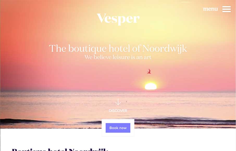
by Gene Crawford | Nov 3, 2014 | Gallery, Travel
I really like the way the “departure” and “arrival” search is placed. It’s front and center, very good UI. I also dig the way the images reveal as you scroll down, normally I don’t like that kind of treatment too much but it works...