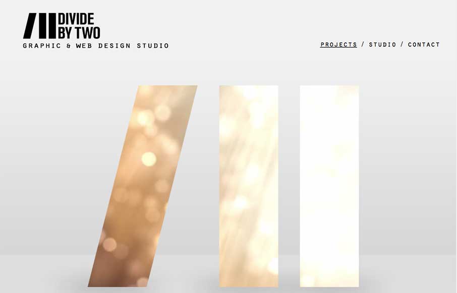
by Gene Crawford | Oct 31, 2014 | Gallery
Nice simple layout. I like the logo treatment in the hero image space with the animation/video in the background of the letter forms. Nice touch there. Submitted by: Joana Carvalho Role: Designer & Developer This is my own studio’s website. We tried to...
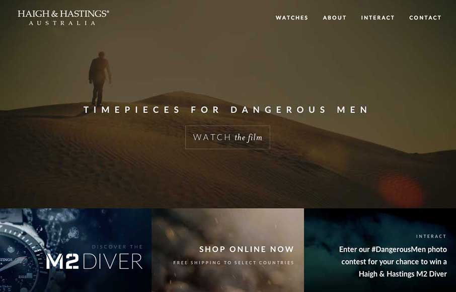
by Gene Crawford | Oct 30, 2014 | Gallery
Very different vibe than what i’m used to seeing with the Haigh And Hastings website layout. I really like how the overall layout changes for the different screen widths. There’s some dramatic layout changes – check it out.
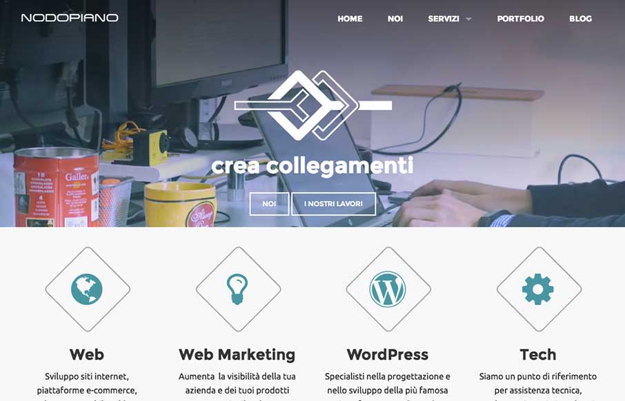
by Gene Crawford | Oct 27, 2014 | Gallery
It’s always nice when there’s a strong base to a design and always awesome when you layer good detail work on top of that strong base. That’s what the Nodopiano site design does so well. This is my last work,the website for an italian web agency....
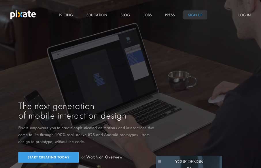
by Aaron Griswold | Oct 24, 2014 | Gallery
As you may have guessed by now, we see a ton of websites – good, bad, spam (ugly). We also have seen every “app product page”, that most have never deviated from the structure of the Square Reader product page from 3 years ago… Pixate could...
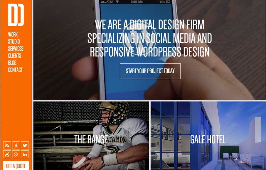
by Gene Crawford | Oct 20, 2014 | Gallery
You don’t see many site designs that have that fixed nav bar layout anymore, it’s not part of what’s trending. But when you find a site with it done and done well, it’s good stuff indeed. I really dig this layout, it’s very intuitive and...