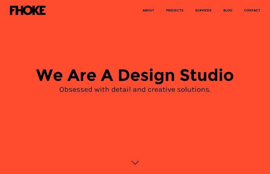
by Aaron Griswold | Apr 27, 2015 | Gallery
Reviewed Fhoke.com out of the UK less than 1 year ago….https://unmatchedstyle.com/gallery/fhoke.php – and like their new stuff. Listen, anyone who uses orange + full width + 880px headshots on the About page, is going big and bold with their design....
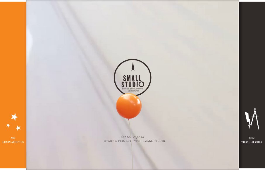
by Aaron Griswold | Apr 23, 2015 | Gallery
Whoah. I’m not sure where to start on the agency site from Small Studio out of Melbourne, Australia. There is so much going on, and for the most part it seems seamless design-wise (I’m still a little tripped up on what the balloon is in the client...
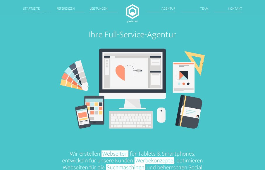
by Aaron Griswold | Apr 22, 2015 | Gallery
What I like about the pixelsmart agency site out of Germany is that they stick to a theme throughout the site – honey comb or angled view of a cube and turn it into a flat icon, you get a hexagon which shape is utilized heavily in their content design. It looks...
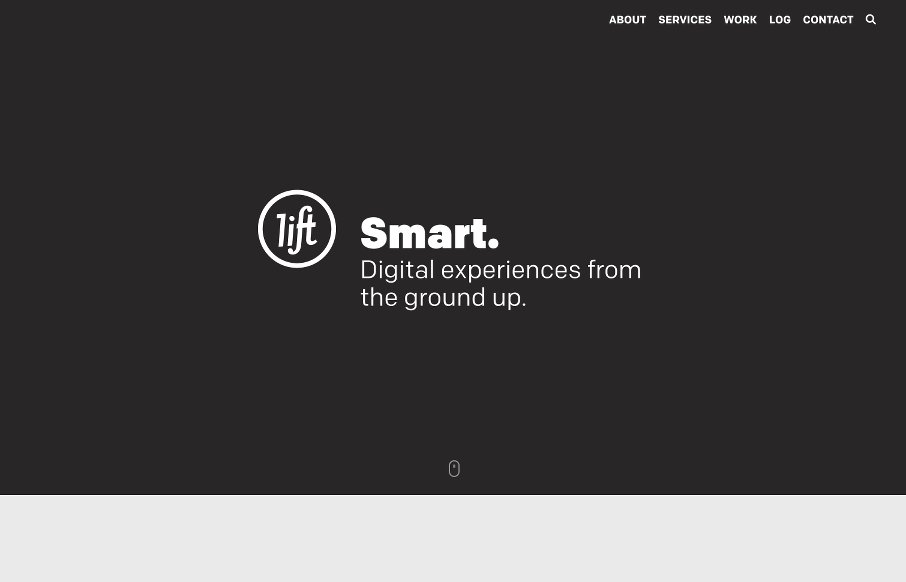
by Aaron Griswold | Apr 21, 2015 | Gallery
Love it when we get a chance to review sites a second (and third time) like Lift Interactive out of Edmonton. They’ve made another good one here. Like the mix of text treatments, b/w background images / color images / flat color illustrations. It all seems to...
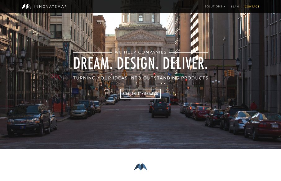
by Aaron Griswold | Apr 21, 2015 | Gallery, Marketing Company
Solid midwestern work from InnovateMap out of Indianapolis (borrowing from the designer below). Like this trend to have softer edges on images, more of an Instagram feel when it comes to portraying companies (compared to sites that have stark, bright, fake / stock...