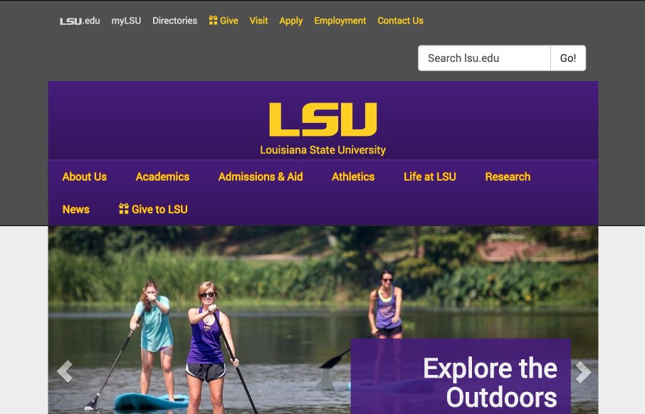
by Aaron Griswold | Jul 15, 2015 | Education, Gallery
Like the look of the new LSU (Louisiana State University) website. Not wild about the colors… because I’m a U of South Carolina fan… so discount what I just said – the those are school colors, and look good for the site 🙂 Think it’s...
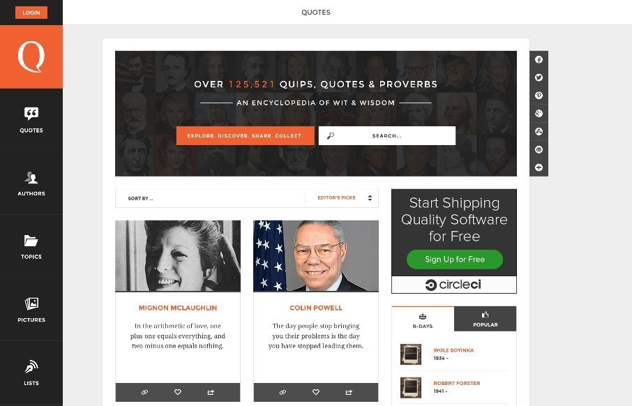
by Aaron Griswold | Jul 13, 2015 | Gallery
I’m a quote person – have them delivered daily to my interweb mail portal. The Quotarty looks pretty fun – looks like a very updated and organized quote site, compared to the normal, spammy, 1996 quote sites that, well have been around since 1996...
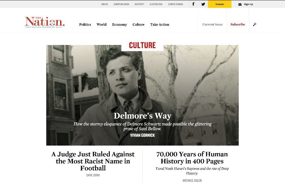
by Aaron Griswold | Jul 13, 2015 | Gallery
We’ve seen a lot of “newspaper / magazine” type site launches this year – and cool to see America’s oldest weekly magazine do the same. Like the top story categories at the top of the page (think they change as big issues do). Really like...
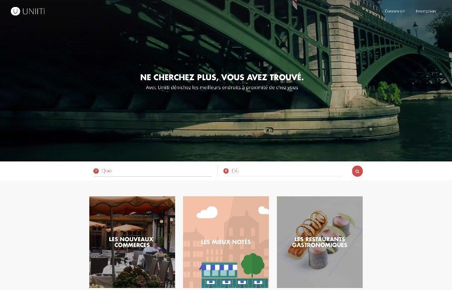
by John David Hunt | Jul 9, 2015 | Food and Beverage, Gallery
We’ve reviewed Uniiti’s work out of France before – this looks like their recommendation app for restaurants and other services. Apparently the footer landscape image changed. Last night it was a dark sky with a rocket ship and this morning...
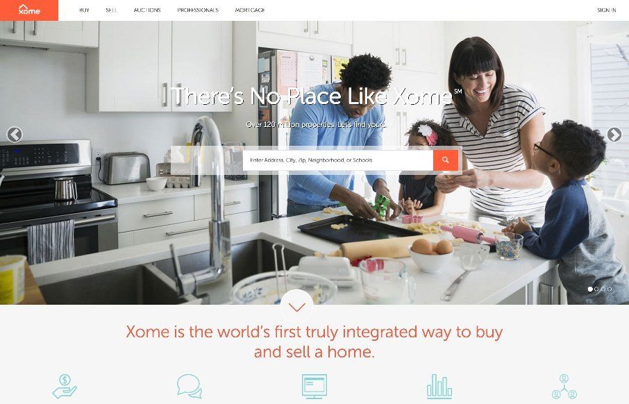
by Aaron Griswold | Jun 18, 2015 | Gallery
Pretty cool experience for a search based website. I like how the search is focused on top of the main hero image space. Keeps it front and center. There’s very little small screen width experience here but overall for desktop it’s tops. Cool form elements...