by Gene Crawford | Apr 25, 2016 | Fashion, Gallery
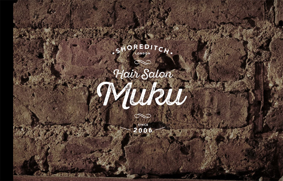
Love the graphic design, the logo and imagery. Really nice look and feel. Then the approach to the layout is solid as well, the nav isn’t really necessary and that’s smart from a user and mobile perspective. Then when you get to the hamburger there some...
by Gene Crawford | Apr 21, 2016 | Gallery
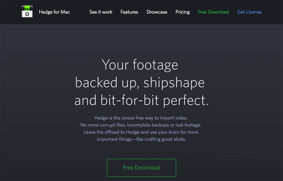
Pretty nifty app/product website. I dig the animated piece that explains what the app does and how it works. Also nifty that it’s largely a dark background site. Wanting to showcase Hedge’s main features we chose to feature an animation combined with a a...
by Gene Crawford | Apr 21, 2016 | Gallery
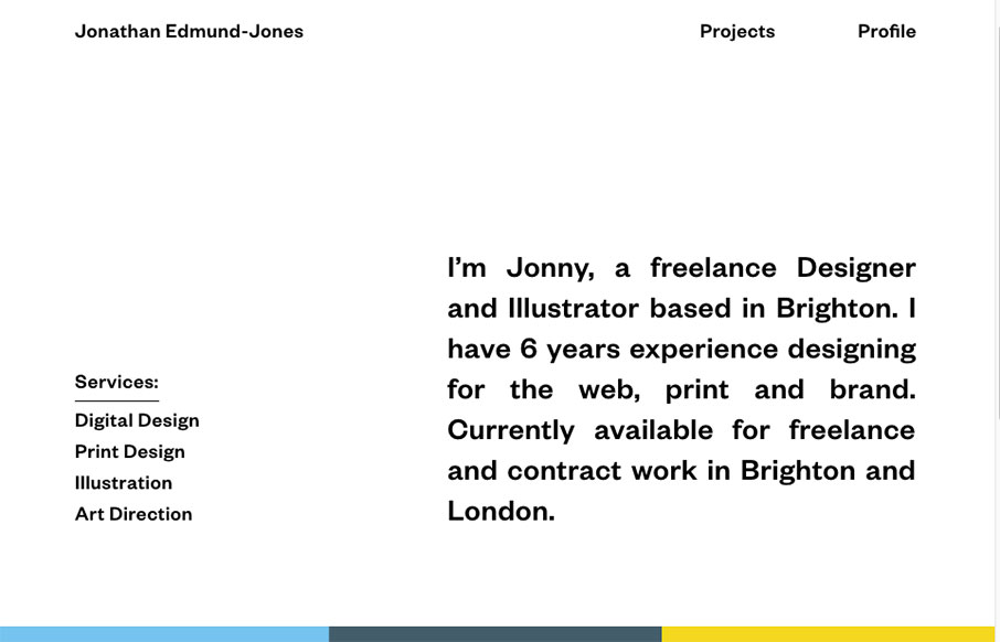
Pretty nifty and very different looking/feeling site design for Jonathan Edmund-Jones. I like the way the top half is black and white and all text with the second half mostly color and work samples. It’s a nice reveal as you scroll down, creating a pretty nifty...
by Gene Crawford | Apr 21, 2016 | Gallery
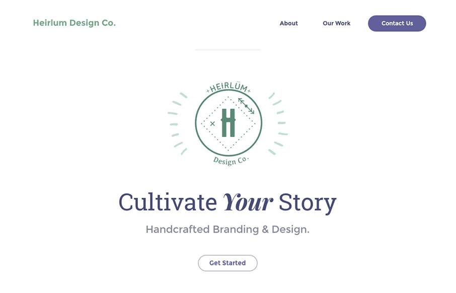
I really dig the look and feel of this website layout. It has just the right amount of detail work and minimal approach to make me take a closer look. The off kilter layout is very original feeling too. Great work. From the Designer: We wanted this website to be super...
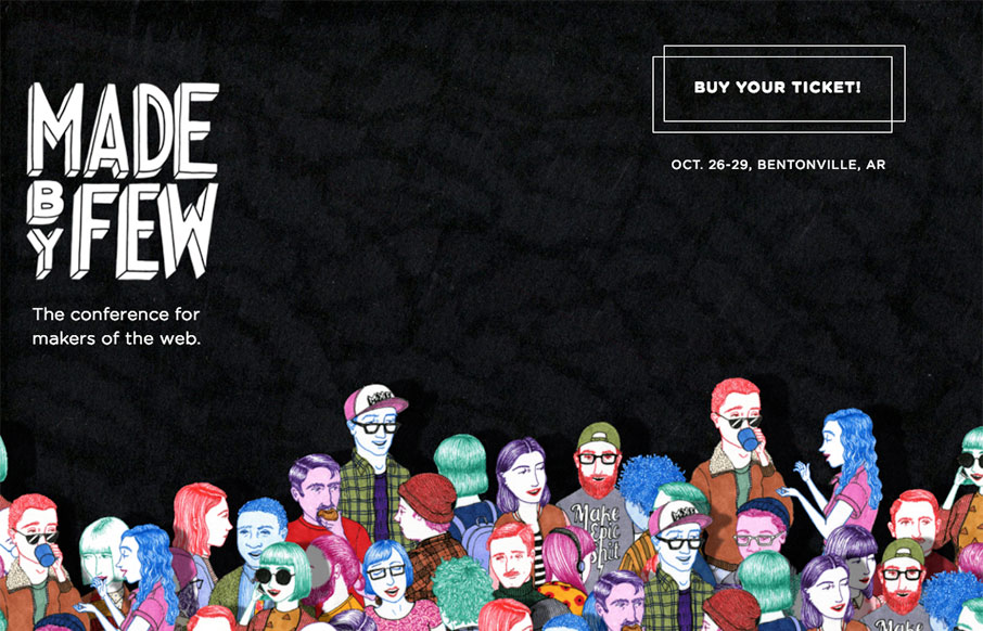
by Gene Crawford | Apr 20, 2016 | Gallery
Just LUUURRRVVE the new Made By Few 2016 website. That little parallax effect is badass and the illustrations blow me away. Here at UMS we totally understand what a pile of work getting a website this cool is… Great job all around ya’ll. This year’s...
