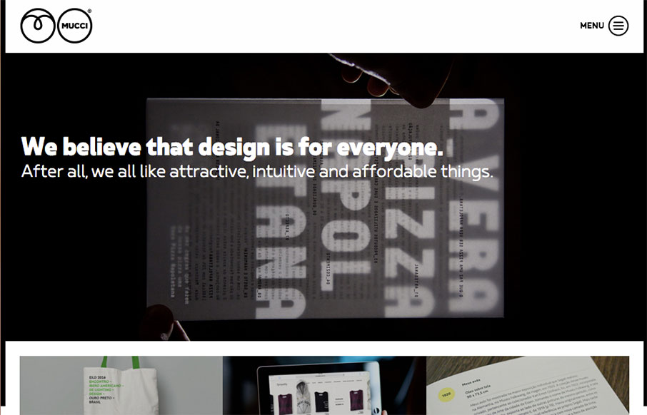
by Gene Crawford | Apr 28, 2016 | Gallery
Clever layout for Mucci Estúdio. I dig the main nav interaction and how the hero image get’s folded up under it when you scroll. From the Designer: Mucci Estúdio is a graphic and web design studio based in São Paulo, Brazil. Submitted by: André Giacomucci...

by Gene Crawford | Apr 27, 2016 | Gallery
Badass looking design for Sugar Vision. I love all the things! It has solid design and layout and execution and also heart. I love the vibe and design approach, so much cool. From the Designer: Sugar Vision is a dedicated team of experienced creatives working on...

by Gene Crawford | Apr 26, 2016 | Gallery
Pretty solid design work here. I really dig the way the logo slides over the word mark as you scroll down. The remainder of the home page layout is well done, with the different sections giving it a good rhythm and corporate vibe. From the Designer: As a digital...
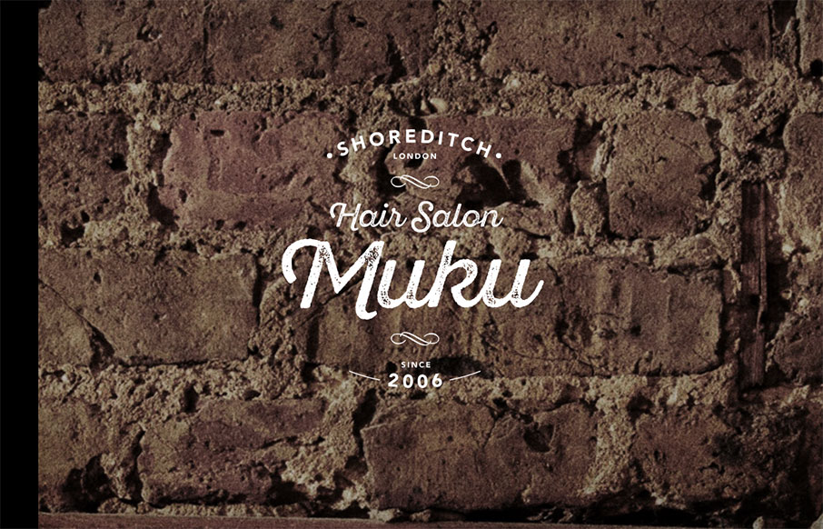
by Gene Crawford | Apr 25, 2016 | Fashion, Gallery
Love the graphic design, the logo and imagery. Really nice look and feel. Then the approach to the layout is solid as well, the nav isn’t really necessary and that’s smart from a user and mobile perspective. Then when you get to the hamburger there some...
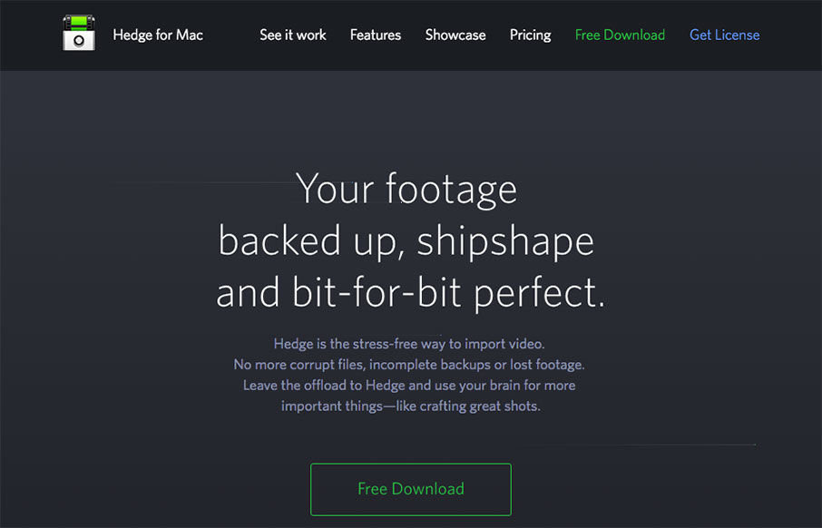
by Gene Crawford | Apr 21, 2016 | Gallery
Pretty nifty app/product website. I dig the animated piece that explains what the app does and how it works. Also nifty that it’s largely a dark background site. Wanting to showcase Hedge’s main features we chose to feature an animation combined with a a...