by Gene Crawford | Aug 20, 2015 | Gallery
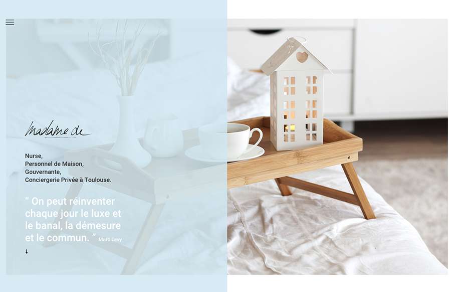
Pretty cool look to this website, it’s soft and open feeling. I also really love the placement of the hamburger icon inside the top left corner of that darker shade/color box. It draws my eye there almost instantly.

by Gene Crawford | Aug 19, 2015 | Gallery
There are some really intricate interactions at play on this site. I like the little toggle areas where you can view multiple types of content in the spot on the page, as well as the side scrolling section. It plays into the target audience a bit too I believe. The...
by Gene Crawford | Aug 19, 2015 | Gallery
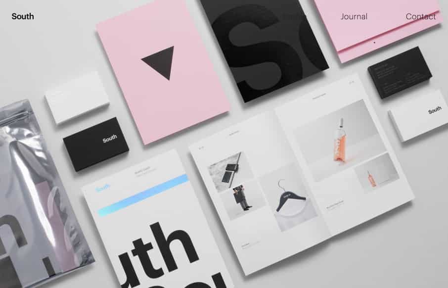
Beautifully designed minimalist website for Studio South. I love the strict grid layout and great photography of the work. Interesting approach to display the hamburger menu even though the main nav is “open” when you view it on mobile screen width.
by Gene Crawford | Aug 18, 2015 | Gallery
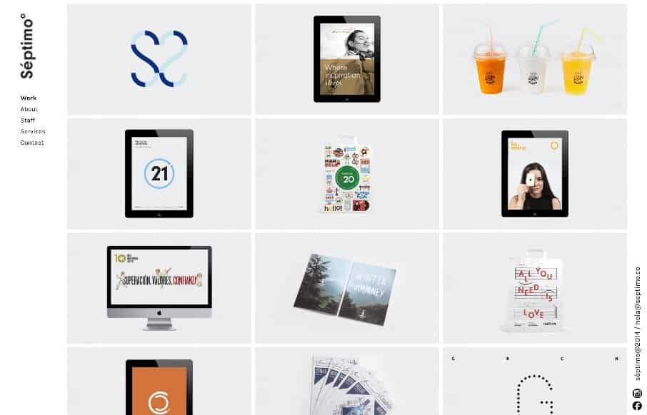
The strict “blocky” grid in this design is pretty cool. It’s been done before and fairly straightforward but when used in this context it feels fresh and unique almost. I dig the fixed left nav too. Check the different screen width design changes out...

by Gene Crawford | Aug 18, 2015 | Gallery
I like the way this site layout feels almost like a new conceptual approach, much like the app seems to be. I dig the meta-ness of this. I like a lot about how they’ve managed the design across screen widths, and if you scale the page down in your browser the...
