
by Gene Crawford | May 24, 2016 | Gallery
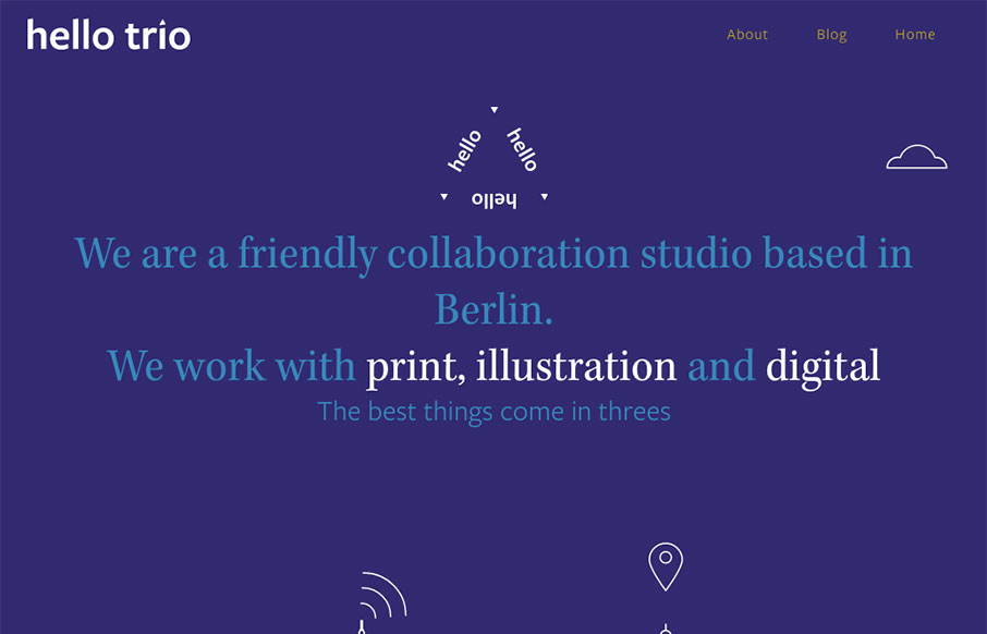
Whew. I loved making my way all the way to the bottom of this home page. The way the copy plays with the headlines and sections is brilliant. I love it. I also really dig the overall design. Colors, layout, etc… for each section, it changes up enough to show...
by Gene Crawford | May 19, 2016 | Design Firm, Gallery
Pretty cool vibe to this site. I dig the hero area and the slight parallax/apple movement technique. I also really dig the visual break down of each section as you scroll down the page. Solid work.

by Gene Crawford | May 17, 2016 | Design Firm, Gallery
What a badass website. It’s really the approach to the brand that drives this site design. From the animated background flag to each illustration and placement of content this website makes me happy. Bravo.
by Gene Crawford | May 12, 2016 | Gallery
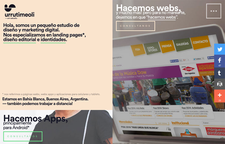
Cool grid layout to the UrrutiMeoli Estudio website. I dig the large square photos placed above the cut out style photos. It makes a nice presentation as you scroll. Giving the content good rhythm. Submitted by: Facundo Urruti Role: Designer Country:...

by Aaron Griswold | May 10, 2016 | Design Firm, Gallery
Ah man – check out this site by Nature Digital out of LA. While I’m not as wild about sites that change the footprint of your cursor, it’s cool here with the video background. But what is really cool is the layout and movement of the case studies...