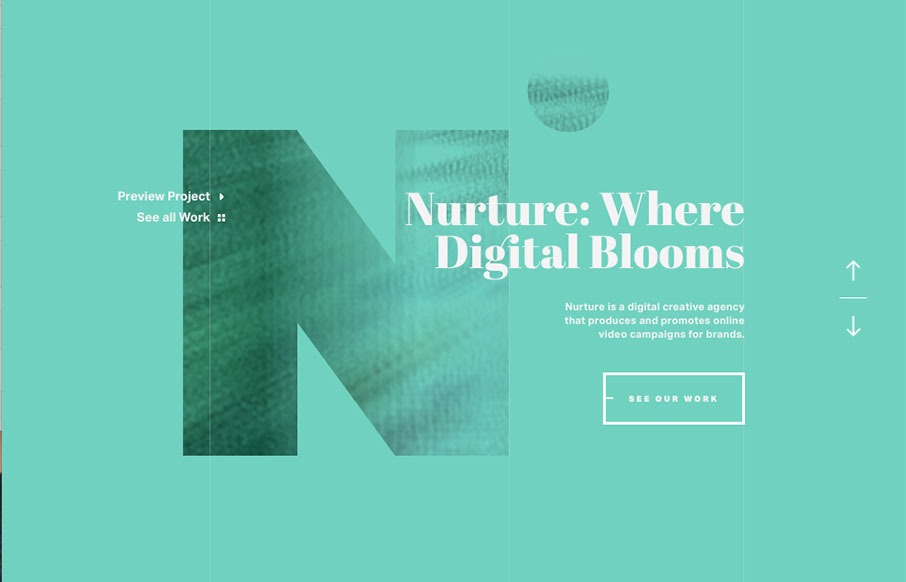
Ah man – check out this site by Nature Digital out of LA. While I’m not as wild about sites that change the footprint of your cursor, it’s cool here with the video background. But what is really cool is the layout and movement of the case studies – love the video and how it passes over to the left as the detail info starts to scroll on the right. Also love the transitions from the hamburger drawer menu to different pages – and also love the Work page itself – all very sweet!
Glassmorphism: The Transparent Design Trend That Refuses to Fade
Glassmorphism brings transparency, depth, and light back into modern UI. Learn how this “frosted glass” design trend enhances hierarchy, focus, and atmosphere, plus how to implement it in CSS responsibly.


0 Comments