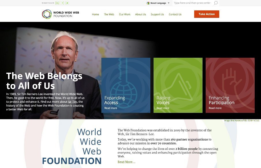
by Gene Crawford | Jun 3, 2015 | Gallery, Nonprofit
Solid, solid design here. There’s a lot to this design but I only want to look at one thing for this write up. Take a look at the screen layout changes between what looks like iPhone and iPad – the marquis areas break out of being on top of the hero image...
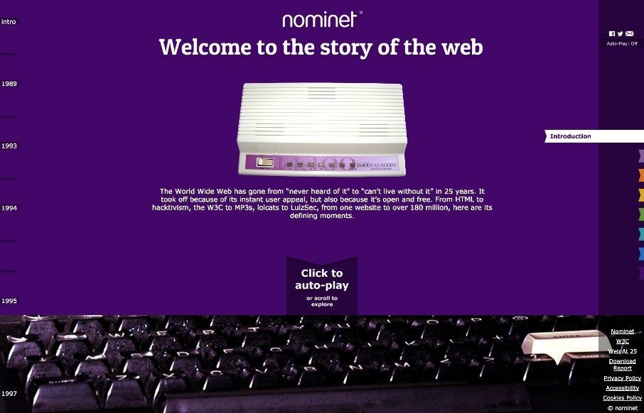
by Gene Crawford | Jun 3, 2015 | Gallery
It’s a fun website to scroll through. It’s also pretty nifty visually. I like the navigation by year and then also by major event (bookmarks). Solid stuff.
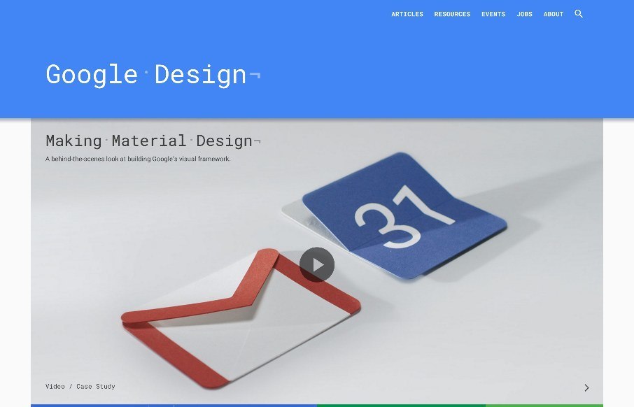
by Gene Crawford | Jun 3, 2015 | Gallery
A simple feeling design that is anything but simple. Clearly, they utilized their Material Design approach to this site. There is also some really nice little interactions, like the “ping” visual thing when you click on main links. I will say that this...
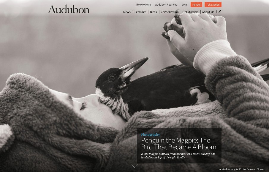
by Gene Crawford | Jun 2, 2015 | Gallery, Nonprofit
A beautifully executed website for Audubon. I love how the first thing you see is kind of like a splash screen, with a large image but still visible navigation, then as you scroll it slides up to reveal a more traditional feeling site. Then the site is not very...
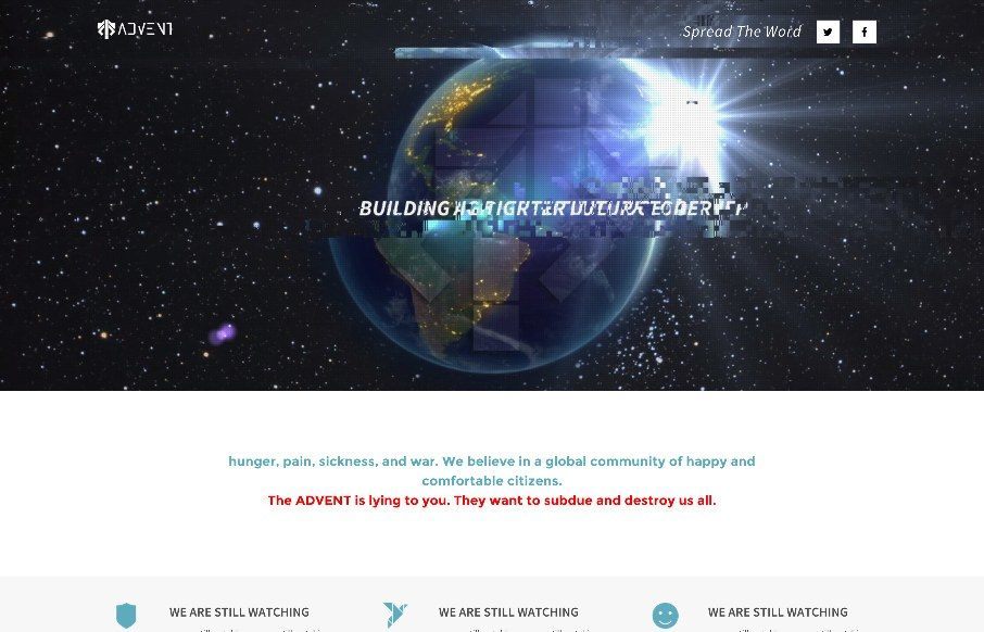
by Aaron Griswold | Jun 1, 2015 | Gallery, Gaming
What the… I only wish some of the hacked websites we’ve seen over the years could have been this cool. I’m writing this Sunday, May 31st – and not sure how the site is changing on June 1st (the last part of this one-pager for possibly a video...