
by Gene Crawford | Dec 13, 2023 | Design Firm, Gallery
Art4Web has a neat parallax header, which looks impressive. The rest of the design is pretty straightforward, using stripes to organize text and images, with some nice animations for extra flair. It’s simple but gets the job done.
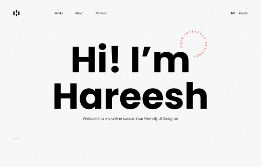
by Gene Crawford | Nov 30, 2023 | Design Firm, Gallery
Personal website portfolio for Hareesh. I love the minimalism but deep interactions as you scroll. Nice attention to detail with the type and layering of imagery. Solid work.
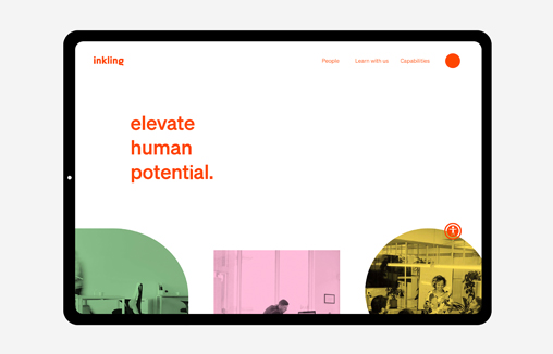
by Gene Crawford | Nov 27, 2023 | Gallery, Marketing
In need of a revamp of their brand identity and website design, Inkling approached strategic branding agency, Percept. The result was more appropriate brand positioning and a brand identity that represents the personality of the organisation.
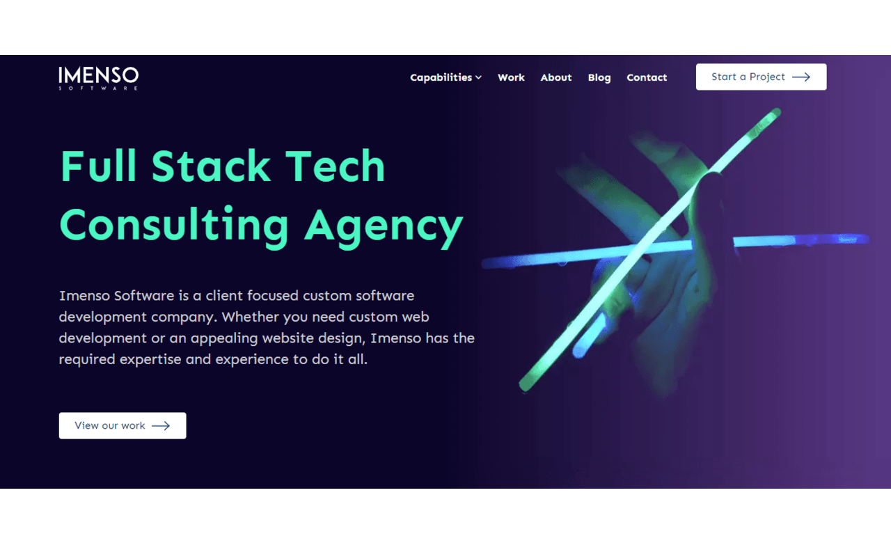
by Gene Crawford | Nov 21, 2023 | Gallery, Software
I think corporate-vibe websites get ignored in galleries mostly. I really like this one, the simple and straightforward layout and then the details here and there make it really work. I especially like the “skills” section towards the bottom of the home...
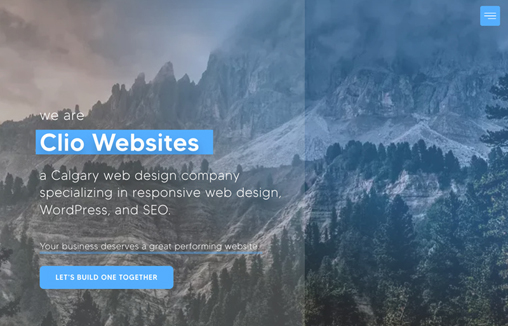
by Gene Crawford | Nov 17, 2023 | Design Firm, Gallery
Rather different feeling layout here. I really like the simple color pallet and the background image working together. Then it’s fairly minimal in it’s approach which I always love.