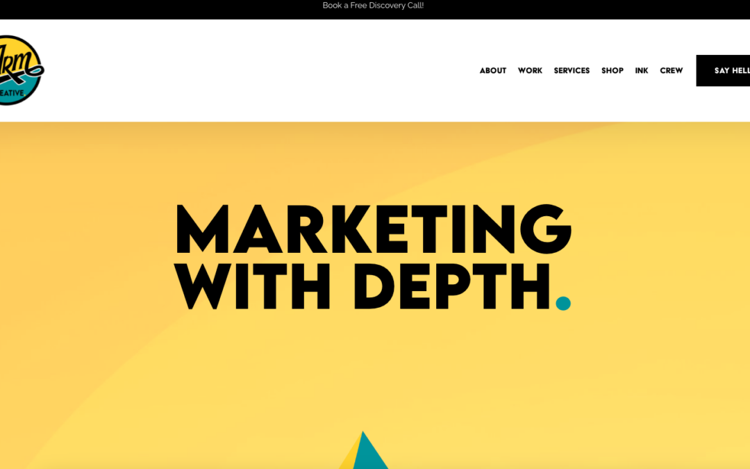
by Gene Crawford | Nov 16, 2023 | Design Firm, Gallery
ARM Creative is a company that creates marketing campaigns. They use a mixture of video and static images to offer creative production strategy to their clients.
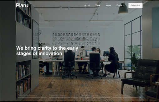
by Gene Crawford | Nov 13, 2023 | Design Firm, Gallery
Plan is an independent product strategy consultancy, helping with world-leading mobility.

by Gene Crawford | Nov 9, 2023 | Design Firm, Gallery
Plug & Play is a creative design agency with an innovative and technically skilled team. They are passionate about creating impactful digital experiences and embrace high quality and high performance design. Plug & Play specialise in Web Design, Web...

by Gene Crawford | Nov 3, 2023 | Design Firm, Gallery
In moments between client work, early mornings fueled by coffee and maybe (just maybe) some late evenings with a cocktail in hand, our re-designed studio website has come to life! We are so excited and proud to share our work with the world.
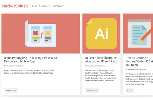
by Gene Crawford | Nov 1, 2023 | Education, Gallery, Marketing
MarketSplash: Digital Marketing & Digital Design Publication Pretty useful resource, but also a pretty neat layout and approach to a blog/website. I dig it.