by Gene Crawford | Aug 9, 2012 | Education, Entertainment, Gallery
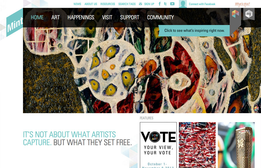
The way they’ve used the logo in the mint museum website is pretty clever it’s off the side and sort of slanted and it’s not the central element but yet it’s very noticeable. The large hero image slideshow is pretty standard but they’ve...
by Gene Crawford | Aug 8, 2012 | Food and Beverage, Gallery
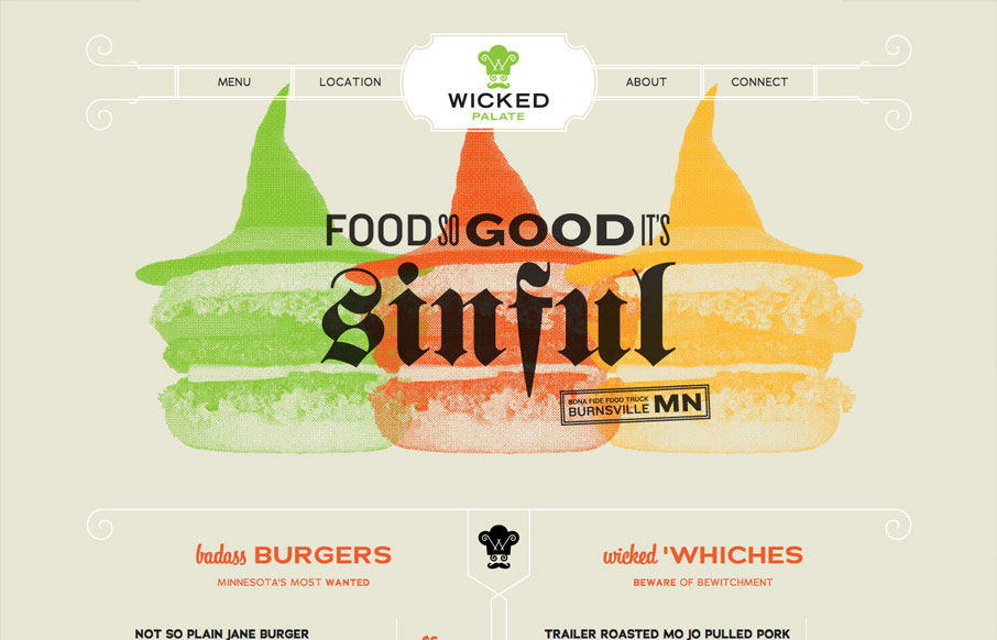
Holy cow, this is how all restaurants should do their websites. It’s a single page that uses anchors to scroll you down to the section you need. It’s mainly a menu. Then it’s responsive so you can see it on your iPhone, which I don’t know about...
by Gene Crawford | Aug 7, 2012 | Design Firm, Gallery
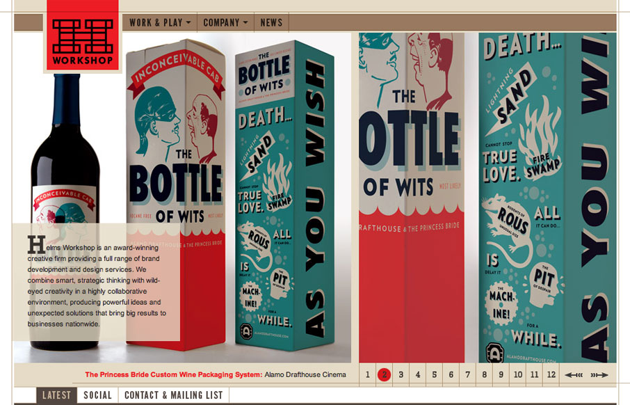
I think the Helms Workshop website has been around for a while and I’m just now seeing it. I still think it holds up really well and I love the tight typography and the minimal pallet with the browns and then the Red for highlight & focus is just nice.
by Gene Crawford | Aug 7, 2012 | Gallery, Marketing
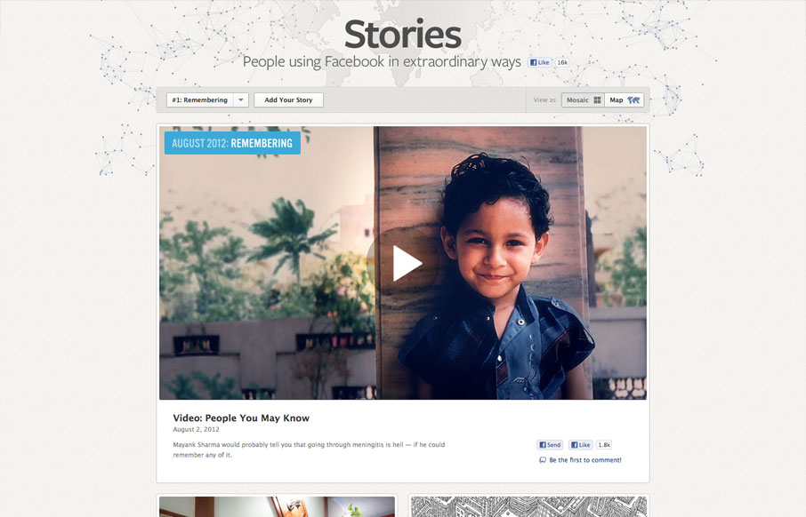
It’s cool to see such great design things coming out of Facebook. Is this what they’ve hired all those designers for? Could be, but I really like it! This design is rather minimal which is perfect for this scenario, the grid is also nice how it goes from...
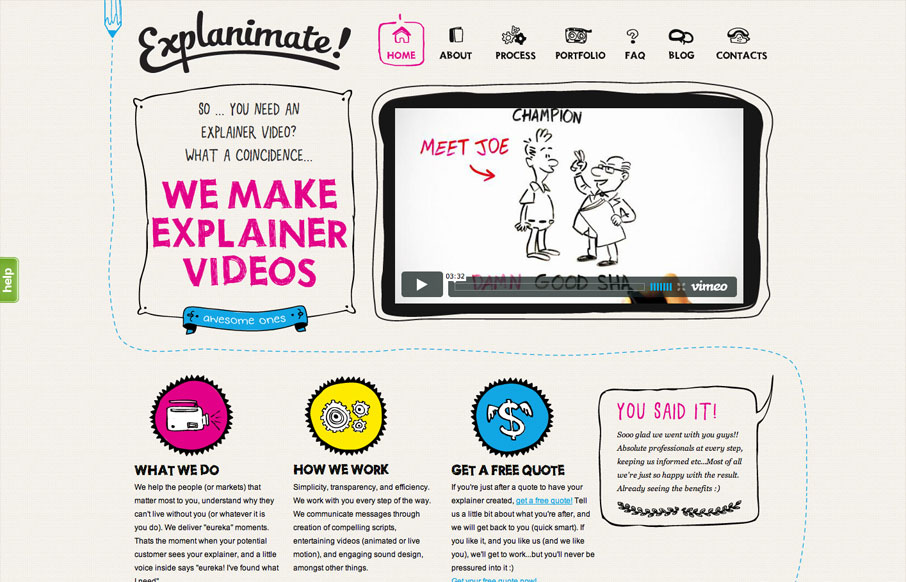
by Gene Crawford | Aug 6, 2012 | Gallery, Marketing
The website is built visually around what these guys do as a service. They illustrate what your product or service does, so they use that same skill on their own stuff. Very fun and open feel. Simple colors and type all work in tandem together like it should....
