by Gene Crawford | Jul 3, 2012 | Gallery
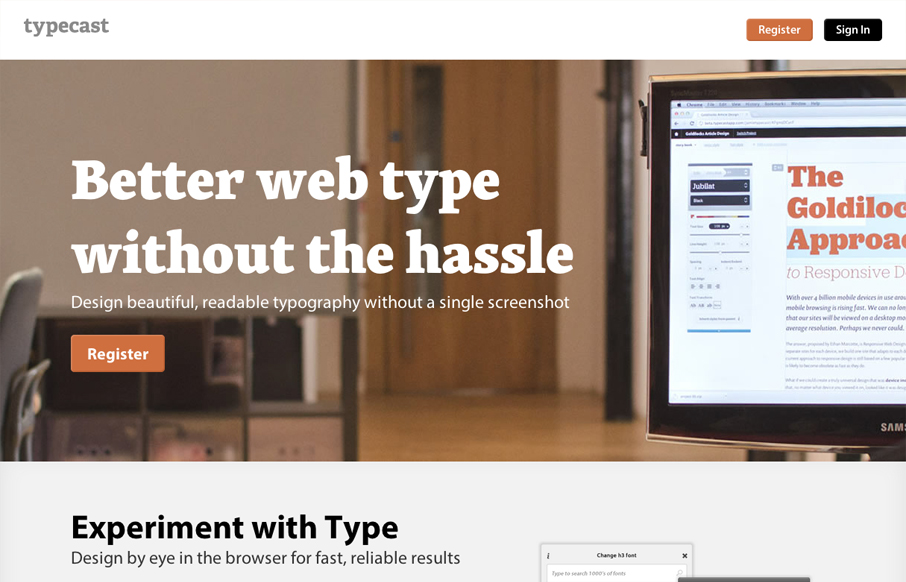
Aside from what looks like a brilliant app. The typecastapp.com website is very well produced. I like asymmetrical layout a lot, the right side is heavy with visuals and it really helps to draw you down the page more. Keeping your eyes focused on that right side...

by Gene Crawford | Jul 2, 2012 | Gallery
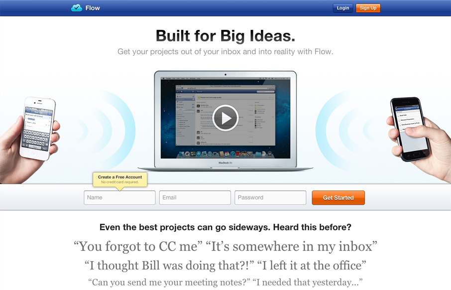
Really great looking/working website. I dig the bold colors, they kind of burn into your retina in a good way. I also like the small animation on the initial page load from the two hands holding the iPhones. The thing I like the most is the multiple chances to get...

by Gene Crawford | Jun 27, 2012 | Gallery
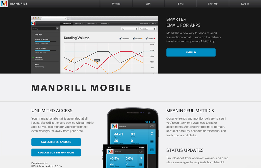
The Mandrill site is a such a nice product/app website. The experience is clean with a few little visual treats here and there, like the slight parallax type image shift on the two mobile phone images. Good responsive design too. I particularly like the signup form...

by Gene Crawford | Jun 27, 2012 | Gallery
The Hull Digital Live conference website is a nice responsive top navigation design to study. I like the pattern here of going with the fixed top nav then as you get smaller screen widths, it still stays fixed but folds out with a slight transparency on it. It’s...

by Maria | Jun 26, 2012 | Gallery
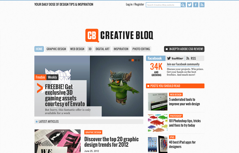
Creative Bloq is a brand new website by the makers of Computer Arts, 3D World and .net magazine that offers up a daily dose of design tips & inspiration. First impressions are that this could be something good. What I noticed immediately is that it’s SUPER...
