by Gene Crawford | Aug 13, 2012 | Gallery, Travel
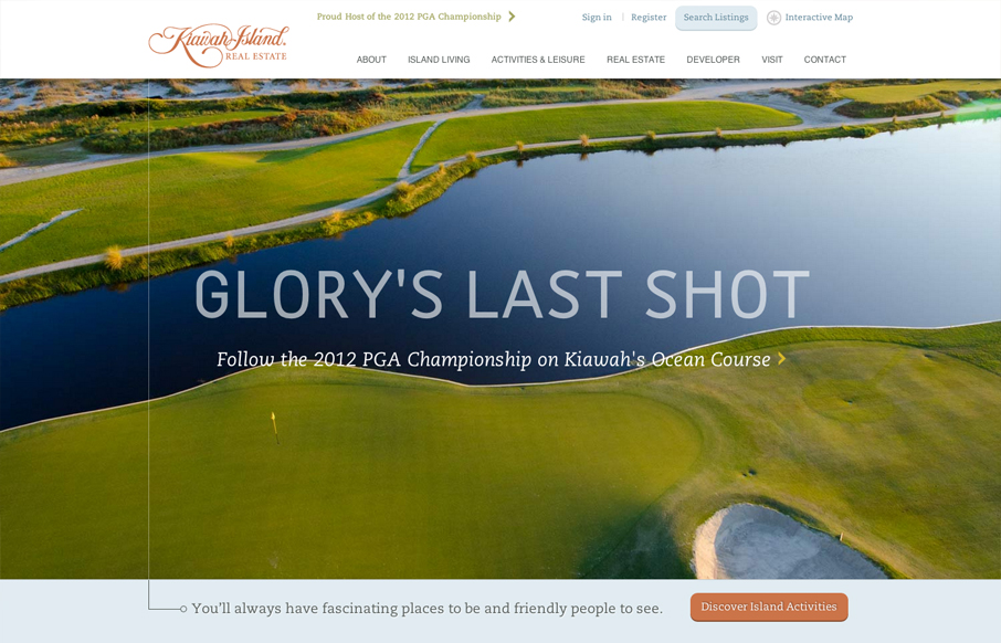
Another great website from the fine folks at e house studio with kiawahisland.com. My favorite part is how the nav is fixed until you get a to a certain target point in the page, then folds up into the top of the page. I also like the change from rectangular imagery...
by Gene Crawford | Aug 13, 2012 | Gallery
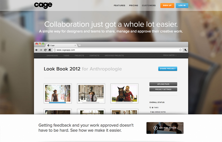
Name: Sandip Patel @cageapp Role: Designer & Developer Cage is an online collaboration tool that provides a secure environment for creative teams in web, mobile, print, video, design, 3D and motion graphics to easily present their work for feedback and approval....
by Gene Crawford | Aug 13, 2012 | Gallery
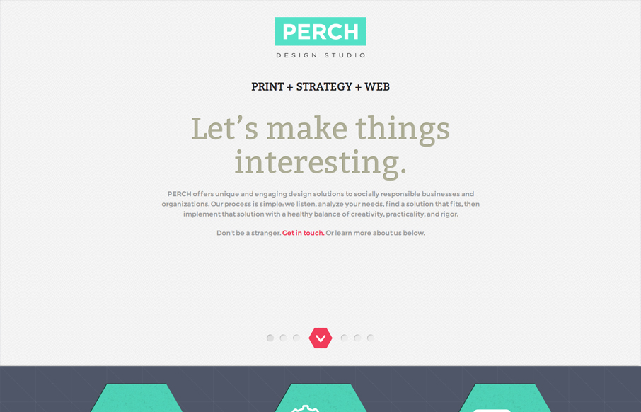
Name: Stacy Kim @perchmade Role: Designer & Developer Although this website is fairly complete—we really consider this a one page splash page—a precursor to the full website. The design is simple and focuses on color and typography. This may be just a one page...
by Gene Crawford | Aug 10, 2012 | Gallery
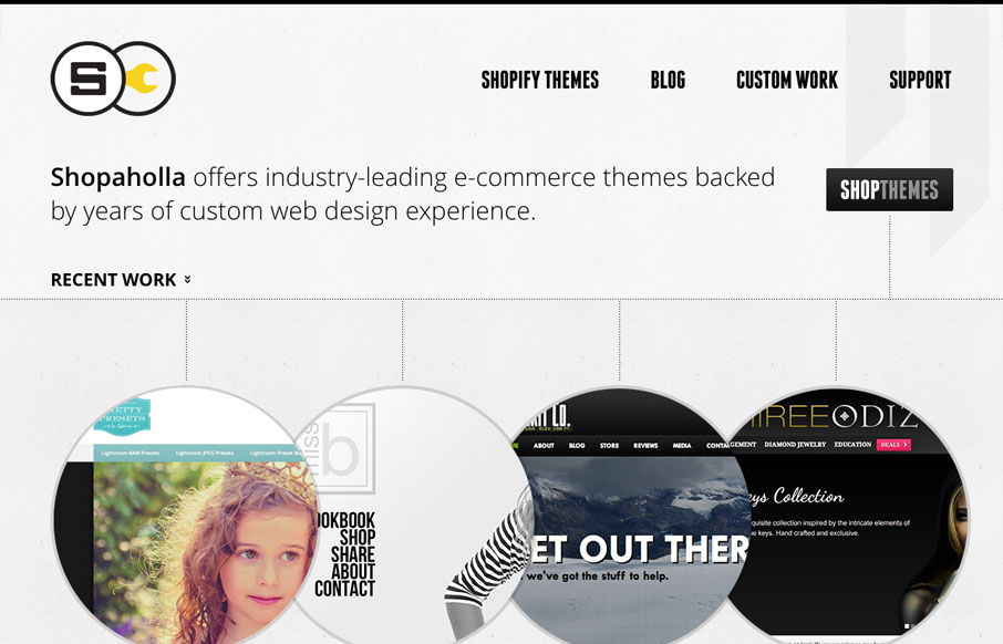
Posted by: Andrew Johnson @and_rwj Role: Designer & Developer This website looks pretty dynamic on first viewing. It has circular shapes were traditional squares would be used, there’s also lots of great little interactions across the page. I especially...
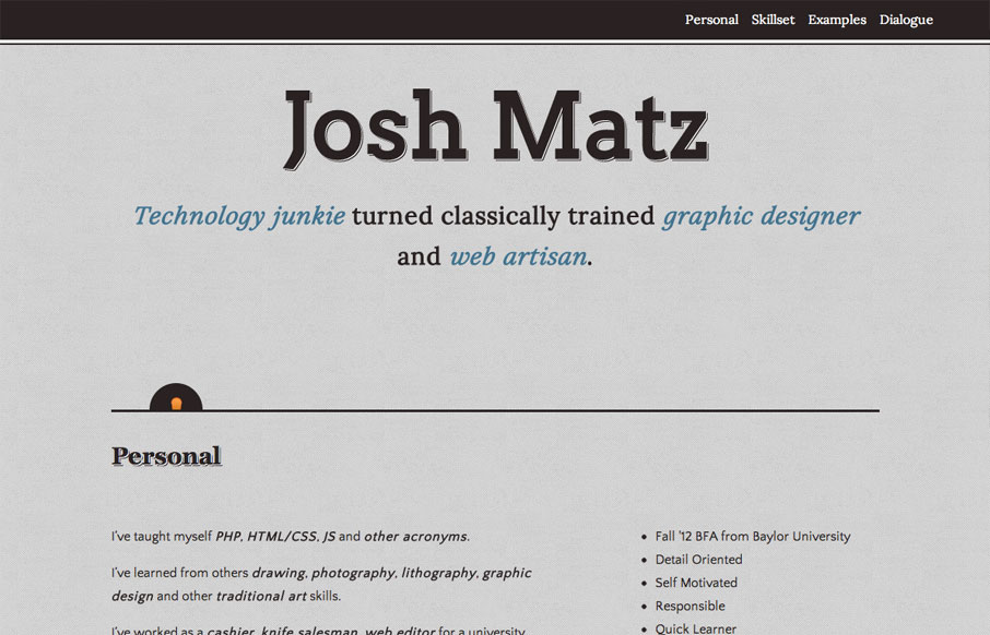
by Gene Crawford | Aug 9, 2012 | Gallery
Submitted by: Josh Matz @joshmatz Role: Designer & Developer Overall another fairly simple design but I liked some of the responsive design decisions and I also like the little interactions that have the surprise questions about Josh. That kind of stuff really...
