
by Giovanni DiFeterici | Aug 20, 2013 | Gallery
Dern. This site has a lot going on at once. I really like to see designs that push conventions into new territory and creativejar have done that in a few ways. The layout of the homepage content is modular, but only loosely structured. This is interesting, but if...
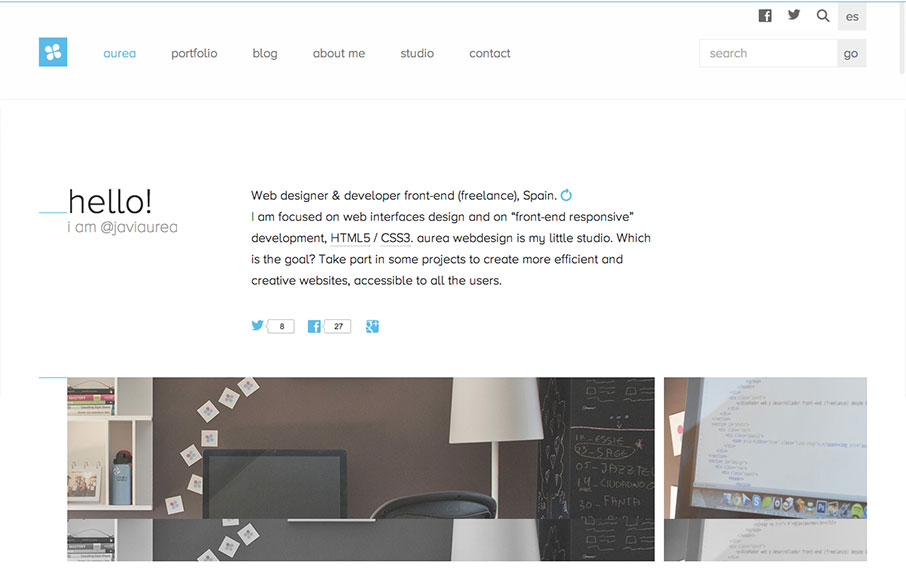
by Giovanni DiFeterici | Aug 19, 2013 | Gallery
Aurea is simple, clean and highly readable. I really enjoy the minimal palette and open layout. It’s a tight design with lots of contemporary details and a well designed aesthetic. Very nice. Cute dog too.
by Giovanni DiFeterici | Aug 15, 2013 | Design Firm, Gallery
I don’t know these guys, but I already love them. This site is funny as hell, but serious. I take them seriously. Seriously…. But seriously, the design has more character and fun that you can shake a stick at. And it looks good at all sizes. And it’s...

by Gene Crawford | Aug 14, 2013 | Gallery
I really love the simplicity of the Do site design. It’s boiled down to just what’s needed. The overall palette is muted, but not really which is a clever understatement to work into the design. I also dig the Features page, I like how it goes from just...
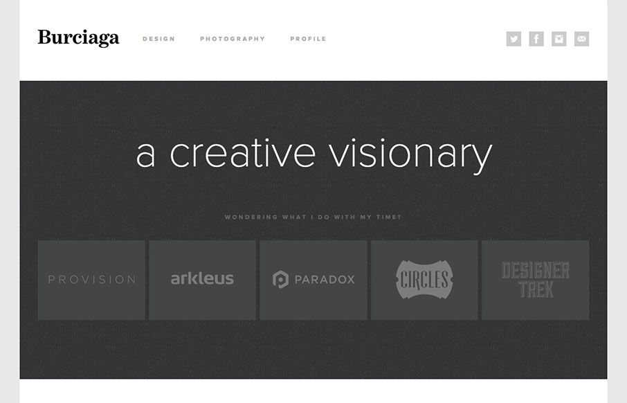
by Gene Crawford | Aug 12, 2013 | Gallery
Super sleek and fairly minimal the Burciaga website looks great. I really like how it starts off primarily muted in colors with the grays, then as you interact with it and scroll you get colors. The design is primarily made up of the examples of work samples which is...