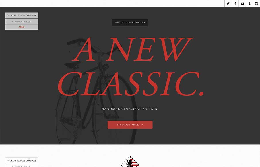
by Giovanni DiFeterici | Jul 18, 2013 | Gallery, Sports/Recreation
The Vickers Bicycles site is a small one that has one clear purpose: promote and sell the English Roadster Bike – a beautiful machine, if I do say so – and does so wonderfully. The simple, open layout has a slightly mechanical feel that doesn’t feel...
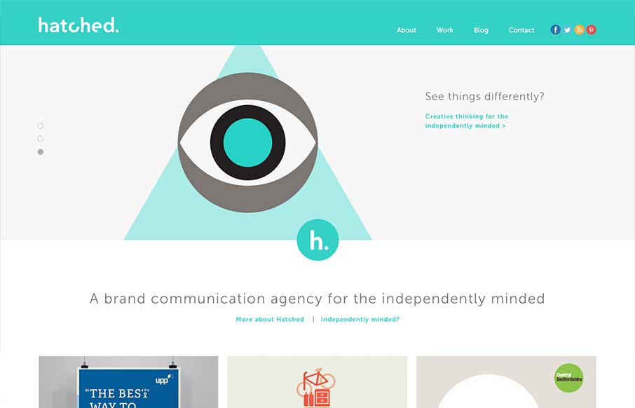
by Giovanni DiFeterici | Jul 17, 2013 | Gallery
The Hatched London website is a simple, elegant site. It’s flat, minimal and strongly graphic. Everything you’d expect from a great design house.
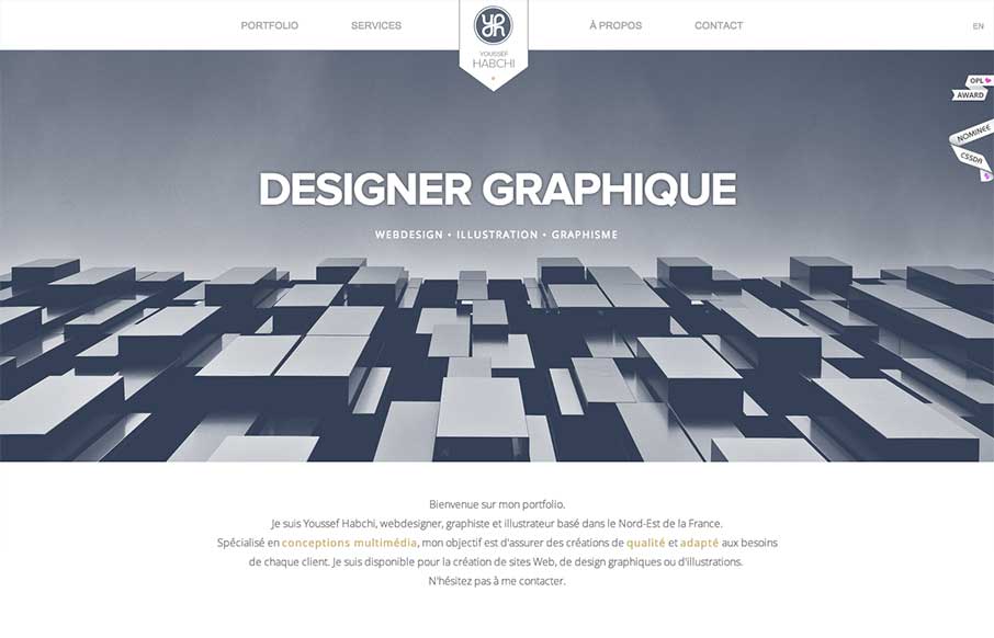
by Giovanni DiFeterici | Jul 15, 2013 | Gallery, Portfolio
While I’m not a hug fan of loading screens, youssef-habchi.com is a really nice responsive portfolio site. It balances low contrast grays beautifully and incorporates a fast, animated transitions that polish the interactions nicely. The splashes of color in the...
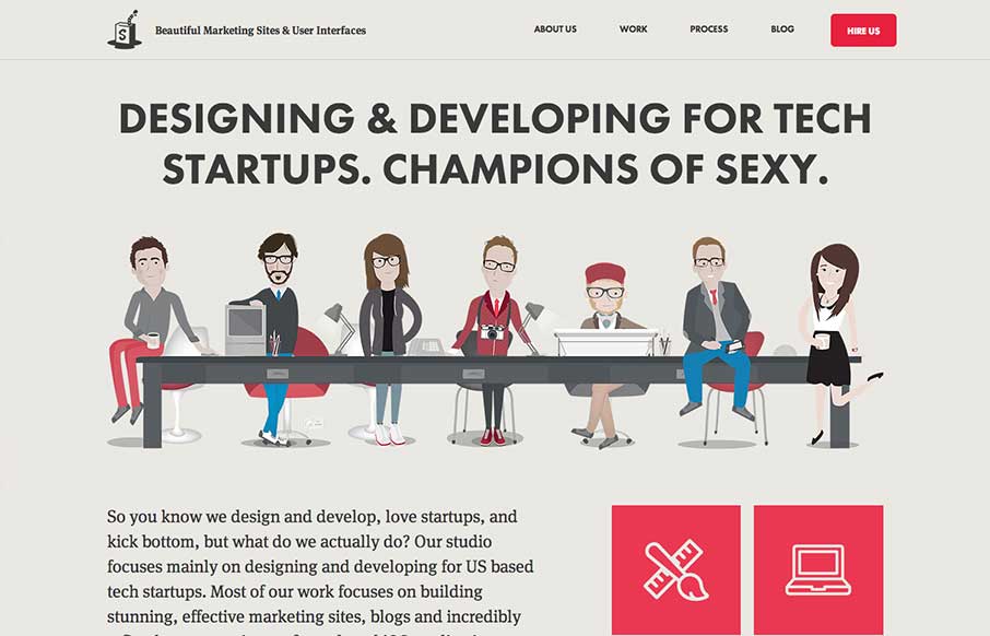
by Giovanni DiFeterici | Jul 11, 2013 | Gallery
The Simple as Milk website packs a lot onto one page! The site is strongly illustrative, which is perfect, one you see the portfolio; you certainly know what you are getting when you hire this agency. I really enjoy the playful quality of the artwork and interface...
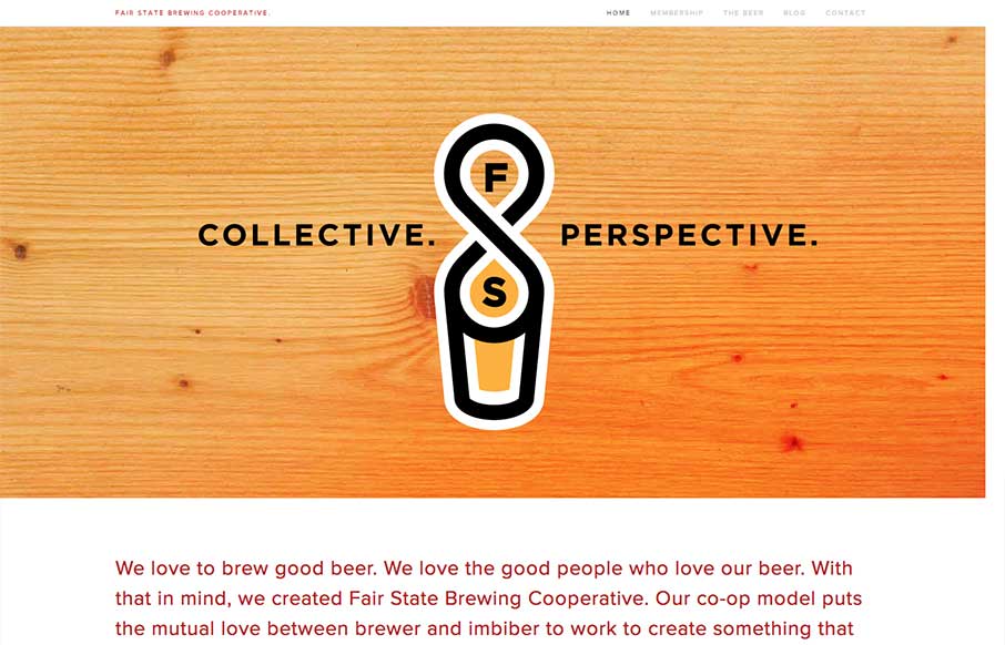
by Giovanni DiFeterici | Jul 10, 2013 | Gallery
Fair State Co-op is a really nice site filled with warmth and dominated by a simple graphic style. The site doesn’t have all the bells and whistles that we often see in the gallery, but its got rock solid design and readability. It’s a very friendly...