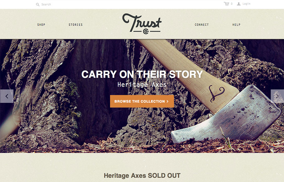
by Gene Crawford | Oct 1, 2013 | Gallery
What a great website. First off it’s about Axes, which are just cool to think about and use. The design of the site has lots of little surprises but executed in a simple way. The main nav has these great large icons that are worked into the drop-down navigation...
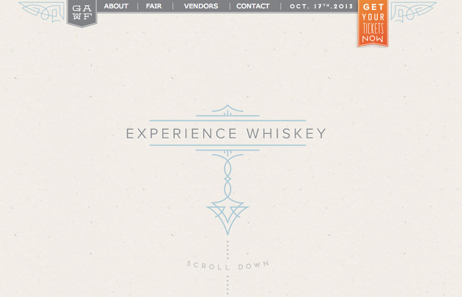
by Gene Crawford | Oct 1, 2013 | Food and Beverage, Gallery
Super simple design but I love the illustration work and limited feel to the layout while being ornate at the same time. It’s almost like whiskey itself, simple yet full of volume when it comes to taste.
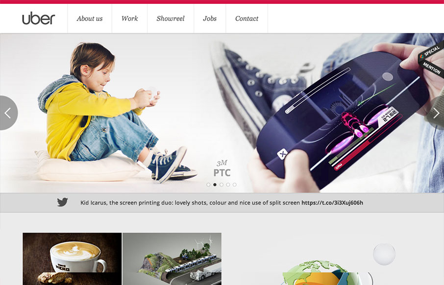
by Gene Crawford | Sep 4, 2013 | Gallery
Pretty standard layout here but it has enough little bells and whistles to keep it feeling quite fresh. I love the slight squeeze that the main nav across the top does as you scroll down. It’s enough to make you notice it and follow it. The rest of the layout...
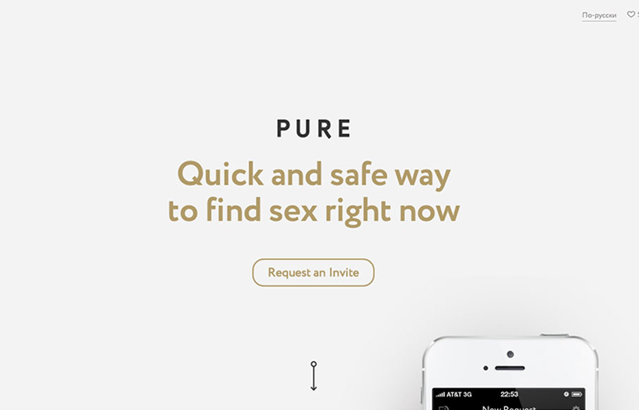
by Giovanni DiFeterici | Sep 3, 2013 | Gallery
I have now seen everything. Pure is a hookup app with no illusions about it’s intended purpose: booty calls. So, there’s that. Now lets talk about the site! getpure.org/en is a slick little single page scroller that snaps to particular scroll heights. The...

by Giovanni DiFeterici | Aug 21, 2013 | Gallery
Mezzolab is a nice modern portfolio site with attractive ice cream colors. Many of the interactions are fairly standard: rollovers with detailed information on the portfolio links, static nav, scaling logo, etc., but the complete package is impressive. The design...