
by Gene Crawford | Sep 18, 2014 | Design Firm, Gallery
Pretty cool looking page design for this WP plugin. I like the branding and the visual layout of the page too. Good stuff. Anyone tried the plugin?
by Gene Crawford | Sep 18, 2014 | Food and Beverage, Gallery
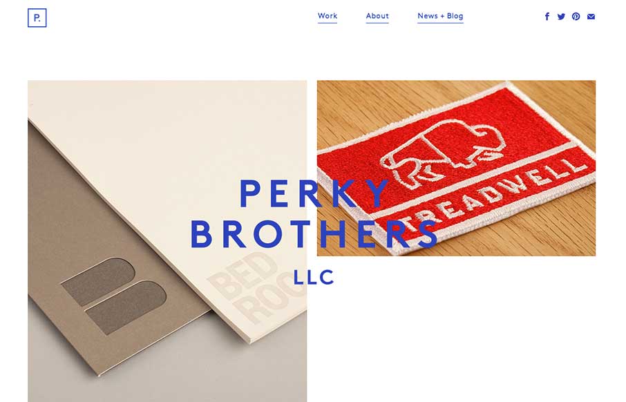
Nice minimal design for Perky Brothers. I love the name. I also really like the overlay of the words that sit on top of the images and stay put as you scroll down the page.
by Gene Crawford | Sep 17, 2014 | Gallery, Portfolio
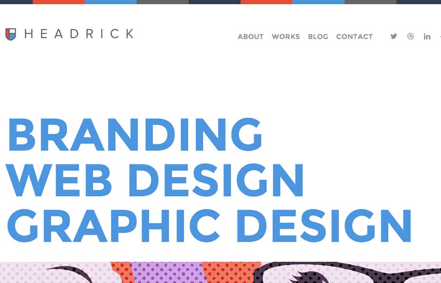
I like how the type and the line work in this layout are all big and bold yet the page feels soft at the same time. Really unique yet familiar feeling at the same time. Smart work. Submitted by: Tony Headrick @tonyheadrick Role: Designer &...

by Gene Crawford | Sep 17, 2014 | Gallery
I dig the look of this design. It’s flat and clean and really feels like a engineering company to me. Only wish it was responsive, but otherwise a really smart looking layout. Steve Semanchik @vitaminisgood Role: Designer The Kibart home page showcases the...
by Gene Crawford | Sep 17, 2014 | Food and Beverage, Gallery
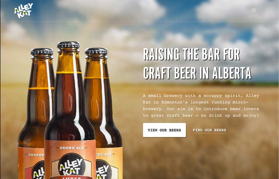
Nice design that feels “crafted” with some hand made looking sections, the type plays into this nicely. The site utilizes a Full Screen Overlay style navigation pattern which seems to fit aesthetically but not functionally too well.
