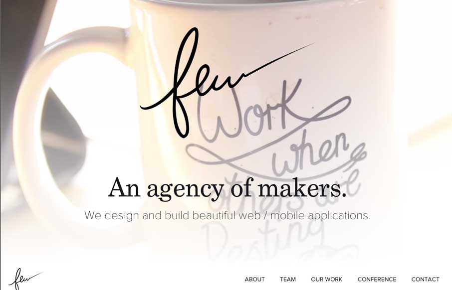
by Gene Crawford | Aug 19, 2014 | Gallery
Really beautiful and wispy design for the few.io site. I really dig the open vibe to the design and just about everything else that goes with it. Also, that is some epic beardage across the team there.
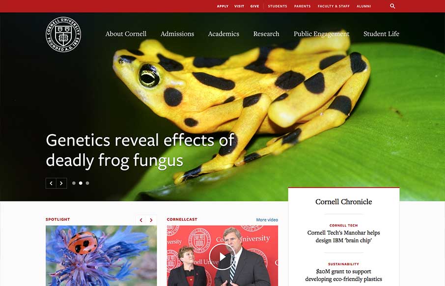
by Gene Crawford | Aug 14, 2014 | Education, Gallery
One of the better responsive higher ed site’s i’ve ever reviewed. There’s tons of nice design patterns in play here as well as other detail work. What’s most striking is that the responsive design isn’t just the home page, but seems to go...

by Gene Crawford | Aug 12, 2014 | Gallery
Nice clean simple website for a web designer’s portfolio. I like the long form write ups and just the simple showing of work. Submitted by: Phil Stringfellow @psdesignuk Role: Designer & Developer This is v6 of my personal website and portfolio, featuring...
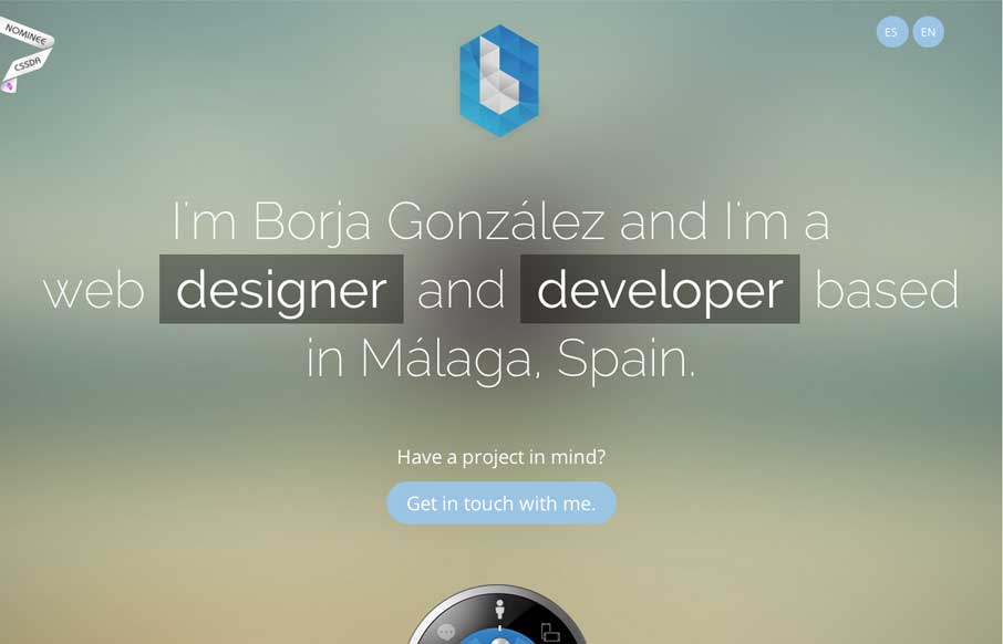
by Aaron Griswold | Aug 8, 2014 | Gallery
Borja has a cool CSS feature that you probably don’t on your portfolio site – a dial that brings up different content. Why should you care – because portfolio sites should not just be about showing your previous work, but also to: Try. New. Things....

by Aaron Griswold | Aug 8, 2014 | Gallery
The things I would have said about Konnu’s website were exactly what their founder said about it (below). Added to what he said, I like how the navigation works in the mobile version – gives it a little of the current app navigation feel. Submitted by: Tim...