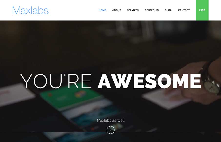
Kind of standard fair for content on the Maxlabs website, but the slight differentiation in the way each section is treated makes it stand out to me. I like the subtle changes in layout as you scroll and the ‘just enough’ interaction to pull you in a bit to read the content or look at the images is nice. Good work.


The Call to Action, Revisited
The Call to Action hasn’t changed in a decade, but the bar has. A fresh look at prominence, copy, mobile tap targets, and accessibility, with lessons from three major design systems.


Awesome. Thanks for adding.